Typeface superfamily on:
[Wikipedia]
[Google]
[Amazon]
{{unsourced, date=March 2019

 In typography, a font superfamily or typeface superfamily is a

 In typography, a font superfamily or typeface superfamily is a
 font family
A typeface (or font family) is the design of lettering that can include variations in size, weight (e.g. bold), slope (e.g. italic), width (e.g. condensed), and so on. Each of these variations of the typeface is a font.
There are thousands o ...
containing
fonts that fall into multiple classifications.
The norm in a superfamily is to start from an identical character shape; class-specific features such as serifs are added to that shape. The result is a set of fonts that, while belonging to different classes such as sans and serif, have a similar appearance. Generally the sans-serif member of a superfamily will be a humanist design to complement the serif.
Other superfamilies may include fonts grouped together for a common purpose that are not exactly complementary in letterform structure.
Notable superfamilies
Same letterforms
; Berlingske: by Playtype, comprising Berlingske Serif, Berlingske Serif Display, Berlingske Serif Stencil, Berlingske sans, Berlingske Sans Display, Berlingske sans Stencil, Berlingske Slab, Berlingske Slab Display, Berlingske Slab Stencil, Berlingske Typewriter. ;FF Meta
FF Meta is a humanist sans-serif typeface family designed by Erik Spiekermann and released in 1991 through his FontFont library. According to Spiekermann, FF Meta was intended to be a "complete antithesis of Helvetica", which he found "boring an ...
: by Erik Spiekermann
Erik Spiekermann (born 30 May 1947 in Stadthagen, Lower Saxony) is a German typographer, designer and writer. He is an honorary professor at the University of the Arts Bremen and ArtCenter College of Design.
Biography
Spiekermann studied art hi ...
, comprising FF Meta (sans), FF Meta Serif and FF Meta Headline
; FF Nexus: by Martin Majoor, comprising FF Nexus Sans, FF Nexus Serif, FF Nexus Mix and FF Nexus Typewriter
; FF Quadraat: by Fred Smeijers
Fred Smeijers ( Eindhoven, 1961) is a Dutch type designer, researcher and writer, educated at the ArtEZ Hogeschool voor de Kunsten in Arnhem in the early 1980s.
Smeijers is the creative director and co-founder of the typeface design and publis ...
, comprising FF Quadraat (serif), FF Quadraat Sans, FF Quadraat Display and FF Quadraat Headliner
; FF Scala
FF Scala is an old-style serif typeface designed by Dutch typeface designer Martin Majoor in 1991 for the Muziekcentrum Vredenburg in Utrecht, the Netherlands. The FF Scala font family was named for the Teatro alla Scala (1776–78) in Milan, ...
: by Martin Majoor, comprising FF Scala
FF Scala is an old-style serif typeface designed by Dutch typeface designer Martin Majoor in 1991 for the Muziekcentrum Vredenburg in Utrecht, the Netherlands. The FF Scala font family was named for the Teatro alla Scala (1776–78) in Milan, ...
(serif) and FF Scala Sans
FF Scala Sans is a humanist sans-serif typeface designed by Dutch designer Martin Majoor in 1993 for the Vredenburg Music Center in Utrecht, the Netherlands. It was designed as a companion to Majoor's earlier serif old style typeface FF Scala, d ...
; FF Seria: by Martin Majoor, comprising FF Seria (serif) and FF Seria Sans
; Generis: by Erik Faulhaber, comprising Generis Sans, Generis Serif, Generis Simple and Generis Slab
; ITC Humana: by Timothy Donaldso, comprising ITC Humana Sans, ITC Humana Serif and ITC Humana Script
;ITC Officina
ITC Officina is a font superfamily designed by Erik Spiekermann and released in 1990
File:1990 Events Collage.png, From left, clockwise: The 1990 FIFA World Cup is played in Italy; The Human Genome Project is launched; Voyager I takes the ...
: by Erik Spiekermann and Just van Rossum, comprising ITC Officina Sans, ITC Officina Serif and ITC Officina Display
; Linotype Authentic: by Karin Huschka, comprising Linotype Authentic Sans, Linotype Authentic Serif, Linotype Authentic Small Serif and Linotype Authentic Stencil
; Linotype Compatil: by Olaf Leu, comprising Compatil Text, Compatil Fact, Compatil Letter and Compatil Exquisit
; Lucida
Lucida (pronunciation: ) is an extended family of related typefaces designed by Charles Bigelow and Kris Holmes and released from 1984 onwards. The family is intended to be extremely legible when printed at small size or displayed on a low-resol ...
: by Charles Bigelow and Kris Holmes, comprising Lucida Sans, Lucida Serif, Lucida Typewriter Sans, Lucida Typewriter Serif and Lucida Math
; Merriweather: by Eben Sorkin, comprising Merriweather and Merriweather Sans
;Penumbra: by Lance Hidy, comprising Penumbra Sans, Penumbra Serif, Penumbra Half Serif and Penumbra Flare
; PT Fonts: by Alexandra Korolkova et al, comprising PT Serif, PT Sans and PT Mono.
; Rotis: by Otl Aicher, comprising rotis serif, rotis semi-serif, rotis semi-sans and rotis sans
; Sassoon: by Rosemary Sassoon and Adrian William, comprising Sassoon Sans, Sassoon Book, Sassoon Primary, Sassoon Infant and Sassoon Sans Slope
; Source: by Paul D. Hunt and Frank Grießhammer, comprising Source Sans Pro
Source Sans Pro is a sans serif typeface created by Paul D. Hunt, released by Adobe in 2012. It is the first open-source font family from Adobe, distributed under the SIL Open Font License.
The typeface is inspired by the forms of the Americ ...
, Source Serif Pro
Source Serif is a serif typeface created by Frank Grießhammer for Adobe Systems. It is the third open-source font family from Adobe, distributed under the SIL Open Font License.
The typeface is inspired by the forms of Pierre Simon Fournier an ...
and Source Code Pro
Source Code Pro is a monospaced sans serif typeface created by Paul D. Hunt for Adobe Systems. It is the second open-source font family from Adobe, distributed under the SIL Open Font License.
Source Code Pro (2012)
Source Code Pro is a set o ...
; Stone: by Sumner Stone, comprising Stone Serif, Stone Sans and Stone Informal
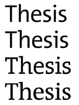
; Thesis
A thesis ( : theses), or dissertation (abbreviated diss.), is a document submitted in support of candidature for an academic degree or professional qualification presenting the author's research and findings.International Standard ISO 7144: ...
: by Lucas de Groot
Lucas de Groot (born in Noordwijkerhout, the Netherlands), known professionally as Luc(as) de Groot, is a Dutch type designer. He is the head of the type foundry Fontfabrik, also trading as LucasFonts.
De Groot is particularly known for the very ...
, comprising TheSans, TheSerif, TheMix and TheAntiqua
; Trajan
Trajan ( ; la, Caesar Nerva Traianus; 18 September 539/11 August 117) was Roman emperor from 98 to 117. Officially declared ''optimus princeps'' ("best ruler") by the senate, Trajan is remembered as a successful soldier-emperor who presi ...
: both Trajan (serif, designed by Carol Twombly
Carol Twombly (born June 13, 1959) is an American designer, best known for her type design. She worked as a type designer at Adobe Systems from 1988 through 1999, during which time she designed, or contributed to the design of, many typefaces, i ...
) and Trajan Sans. No lower-case.
Same purpose
;Computer Modern
Computer Modern is the original family of typefaces used by the typesetting program TeX. It was created by Donald Knuth with his Metafont program, and was most recently updated in 1992. Computer Modern, or variants of it, remains very widely u ...
: by Donald E. Knuth
Donald Ervin Knuth ( ; born January 10, 1938) is an American computer scientist, mathematician, and professor emeritus at Stanford University. He is the 1974 recipient of the ACM Turing Award, informally considered the Nobel Prize of computer sc ...
, comprising cmr (antiqua), cmss (grotesque) and cmtt (monospaced
A monospaced font, also called a fixed-pitch, fixed-width, or non-proportional font, is a font whose letters and characters each occupy the same amount of horizontal space. This contrasts with variable-width fonts, where the letters and spaci ...
)
; DejaVu and Bitstream Vera
Vera is a digital typeface (computer font) superfamily with a liberal license. It was designed by Jim Lyles from the now-defunct Bitstream Inc. type foundry, and it is closely based on Bitstream Prima, for which Lyles was also responsible. It ...
: comprising DejaVu Sans, DejaVu Sans Mono and DejaVu Serif.
; Droid: by Steve Matteson, comprising Droid Sans, Droid Serif and Droid Sans Mono.
; IBM Plex
IBM Plex is an open source typeface superfamily conceptually designed and developed by Mike Abbink at IBM in collaboration with Bold Monday to reflect the design principles of IBM and to be used for all brand material across the company inte ...
: by Mike Abbink, comprising IBM Plex Sans, IBM Plex Sans Condensed, IBM Plex Serif and IBM Plex Mono
; Roboto
Roboto () is a neo-grotesque sans-serif typeface family developed by Google as the system font for its mobile operating system Android, and released in 2011 for Android 4.0 "Ice Cream Sandwich".
The entire font family has been licensed un ...
: by Christian Robertson, comprising Roboto, Roboto Slab and Roboto Mono
; Corporate ASE: by Kurt Weidemann, comprising antiqua, sans and Egyptienne
; Liberation
Liberation or liberate may refer to:
Film and television
* ''Liberation'' (film series), a 1970–1971 series about the Great Patriotic War
* "Liberation" (''The Flash''), a TV episode
* "Liberation" (''K-9''), an episode
Gaming
* '' Liberati ...
: by Steve Matteson, comprising Liberation Sans, Liberation Serif and Liberation Mono
Typography
*