|
Typography
Typography is the art and technique of arranging type to make written language legible, readable and appealing when displayed. The arrangement of type involves selecting typefaces, point sizes, line lengths, line-spacing ( leading), and letter-spacing (tracking), as well as adjusting the space between pairs of letters (kerning). The term ''typography'' is also applied to the style, arrangement, and appearance of the letters, numbers, and symbols created by the process. Type design is a closely related craft, sometimes considered part of typography; most typographers do not design typefaces, and some type designers do not consider themselves typographers. Typography also may be used as an ornamental and decorative device, unrelated to the communication of information. Typography is the work of typesetters (also known as compositors), typographers, graphic designers, art directors, manga artists, comic book artists, and, now, anyone who arranges words, letters, numbers ... [...More Info...] [...Related Items...] OR: [Wikipedia] [Google] [Baidu] |
Leading
In typography, leading ( ) is the space between adjacent lines of type; the exact definition varies. In hand typesetting, leading is the thin strips of lead (or aluminium) that were inserted between lines of type in the composing stick to increase the vertical distance between them. The thickness of the strip is called leading and is equal to the difference between the size of the type and the distance from one baseline to the next. For instance, given a type size of 10 points and a distance between baselines of 12 points, the leading would be 2 points. The term is still used in modern page-layout software such as QuarkXPress, the Affinity Suite, and Adobe InDesign. Consumer-oriented word-processing software often talks of line spacing or, more accurately, interline spacing. Origins The word comes from lead strips that were put between set lines of lead type, hence the pronunciation "ledding" and not "leeding". The practice became popular in the eighteenth ... [...More Info...] [...Related Items...] OR: [Wikipedia] [Google] [Baidu] |
Typeface
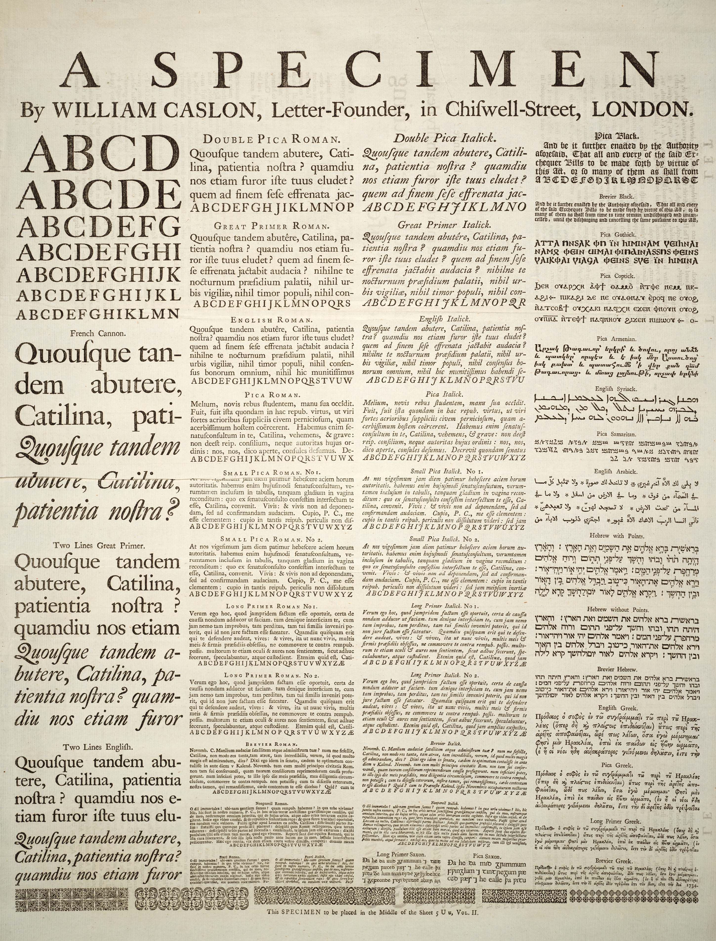
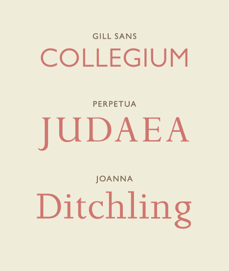
A typeface (or font family) is the design of lettering that can include variations in size, weight (e.g. bold), slope (e.g. italic), width (e.g. condensed), and so on. Each of these variations of the typeface is a font. There are list of typefaces, thousands of different typefaces in existence, with new ones being developed constantly. The art and craft of designing typefaces is called ''type design''. Designers of typefaces are called ''type designers'' and are often employed by ''type foundry, type foundries''. In desktop publishing, type designers are sometimes also called ''font developers'' or ''font designers''. Every typeface is a collection of glyphs, each of which represents an individual letter, number, punctuation mark, or other symbol. The same glyph may be used for character (symbol), characters from different scripts, e.g. Roman uppercase A looks the same as Cyrillic uppercase А and Greek uppercase alpha. There are typefaces tailored for special applications, s ... [...More Info...] [...Related Items...] OR: [Wikipedia] [Google] [Baidu] |
Serif
In typography, a serif () is a small line or stroke regularly attached to the end of a larger stroke in a letter or symbol within a particular font or family of fonts. A typeface or "font family" making use of serifs is called a serif typeface (or serifed typeface), and a typeface that does not include them is sans-serif. Some typography sources refer to sans-serif typefaces as "grotesque" (in German, ) or "Gothic", and serif typefaces as "roman". Origins and etymology Serifs originated from the first official Greek writings on stone and in Latin alphabet with inscriptional lettering—words carved into stone in Roman antiquity. The explanation proposed by Father Edward Catich in his 1968 book ''The Origin of the Serif'' is now broadly but not universally accepted: the Roman letter outlines were first painted onto stone, and the stone carvers followed the brush marks, which flared at stroke ends and corners, creating serifs. Another theory is that serifs were devised to neate ... [...More Info...] [...Related Items...] OR: [Wikipedia] [Google] [Baidu] |
Letter Case
Letter case is the distinction between the Letter (alphabet), letters that are in larger uppercase or capitals (or more formally ''majuscule'') and smaller lowercase (or more formally ''minuscule'') in the written representation of certain languages. The writing systems that distinguish between the upper and lowercase have two parallel sets of letters, with each letter in one set usually having an equivalent in the other set. The two case variants are alternative representations of the same letter: they have the same name and pronunciation and are treated identically when sorting in alphabetical order. Letter case is generally applied in a mixed-case fashion, with both upper and lowercase letters appearing in a given piece of text for legibility. The choice of case is often prescribed by the grammar of a language or by the conventions of a particular discipline. In orthography, the uppercase is primarily reserved for special purposes, such as the first letter of a Sentence (ling ... [...More Info...] [...Related Items...] OR: [Wikipedia] [Google] [Baidu] |
Point (typography)
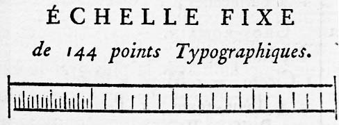
In typography, the point is the smallest unit of measure. It is used for measuring font size, leading, and other items on a printed page. The size of the point has varied throughout printing's history. Since the 18th century, the size of a point has been between 0.18 and 0.4 millimeters. Following the advent of desktop publishing in the 1980s and 1990s, digital printing has largely supplanted the letterpress printing and has established the DTP point (DeskTop Publishing point) as the ''de facto'' standard. The DTP point is defined as of an international inch () and, as with earlier American point sizes, is considered to be of a pica. In metal type, the point size of the font describes the height of the metal body on which the typeface's characters were cast. In digital type, letters of a font are designed around an imaginary space called an '' em square''. When a point size of a font is specified, the font is scaled so that its em square has a side length of that parti ... [...More Info...] [...Related Items...] OR: [Wikipedia] [Google] [Baidu] |
Letter-spacing
Examples of headline letter spacing In typography, letter spacing, character spacing or tracking is an optically consistent adjustment to the space between letters to change the visual density of a line or block of text. Letter spacing is distinct from kerning, which adjusts the spacing of particular pairs of adjacent characters such as "7." which would appear to be badly spaced if left unadjusted. History Historically, with metal type, a kern meant having a letter stick out beyond the metal slug to which it was attached, or having part of the body of the slug cut off to allow letters to overlap. A kern could therefore only bring letters closer together (negative spacing). Digital kerning could go in either direction. Tracking can similarly go in either direction, but with metal type, one could make groups of letters only farther apart (positive spacing). In the days of hot metal typesetting, ''letter spacing'' required adding horizontal space between letters of words set in m ... [...More Info...] [...Related Items...] OR: [Wikipedia] [Google] [Baidu] |
Type Design
Type design is the art and process of designing typefaces. This involves drawing each letterform using a consistent style. The basic concepts and design variables are described below. A typeface differs from other modes of graphic production such as handwriting and drawing in that it is a fixed set of alphanumeric characters with specific characteristics to be used repetitively. Historically, these were physical elements, called sorts, placed in a wooden frame; modern typefaces are stored and used electronically. It is the art of a type designer to develop a pleasing and functional typeface. In contrast, it is the task of the typographer (or typesetter) to lay out a page using a typeface that is appropriate to the work to be printed or displayed. History The technology of printing text using movable type was invented in China, but the vast number of Chinese characters, and the esteem with which calligraphy was held, meant that few distinctive, complete typefaces were created ... [...More Info...] [...Related Items...] OR: [Wikipedia] [Google] [Baidu] |
Kerning
In typography, kerning is the process of adjusting the spacing between Character (symbol), characters in a Typeface#Proportion, proportional font, usually to achieve a visually pleasing result. Kerning adjusts the space between individual letterforms, while Letter-spacing, tracking (letter-spacing) adjusts spacing uniformly over a range of characters. In a well-kerned font, the two-dimensional blank spaces between each pair of characters all have a visually similar area. The term "keming" is sometimes used informally to refer to poor kerning (the letters r and n placed too close together being easily mistaken for the letter m). The related term ''kern'' denotes a part of a type letter that overhangs the edge of the Movable type, type block. Metal typesetting The source of the word ''kern'' is from the French word , meaning "projecting angle, quill of a pen". The French term originated from the Latin , , meaning "hinge". In the days when all type was cast metal, the parts ... [...More Info...] [...Related Items...] OR: [Wikipedia] [Google] [Baidu] |


