|
Bookerly
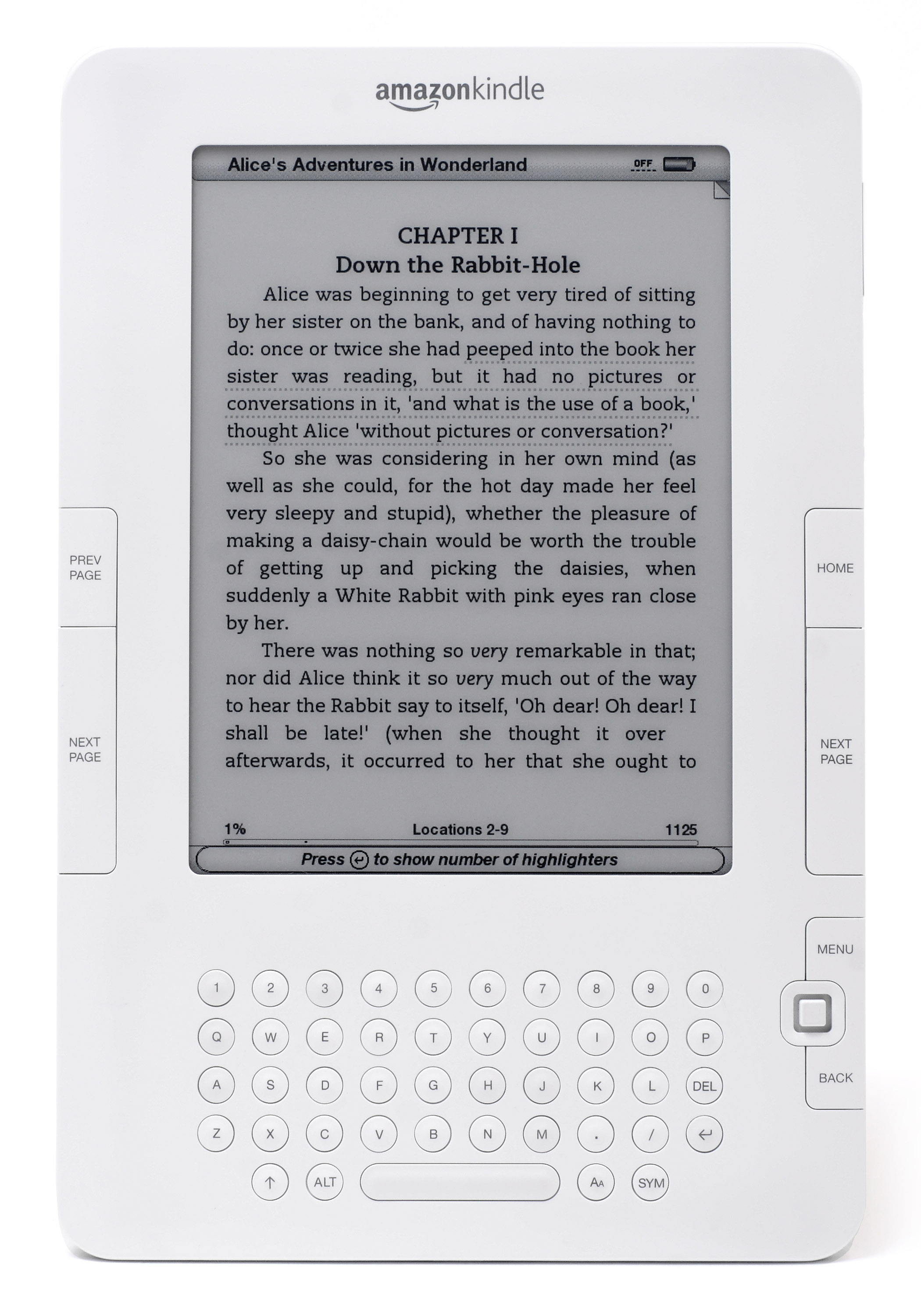
Bookerly is a serif typeface designed by Dalton Maag as an exclusive font for reading on Amazon.com, Amazon's Amazon Kindle, Kindle devices and apps. Combined with a new typesetting engine, Amazon.com asserts that the font helps the user "read faster with less eyestrain." The font includes typographic ligature, ligatures and kerning pairs. Bookerly replaced Caecilia as the default font for the 2015 Kindle Paperwhite (3rd generation) and it has been used as the default font on Amazon's following e-readers. The Bookerly font was added to many of the older Kindle devices via firmware updates, and is also available at Amazon's Developer site. See also * Athelas (typeface), Athelas * Literata * New York (2019 typeface) References Serif typefaces Old style serif typefaces Corporate typefaces Dalton Maag typefaces {{typ-stub ... [...More Info...] [...Related Items...] OR: [Wikipedia] [Google] [Baidu] |
Kindle Paperwhite (3rd Generation)
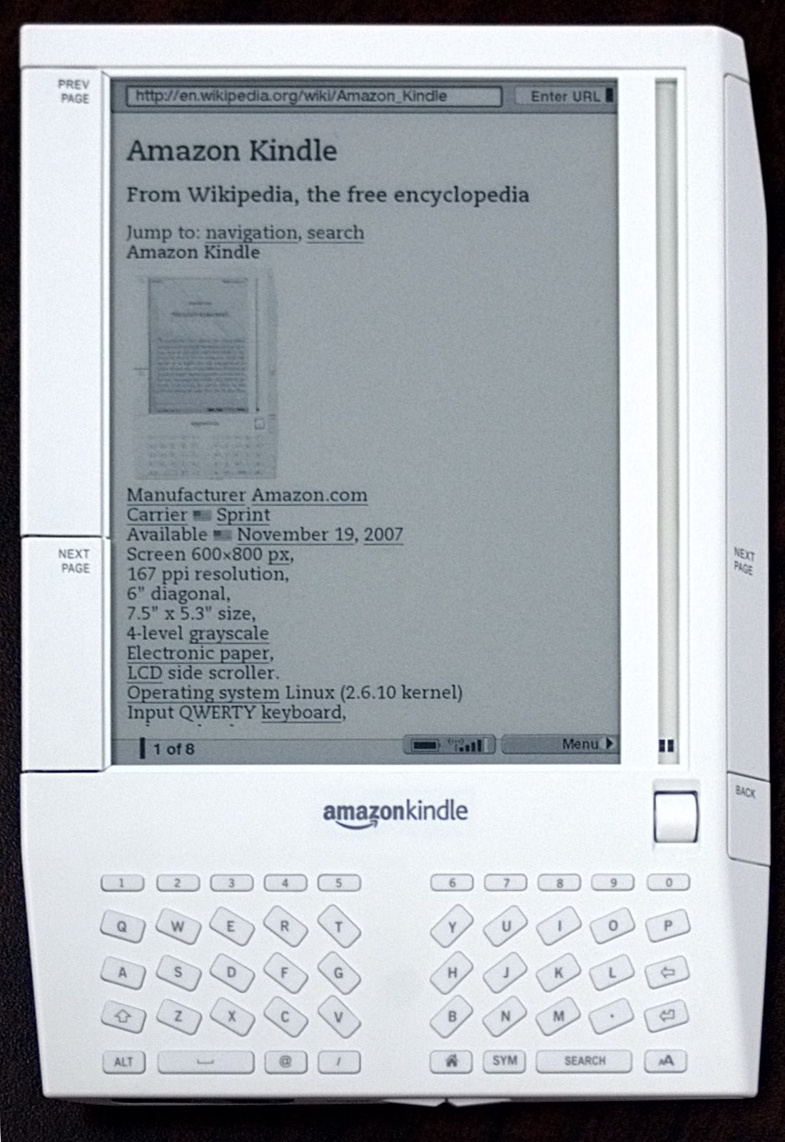
Amazon Kindle is a series of e-readers designed and marketed by Amazon. Amazon Kindle devices enable users to browse, buy, download, and read e-books, newspapers, magazines and other digital media via wireless networking to the Kindle Store. The hardware platform, which Amazon subsidiary Lab126 developed, began as a single device in 2007. Currently, it comprises a range of devices, including e-readers with E Ink electronic paper displays and Kindle applications on all major computing platforms. All Kindle devices integrate with Windows and macOS file systems and Kindle Store content and, as of March 2018, the store had over six million e-books available in the United States.Kindle Store: Kindle eBooks . Retrieved March 30, 2018. Naming and evolution In 2004, Amazon foun ...[...More Info...] [...Related Items...] OR: [Wikipedia] [Google] [Baidu] |
Amazon Kindle
Amazon Kindle is a series of e-readers designed and marketed by Amazon. Amazon Kindle devices enable users to browse, buy, download, and read e-books, newspapers, magazines and other digital media via wireless networking to the Kindle Store. The hardware platform, which Amazon subsidiary Lab126 developed, began as a single device in 2007. Currently, it comprises a range of devices, including e-readers with E Ink electronic paper displays and Kindle applications on all major computing platforms. All Kindle devices integrate with Windows and macOS file systems and Kindle Store content and, as of March 2018, the store had over six million e-books available in the United States.Kindle Store: Kindle eBooks . Retrieved March 30, 2018. Naming and evolution In 2004, Amazon foun ...[...More Info...] [...Related Items...] OR: [Wikipedia] [Google] [Baidu] |
Dalton Maag
Dalton Maag is an independent font foundry with offices in London, UK, and São Paulo, Brazil. It designs fonts for use in corporate identities, logos, and other text uses. Dalton Maag has a library of 30 retail fonts as of 2016 and offers custom font creation and modification services to its clients. Typefaces Many of Dalton Maag's typefaces have been designed for corporate clients. Dalton Maag's larger clients include AT&T, Netflix, BBC, Amazon, McDonald's, Nokia, BMW, DeviantArt, Intel, Vodafone, Ubuntu and Toyota. They also have a library of typefaces available to purchase from their website. Transport-related typefaces have included "Pantograph" for Manchester Metrolink and "Barlow", named after William Henry Barlow, for St Pancras railway station and the associated High Speed 1 signage. "Barlow" was created from a typeface called "Stroudley", which itself was descended from " Casey", designed for the KCR Corporation in Hong Kong. The Ubuntu typeface was notable for ... [...More Info...] [...Related Items...] OR: [Wikipedia] [Google] [Baidu] |
Literata
Literata is an old-style serif typeface commissioned by Google and designed by the independent type foundry TypeTogether. It was released in 2015 and is the default font family in Google Play Books, since version 3.4.5. The typeface was intended to establish a unique visual identity for the Play Books app, suitable across a wide variety of screen sizes, resolutions, and rendering software. The designers went back to the old-style Roman and Scotch typefaces for inspiration. Literata initially included two different weights (regular and bold) and corresponding upright italicised variations (no real italic). Version 2.1 named ''Literata Book'' added two different weights (Medium and SemiBold) and small caps, and made cap-height numerals the default. It includes support for full extended Latin, Polytonic Greek, and Cyrillic scripts. Compared to Play Books' former default font Droid Serif, Literata has a lower x-height and higher ascenders. On 7 December 2018, Literata was open- ... [...More Info...] [...Related Items...] OR: [Wikipedia] [Google] [Baidu] |
Serif
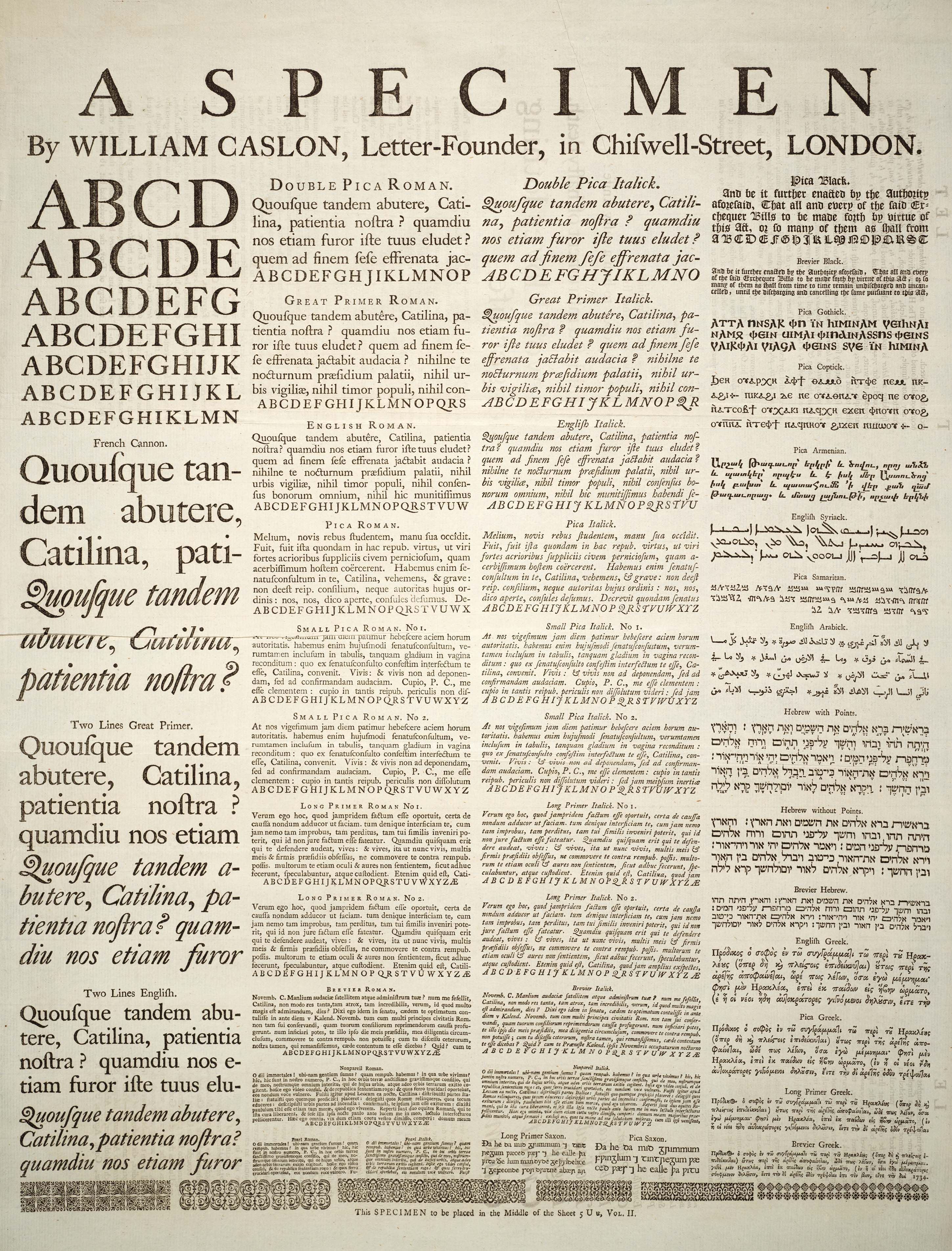
In typography, a serif () is a small line or stroke regularly attached to the end of a larger stroke in a letter or symbol within a particular font or family of fonts. A typeface or "font family" making use of serifs is called a serif typeface (or serifed typeface), and a typeface that does not include them is sans-serif. Some typography sources refer to sans-serif typefaces as "grotesque" (in German, ) or "Gothic", and serif typefaces as "roman". Origins and etymology Serifs originated from the first official Greek writings on stone and in Latin alphabet with inscriptional lettering—words carved into stone in Roman antiquity. The explanation proposed by Father Edward Catich in his 1968 book ''The Origin of the Serif'' is now broadly but not universally accepted: the Roman letter outlines were first painted onto stone, and the stone carvers followed the brush marks, which flared at stroke ends and corners, creating serifs. Another theory is that serifs were devised to neate ... [...More Info...] [...Related Items...] OR: [Wikipedia] [Google] [Baidu] |
Typeface
A typeface (or font family) is the design of lettering that can include variations in size, weight (e.g. bold), slope (e.g. italic), width (e.g. condensed), and so on. Each of these variations of the typeface is a font. There are list of typefaces, thousands of different typefaces in existence, with new ones being developed constantly. The art and craft of designing typefaces is called ''type design''. Designers of typefaces are called ''type designers'' and are often employed by ''type foundry, type foundries''. In desktop publishing, type designers are sometimes also called ''font developers'' or ''font designers''. Every typeface is a collection of glyphs, each of which represents an individual letter, number, punctuation mark, or other symbol. The same glyph may be used for character (symbol), characters from different scripts, e.g. Roman uppercase A looks the same as Cyrillic uppercase А and Greek uppercase alpha. There are typefaces tailored for special applications, s ... [...More Info...] [...Related Items...] OR: [Wikipedia] [Google] [Baidu] |
Amazon
Amazon most often refers to: * Amazons, a tribe of female warriors in Greek mythology * Amazon rainforest, a rainforest covering most of the Amazon basin * Amazon River, in South America * Amazon (company), an American multinational technology company Amazon or Amazone may also refer to: Places South America * Amazon Basin (sedimentary basin), a sedimentary basin at the middle and lower course of the river * Amazon basin, the part of South America drained by the river and its tributaries * Amazon Reef, at the mouth of the Amazon basin Elsewhere * 1042 Amazone, an asteroid * Amazon Creek, a stream in Oregon, US People * Amazon Eve (born 1979), American model, fitness trainer, and actress * Lesa Lewis (born 1967), American professional bodybuilder nicknamed "Amazon" Art and entertainment Fictional characters * Amazon (Amalgam Comics) * Amazon, an alias of the Marvel supervillain Man-Killer * Amazons (DC Comics), a group of superhuman characters * The Amazon, a ' ... [...More Info...] [...Related Items...] OR: [Wikipedia] [Google] [Baidu] |
Typographic Ligature
In writing and typography, a ligature occurs where two or more graphemes or letters are joined to form a single glyph. Examples are the characters æ and œ used in English and French, in which the letters 'a' and 'e' are joined for the first ligature and the letters 'o' and 'e' are joined for the second ligature. For stylistic and legibility reasons, 'f' and 'i' are often merged to create 'fi' (where the tittle on the 'i' merges with the hood of the 'f'); the same is true of 's' and 't' to create 'st'. The common ampersand (&) developed from a ligature in which the handwritten Latin letters 'E' and 't' (spelling , Latin for 'and') were combined. History The earliest known script Sumerian cuneiform and Egyptian language, Egyptian hieratic both include many cases of character combinations that gradually evolve from ligatures into separately recognizable characters. Other notable ligatures, such as the Brahmic family, Brahmic abugidas and the Runes, Germanic bind rune, figure pr ... [...More Info...] [...Related Items...] OR: [Wikipedia] [Google] [Baidu] |
Kerning
In typography, kerning is the process of adjusting the spacing between Character (symbol), characters in a Typeface#Proportion, proportional font, usually to achieve a visually pleasing result. Kerning adjusts the space between individual letterforms, while Letter-spacing, tracking (letter-spacing) adjusts spacing uniformly over a range of characters. In a well-kerned font, the two-dimensional blank spaces between each pair of characters all have a visually similar area. The term "keming" is sometimes used informally to refer to poor kerning (the letters r and n placed too close together being easily mistaken for the letter m). The related term ''kern'' denotes a part of a type letter that overhangs the edge of the Movable type, type block. Metal typesetting The source of the word ''kern'' is from the French word , meaning "projecting angle, quill of a pen". The French term originated from the Latin , , meaning "hinge". In the days when all type was cast metal, the parts ... [...More Info...] [...Related Items...] OR: [Wikipedia] [Google] [Baidu] |
E-readers
An e-reader, also called an e-book reader or e-book device, is a mobile electronic device that is designed primarily for the purpose of reading digital e-books and periodicals. Any device that can display text on a screen may act as an e-reader; however, specialized e-reader devices may optimize portability, readability, and battery life for this purpose. Their main advantage over printed books is portability. This is because an e-reader is capable of holding thousands of books while weighing less than one book, and the convenience provided due to add-on features. Overview An e-reader is a device designed as a convenient way to read e-books. It is similar in form factor to a tablet computer, but often features electronic paper rather than an LCD screen. This yields much longer battery life — the battery can last for several weeks — and better readability, similar to that of paper even in sunlight. Drawbacks of this kind of display include a slow refresh rate and (usua ... [...More Info...] [...Related Items...] OR: [Wikipedia] [Google] [Baidu] |
Athelas (typeface)
Athelas is a serif typeface designed by Veronika Burian and Jose Scaglione and intended for use in body text. Released by their company TypeTogether in 2008, Burian and Scaglione described Athelas as inspired by British fine book printing. Athelas is included as a system font in Apple's macOS operating system and as a default font in its Apple Books e-books application. It won joint first prize for best Latin-alphabet body text face at the Granshan International Type Design Competition in 2008. It is named after a healing herb in Tolkien's ''The Lord of the Rings ''The Lord of the Rings'' is an epic high-fantasy novel by English author and scholar J. R. R. Tolkien. Set in Middle-earth, intended to be Earth at some time in the distant past, the story began as a sequel to Tolkien's 1937 children's b ...''. Cyrillic characters were later added to the font family, designed by Tom Grace, and monotonic Greek characters designed by Irene Vlachou. In 2017 TypeTogether release ... [...More Info...] [...Related Items...] OR: [Wikipedia] [Google] [Baidu] |


.jpg)


