|
Bell Centennial
Bell Centennial is a sans-serif typeface in the industrial or grotesque style designed by Matthew Carter in the period 1975–1978. The typeface was commissioned by AT&T as a proprietary type to replace their then current directory typeface Bell Gothic on the occasion of AT&T's one hundredth anniversary. Carter was working for the Mergenthaler Linotype Company, which now licenses the face for general public use. Design AT&T's brief called for a typeface that would fit substantially more characters per line without loss of legibility, dramatically reducing the need for abbreviations and two-line entries, increase legibility at the smaller point sizes used in a telephone directory, and reduce consumption of paper. Bell Centennial was designed to address and overcome most of the limitations of telephone directory printing: poor reproduction due to high-speed printing on newsprint, and ink spread which decayed legibility as it closed up counterforms. Carter's design increased the ... [...More Info...] [...Related Items...] OR: [Wikipedia] [Google] [Baidu] |
Sans-serif
In typography and lettering, a sans-serif, sans serif, gothic, or simply sans letterform is one that does not have extending features called "serifs" at the end of strokes. Sans-serif typefaces tend to have less stroke width variation than serif typefaces. They are often used to convey simplicity and modernity or minimalism. Sans-serif typefaces have become the most prevalent for display of text on computer screens. On lower-resolution digital displays, fine details like serifs may disappear or appear too large. The term comes from the French word , meaning "without" and "serif" of uncertain origin, possibly from the Dutch word meaning "line" or pen-stroke. In printed media, they are more commonly used for display use and less for body text. Before the term "sans-serif" became common in English typography, a number of other terms had been used. One of these outmoded terms for sans-serif was gothic, which is still used in East Asian typography and sometimes seen in typeface na ... [...More Info...] [...Related Items...] OR: [Wikipedia] [Google] [Baidu] |
Erik Spiekermann
Erik Spiekermann (born 30 May 1947 in Stadthagen, Lower Saxony) is a German typographer, designer and writer. He is an honorary professor at the University of the Arts Bremen and ArtCenter College of Design. Biography Spiekermann studied art history at Berlin's Free University, funding himself by running a letterpress printing press in the basement of his house. Between 1972 and 1979, he worked as a freelance graphic designer in London before returning to Berlin and founding MetaDesign with two partners. In 1989, he and his then-wife Joan Spiekermann started FontShop, the first mail-order distributor for digital fonts. FontShop International followed and now publishes the ''FontFont'' range of typefaces. MetaDesign combined clean, teutonic-looking information design and complex corporate design systems for clients like BVG (Berlin Transit), Düsseldorf Airport, Audi, Volkswagen and Heidelberg Printing, amongst others. In 2001, Spiekermann left MetaDesign over policy disagreem ... [...More Info...] [...Related Items...] OR: [Wikipedia] [Google] [Baidu] |
Typefaces And Fonts Introduced In 1978
A typeface (or font family) is the design of lettering that can include variations in size, weight (e.g. bold), slope (e.g. italic), width (e.g. condensed), and so on. Each of these variations of the typeface is a font. There are thousands of different typefaces in existence, with new ones being developed constantly. The art and craft of designing typefaces is called ''type design''. Designers of typefaces are called ''type designers'' and are often employed by ''type foundries''. In desktop publishing, type designers are sometimes also called ''font developers'' or ''font designers''. Every typeface is a collection of glyphs, each of which represents an individual letter, number, punctuation mark, or other symbol. The same glyph may be used for characters from different scripts, e.g. Roman uppercase A looks the same as Cyrillic uppercase А and Greek uppercase alpha. There are typefaces tailored for special applications, such as cartography, astrology or mathematics. ... [...More Info...] [...Related Items...] OR: [Wikipedia] [Google] [Baidu] |
Corporate Typefaces
A corporation is an organization—usually a group of people or a company—authorized by the state to act as a single entity (a legal entity recognized by private and public law "born out of statute"; a legal person in legal context) and recognized as such in law for certain purposes. Early incorporated entities were established by charter (i.e. by an ''ad hoc'' act granted by a monarch or passed by a parliament or legislature). Most jurisdictions now allow the creation of new corporations through registration. Corporations come in many different types but are usually divided by the law of the jurisdiction where they are chartered based on two aspects: by whether they can issue stock, or by whether they are formed to make a profit. Depending on the number of owners, a corporation can be classified as ''aggregate'' (the subject of this article) or '' sole'' (a legal entity consisting of a single incorporated office occupied by a single natural person). One of the most att ... [...More Info...] [...Related Items...] OR: [Wikipedia] [Google] [Baidu] |
Neo-grotesque Sans-serif Typefaces
In typography and lettering, a sans-serif, sans serif, gothic, or simply sans letterform is one that does not have extending features called " serifs" at the end of strokes. Sans-serif typefaces tend to have less stroke width variation than serif typefaces. They are often used to convey simplicity and modernity or minimalism. Sans-serif typefaces have become the most prevalent for display of text on computer screens. On lower-resolution digital displays, fine details like serifs may disappear or appear too large. The term comes from the French word , meaning "without" and "serif" of uncertain origin, possibly from the Dutch word meaning "line" or pen-stroke. In printed media, they are more commonly used for display use and less for body text. Before the term "sans-serif" became common in English typography, a number of other terms had been used. One of these outmoded terms for sans-serif was gothic, which is still used in East Asian typography and sometimes seen in typeface ... [...More Info...] [...Related Items...] OR: [Wikipedia] [Google] [Baidu] |
Linotype Typefaces
Linotype may refer to: * Linotype machine, a typesetting machine, once commonly used for newspapers * Mergenthaler Linotype Company The Mergenthaler Linotype Company is a corporation founded in the United States in 1886 to market the Linotype machine (), a system to cast metal type in lines (linecaster) invented by Ottmar Mergenthaler. It became the world's leading manufacture ... (later, Linotype GmbH), a type foundry that produced the first linotype machines * Linotype (alloy), a group of lead alloys, used in linotype machines {{disambig ... [...More Info...] [...Related Items...] OR: [Wikipedia] [Google] [Baidu] |
Verdana
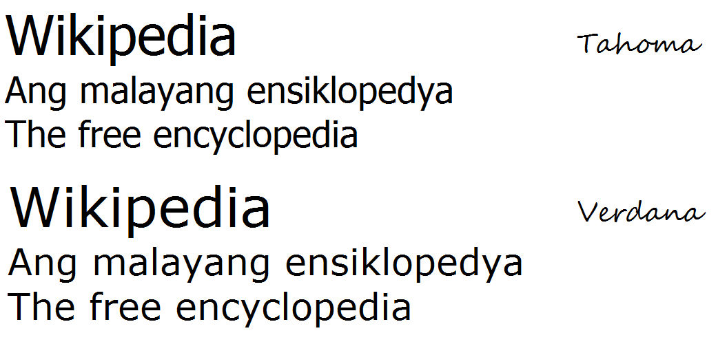
Verdana is a humanist sans-serif typeface designed by Matthew Carter for Microsoft Corporation, with hand-hinting done by Thomas Rickner, then at Monotype. Demand for such a typeface was recognized by Virginia Howlett of Microsoft's typography group and commissioned by Steve Ballmer. The name "Verdana" is derived from " verdant" (green) and "Ana" (the name of Howlett's eldest daughter). Bearing similarities to humanist sans-serif typefaces such as Frutiger, Verdana was designed to be readable at small sizes on the low-resolution computer screens of the period. Like many designs of this type, Verdana has a large x-height (tall lower-case characters), with wider proportions and looser letter-spacing than on print-orientated designs like Helvetica. The counters and apertures are wide, to keep strokes clearly separate from one another, and similarly shaped letters are designed to appear clearly different to increase legibility for body text. The bold weight is thicker than would b ... [...More Info...] [...Related Items...] OR: [Wikipedia] [Google] [Baidu] |
Georgia (typeface)
Georgia is a serif typeface designed in 1993 by Matthew Carter and hinted by Tom Rickner for the Microsoft Corporation. It was intended as a serif typeface that would appear elegant but legible when printed small or on low-resolution screens. The typeface is inspired by Scotch Roman designs of the 19th century and was based on designs for a print typeface on which Carter was working when contacted by Microsoft; this would be released under the name Miller the following year. The typeface's name referred to a tabloid headline, "Alien heads found in Georgia." Design As a transitional serif design, Georgia shows a number of traditional features of "rational" serif typefaces from around the early 19th century, such as alternating thick and thin strokes, ball terminals and a vertical axis. Speaking in 2013 about the development of Georgia and Miller, Carter said: "I was familiar with Scotch Romans, puzzled by the fact that they were once so popular... and then they disappeared complet ... [...More Info...] [...Related Items...] OR: [Wikipedia] [Google] [Baidu] |
Deutsche Bundespost
The Deutsche Bundespost (German federal post office) was a German state-run postal service and telecommunications business founded in 1947. It was initially the second largest federal employer during its time. After staff reductions in the 1980s, the staff was reduced to roughly 543,200 employees in 1985. The corporation was dissolved in 1995 under two rounds of postal reforms that took place in the German Post Office in 1989 and 1995, respectively. Following the reforms, the former Deutsche Bundespost was broken into three publicly traded corporations: Deutsche Post AG (German Post), Deutsche Telekom (German Telecom), and Deutsche Postbank AG (German Post Bank). History Created in 1947 in the Trizone as a successor to the ''Reichspost'' (German imperial post office), until 1950 the enterprise was called ''Deutsche Post'' (German post office). Until 1989, the ''Deutsche Bundespost'' was a state-owned operation. Organization The ''Bundespost'' was developed according to a ... [...More Info...] [...Related Items...] OR: [Wikipedia] [Google] [Baidu] |
FF Meta
FF Meta is a humanist sans-serif typeface family designed by Erik Spiekermann and released in 1991 through his FontFont library. According to Spiekermann, FF Meta was intended to be a "complete antithesis of Helvetica", which he found "boring and bland". It originated from an unused commission for the Deutsche Bundespost (German Federal Post Office). Throughout the 1990s, FF Meta was embraced by the international design community with Spiekermann and E. M. Ginger writing that it had been dubiously praised as the ''Helvetica of the 1990s''. FF Meta has been adopted by numerous corporations and other organizations as a corporate typeface, for signage or in their logo. These include Imperial College London, The Weather Channel, Free Tibet, the television stations WSYR-TV, WIVT and WUTR in upstate New York, Herman Miller, Zimmer Holdings, Mozilla Corporation, Mozilla Foundation, Schaeffler Group, Endemol, Greggs, Digital UK, Liberal Democrats, Mumsnet and Fort Wayne International Ai ... [...More Info...] [...Related Items...] OR: [Wikipedia] [Google] [Baidu] |
Frutiger (typeface)
Frutiger (pronounced ) is a series of typefaces named after its Swiss designer, Adrian Frutiger. Frutiger is a humanist sans-serif typeface, intended to be clear and highly legible at a distance or at small text sizes. A very popular design worldwide, type designer Steve Matteson described its structure as "the best choice for legibility in pretty much any situation" at small text sizes, while Erik Spiekermann named it as "the best general typeface ever". Distinctive characteristics Characteristics of this typeface are: ;Lowercase: square dot over the letter ''i''; double-storey ''a'', single-storey ''g''. Wide, open apertures on letters such as ''a'', ''e'' and ''s''. Very high x-height, increasing its clarity. ;Uppercase: Wide ''A'' with a very low centre bar, though less obvious in bold weight. ''Q'' with a stroke below the circle only. Univers-like ''M'', square and with centre strokes descending to the base of the letter. ;Figures: diagonal serif on the ''1''; closed ''4''. ... [...More Info...] [...Related Items...] OR: [Wikipedia] [Google] [Baidu] |
Matthew Carter
Matthew Carter (born 1 October 1937) is a British type designer.Christophe_Plantin.html" ;"title="y Christophe Plantin">y Christophe Plantin' in typography's golden age was in perfect condition (some muddle aside) [along with] Plantin's accounts and inventories which names the cutters of his types." Carter also advised IBM as an independent consultant in the 1980s. Bitstream In 1981, Carter and his colleague Mike Parker created Bitstream Inc. This digital type foundry was one of the largest suppliers of type before its acquisition by Monotype in 2012. The company however did receive extensive criticism for its strategy of cheaply offering digitisations of pre-existing typefaces that it had not designed, often under alternative names (for example, Times New Roman as 'Dutch 801'). While technically not illegal, this selling of large numbers of typefaces on CD would be described by font designer John Hudson as "one of the worst instances of piracy in the history of type". In h ... [...More Info...] [...Related Items...] OR: [Wikipedia] [Google] [Baidu] |


