|
Roman Type
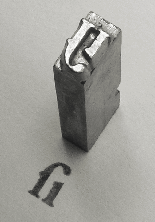
In Latin script typography, roman is one of the three main kinds of Typeface, historical type, alongside blackletter and Italic type, italic. Sometimes called normal or regular, it is distinct from these two for its upright style (relative to the calligraphy-inspired italic) and its simplicity (relative to blackletter). During the early Renaissance, roman (in the form of Antiqua (typeface class), Antiqua) and italic type were used separately. Today, roman and italic type are mixed, and most typefaces are composed of both an upright roman style and an associated italic or Oblique type, oblique style. History Roman type was modelled from a European scribal manuscript style of the 15th century, based on the pairing of Roman square capitals, inscriptional capitals used in ancient Rome with Carolingian minuscules. Early roman typefaces show a variety of designs, for instance resembling what would now be considered blackletter. Printers and typefounders such as Nicolas Jenson and Aldu ... [...More Info...] [...Related Items...] OR: [Wikipedia] [Google] [Baidu] |
Garamond
Garamond is a group of many serif typefaces, named for sixteenth-century Parisian engraver Claude Garamond, generally spelled as Garamont in his lifetime. Garamond-style typefaces are popular to this day and often used for book printing and body text. Garamond's types followed the model of an influential typeface cut for Venetian printer Aldus Manutius by his punchcutter Francesco Griffo in 1495, and are in what is now called the Serif#Old-style, old-style of serif letter design, letters with a relatively organic structure resembling handwriting with a Quill pen, pen, but with a slightly more structured, upright design. Following an eclipse in popularity in the eighteenth and nineteenth century, many modern revival faces in the Garamond style have been developed. It is common to pair these with italic type, italics based on those created by his contemporary Robert Granjon, who was well known for his proficiency in this genre. However, although Garamond himself remains considere ... [...More Info...] [...Related Items...] OR: [Wikipedia] [Google] [Baidu] |
Robert Estienne
Robert I Estienne (; 15037 September 1559), known as ''Robertus Stephanus'' in Latin and sometimes referred to as ''Robert Stephens'', was a 16th-century printer in Paris. He was the proprietor of the Estienne print shop after the death of his father Henri Estienne (elder), Henri Estienne, the founder of the Estienne printing firm. Estienne published and republished many classical texts as well as Greek and Latin translations of the Bible. Known as "Printer to the King" in Latin, Hebrew, and Greek, Estienne's most prominent work was the ''Thesaurus linguae latinae'' which is considered to be the foundation of modern Latin lexicography. Additionally, he was the first to print the New Testament divided into Chapters and verses of the Bible, standard numbered verses. Raised a Roman Catholic, Catholic, he became a Protestant late in his life. Many of his published Bibles included commentary which upset the Catholic theologians of University of Paris, the Sorbonne who sought to censor ... [...More Info...] [...Related Items...] OR: [Wikipedia] [Google] [Baidu] |
The Elements Of Typographic Style
''The Elements of Typographic Style'' is a book on typography and style by Canadian typographer, poet and translator Robert Bringhurst. Originally published in 1992 by Hartley & Marks Publishers, it was revised in 1996, 2001 (v2.4), 2002 (v2.5), 2004 (v3.0), 2005 (v3.1), 2008 (v3.2), and 2012 (v4.0). A history and guide to typography, it has been praised by Hermann Zapf, who said "I wish to see this book become the Typographers' Bible." Jonathan Hoefler and Tobias Frere-Jones consider it "the finest book ever written about typography," according to the FAQ section of their type foundry's website. Because of its status as a respected and frequently cited resource, typographers and designers often refer to it simply as ''Bringhurst''. The title alludes to ''The Elements of Style'', the classic guide to writing by Strunk and White.Foreword to version 3.1, p. 9, Editions * First edition: Hartley & Marks Publishers, 1992, 254pp, (hardcover) * Second edition: Hartley & Mark ... [...More Info...] [...Related Items...] OR: [Wikipedia] [Google] [Baidu] |
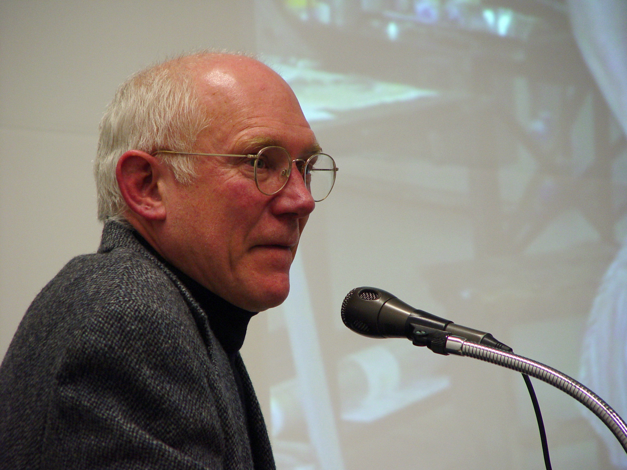
Bringhurst, Robert
Robert Bringhurst Appointments to the Order of Canada (2013). (born 1946) is a CanadianWong (1999). poet, typographer and author. He has translated substantial works from Haida and Navajo and from classical Greek and Arabic. He wrote '' The Elements of Typographic Style'', a reference book of typefaces, glyphs and the visual and geometric arrangement of type. He was named an Officer of the Order of Canada in June 2013. He lives on Quadra Island, near Campbell River, British Columbia (approximately 170 km northwest of Vancouver) with his wife, Jan Zwicky, a poet and philosopher. Life Bringhurst was born on October 16, 1946, in Los Angeles, California, and raised in Utah, Montana, Wyoming, Alberta, and British Columbia. He studied architecture, linguistics, and physics at the Massachusetts Institute of Technology, and comparative literature and philosophy at the University of Utah. He holds a BA from Indiana University (1973) and an MFA in creative writing from the Un ... [...More Info...] [...Related Items...] OR: [Wikipedia] [Google] [Baidu] |
Serif
In typography, a serif () is a small line or stroke regularly attached to the end of a larger stroke in a letter or symbol within a particular font or family of fonts. A typeface or "font family" making use of serifs is called a serif typeface (or serifed typeface), and a typeface that does not include them is sans-serif. Some typography sources refer to sans-serif typefaces as "grotesque" (in German language, German, ) or "Gothic" (although this often refers to blackletter type as well). In German usage, the term Antiqua (typeface class), Antiqua is used more broadly for serif types. Serif typefaces can be broadly classified into one of four subgroups: Serif#Old-style, Old-style, Serif#Transitional, Transitional, Serif#Didone, Didone, and Serif#Slab serif, Slab serif, in order of first emergence. Origins and etymology Serifs originated from the first official Greek writings on stone and in Latin alphabet with Roman square capitals, inscriptional lettering—words carved into s ... [...More Info...] [...Related Items...] OR: [Wikipedia] [Google] [Baidu] |
History Of Western Typography
Modern typographers view typography as a craft with a very long History of printing, history tracing its origins back to the first punches and dies used to make Seal (emblem), seals and coinage currency in Ancient history, ancient times. The basic elements of typography are at least as old as civilization and the earliest writing systems—a series of key developments that were eventually drawn together into one systematic craft. While woodblock printing and movable type had History of typography in East Asia, precedents in East Asia, typography in the Western world developed after the invention of the printing press by Johannes Gutenberg in the mid-15th century. The initial Global spread of the printing press, spread of printing throughout Germany and Italy led to the enduring legacy and continued use of blackletter, Roman type, roman, and italic types. Medieval design roots Typography, type-founding, and typeface design began as closely related crafts in mid-15th-century ... [...More Info...] [...Related Items...] OR: [Wikipedia] [Google] [Baidu] |
Gaelic Type
Gaelic type (sometimes called Irish character, Irish type, or Gaelic script) is a family of Insular script typefaces devised for printing Early Modern Irish. It was widely used from the 16th century until the mid-18th century in Scotland and the mid-20th century in Ireland, but is now rarely used. Sometimes, all Gaelic typefaces are called ''Celtic'' or ''uncial'' although most Gaelic types are not uncials. The "Anglo-Saxon" types of the 17th century are included in this category because both the Anglo-Saxon types and the Gaelic/Irish types derive from the insular manuscript hand. The terms ''Gaelic type'', ''Gaelic script'' and ''Irish character'' translate the Modern Irish phrase (). In Ireland, the term is used in opposition to the term , Roman type. The Scots Gaelic term is (). (–1770) was one of the last Scottish writers with the ability to write in this script, but his main work, , was published in the Roman script. Characteristics Besides the 26 letters of the ... [...More Info...] [...Related Items...] OR: [Wikipedia] [Google] [Baidu] |
Times New Roman
Times New Roman is a serif typeface commissioned for use by the British newspaper ''The Times'' in 1931. It has become one of the most popular typefaces of all time and is installed on most personal computers. The typeface was conceived by Stanley Morison, the artistic adviser to the British branch of the printing equipment company Monotype, in collaboration with Victor Lardent, a lettering artist in ''The Times's'' advertising department. Asked to advise on a redesign, Morison recommended that ''The Times'' change their body text typeface from a spindly nineteenth-century face to a more robust, solid design, returning to traditions of printing from the eighteenth century and before. This matched a common trend in printing tastes of the period. Morison proposed an older Monotype typeface named Plantin as a basis for the design, and Times New Roman mostly matches Plantin's dimensions. The main change was that the contrast between strokes was enhanced to give a crisper image. T ... [...More Info...] [...Related Items...] OR: [Wikipedia] [Google] [Baidu] |
Adobe Jenson
Adobe Jenson is an old-style serif typeface drawn for Adobe Systems by its chief type designer Robert Slimbach. Its Roman styles are based on a text face cut by Nicolas Jenson in Venice around 1470, and its italics are based on those created by Ludovico Vicentino degli Arrighi fifty years later. Jenson is an organic design, with a low x-height. It is considered a highly readable typeface and is accordingly often used in book design for body text. Development Adobe Jenson was first released in 1996 as a multiple master font. It was created using sophisticated interpolation or multiple-master technology, to create a range of weights and optical sizes suitable for different text sizes. This partial automation of font creation was intended to allow a gradual trend in styles from solid, chunky designs for caption-size small print to more graceful and slender designs for headings. It is now sold in the standard OpenType font format under the name Adobe Jenson Pro. Jenson's type ... [...More Info...] [...Related Items...] OR: [Wikipedia] [Google] [Baidu] |
Caslon
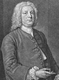
Caslon is the name given to serif typefaces designed by William Caslon, William Caslon I in London, or inspired by his work. Caslon worked as an Engraving, engraver of Punchcutting, punches, the masters used to stamp the moulds or Matrix (printing), matrices used to cast metal type. He worked in the tradition of what is now called Serif#Old-style, old-style serif letter design, that produced letters with a relatively organic structure resembling handwriting with a Quill pen, pen. Caslon established a tradition of engraving type in London, which previously had not been common, and was influenced by the imported Dutch Golden Age, Dutch Baroque typefaces that were popular in England at the time. His typefaces established a strong reputation for their quality and their attractive appearance, suitable for extended passages of text. The letterforms of Caslon's roman type, roman, or upright type include an "A" with a concave hollow at top left and a "G" without a downwards-pointing spur ... [...More Info...] [...Related Items...] OR: [Wikipedia] [Google] [Baidu] |
Baskerville
Baskerville is a serif typeface designed in 1757 by John Baskerville in Birmingham, England, and cut into metal by punchcutter John Handy. Baskerville is classified as a transitional typeface, intended as a refinement of what are now called old-style typefaces of the period, especially those of his most eminent contemporary, William Caslon. Compared to earlier designs popular in Britain, Baskerville increased the contrast between thick and thin strokes, making the serifs sharper and more tapered, and shifted the axis of rounded letters to a more vertical position. The curved strokes are more circular in shape, and the characters became more regular. These changes created a greater consistency in size and form, influenced by the calligraphy Baskerville had learned and taught as a young man. Baskerville's typefaces remain very popular in book design and there are many modern revivals, which often add features such as bold type which did not exist in Baskerville's time. As Ba ... [...More Info...] [...Related Items...] OR: [Wikipedia] [Google] [Baidu] |


