|
Charlotte Sans
Charlotte Sans is a humanist sans-serif typeface designed by Michael Gills in 1992 as part of a larger family called Charlotte, which includes a related serif text face. The face was designed for Letraset. Charlotte Sans bears comparison with Eric Gill's 1927 face Gill Sans, sharing several humanist sans-serif characteristics: a double-story roman a and g, and a single-story lowercase italic a. Charlotte Sans has a tapered glyphic stroke in the t. Terminals in vertical strokes are not parallel to the baseline but instead cut at an angle. Similarities can be seen with Syntax and FF Scala Sans. The overall stroke width is varied, and rhythmic is seen especially in the serif version of the face, which was inspired by the types of 18th-century punch-cutter Pierre-Simon Fournier Pierre-Simon Fournier (15 September 1712 – 8 October 1768) was a French mid-18th century punch-cutter, typefounder and typographic theoretician. He was both a collector and originator of types. Fournier's c ... [...More Info...] [...Related Items...] OR: [Wikipedia] [Google] [Baidu] |
Sans-serif
In typography and lettering, a sans-serif, sans serif, gothic, or simply sans letterform is one that does not have extending features called "serifs" at the end of strokes. Sans-serif typefaces tend to have less stroke width variation than serif typefaces. They are often used to convey simplicity and modernity or minimalism. Sans-serif typefaces have become the most prevalent for display of text on computer screens. On lower-resolution digital displays, fine details like serifs may disappear or appear too large. The term comes from the French word , meaning "without" and "serif" of uncertain origin, possibly from the Dutch word meaning "line" or pen-stroke. In printed media, they are more commonly used for display use and less for body text. Before the term "sans-serif" became common in English typography, a number of other terms had been used. One of these outmoded terms for sans-serif was gothic, which is still used in East Asian typography and sometimes seen in typeface na ... [...More Info...] [...Related Items...] OR: [Wikipedia] [Google] [Baidu] |
Letraset
Letraset was a company known mainly for manufacturing sheets of typefaces and other artwork elements using the dry transfer method. Letraset has been acquired by the Colart group and become part of its subsidiary Winsor & Newton. Corporate history Letraset was founded in London in 1959, with the launch of the Letraset Type Lettering System. In 1961, Letraset came out with their dry transfer lettering system, which pioneered the technique. Starting in 1964, Letraset also applied the dry rub-down transfer technique to create a children's game called Action Transfers, which would later develop into Kalkitos (marketed by Gillette) and many other series of transferable figures that were very popular up to the 1980s.LETRASET was squired by the Swedish stationary company Esselte until 2000 when it was sold to a Management buyout headed up by Martin Gibbs and Michael Travers. Eventually sold to ColArt in 2012. Seeing a decline in the sales of its materials in the early 1990s, Letrase ... [...More Info...] [...Related Items...] OR: [Wikipedia] [Google] [Baidu] |
Sans-serif
In typography and lettering, a sans-serif, sans serif, gothic, or simply sans letterform is one that does not have extending features called "serifs" at the end of strokes. Sans-serif typefaces tend to have less stroke width variation than serif typefaces. They are often used to convey simplicity and modernity or minimalism. Sans-serif typefaces have become the most prevalent for display of text on computer screens. On lower-resolution digital displays, fine details like serifs may disappear or appear too large. The term comes from the French word , meaning "without" and "serif" of uncertain origin, possibly from the Dutch word meaning "line" or pen-stroke. In printed media, they are more commonly used for display use and less for body text. Before the term "sans-serif" became common in English typography, a number of other terms had been used. One of these outmoded terms for sans-serif was gothic, which is still used in East Asian typography and sometimes seen in typeface na ... [...More Info...] [...Related Items...] OR: [Wikipedia] [Google] [Baidu] |
Gill Sans
Gill Sans is a humanist sans-serif typeface designed by Eric Gill and released by the British branch of Monotype from 1928 onwards. Gill Sans is based on Edward Johnston's 1916 "Underground Alphabet", the corporate font of London Underground. As a young artist, Gill had assisted Johnston in its early development stages. In 1926, Douglas Cleverdon, a young printer-publisher, opened a bookshop in Bristol, and Gill painted a fascia for the shop for him in sans-serif capitals. In addition, Gill sketched an alphabet for Cleverdon as a guide for him to use for future notices and announcements. By this time Gill had become a prominent stonemason, artist and creator of lettering in his own right and had begun to work on creating typeface designs. Gill was commissioned to develop his alphabet into a full metal type family by his friend Stanley Morison, an influential Monotype executive and historian of printing. Morison hoped that it could be Monotype's competitor to a wave of German sa ... [...More Info...] [...Related Items...] OR: [Wikipedia] [Google] [Baidu] |
Syntax (typeface)
Syntax comprises a family of fonts designed by Swiss typeface designer Hans Eduard Meier. Originally just a sans-serif font, it was extended with additional serif designs. Syntax Syntax is a humanist sans-serif typeface designed by Meier in 1968, and released in 1969 by the D. Stempel Schriftgießerei (type foundry) of Frankfurt am Main. It is believed to be the final face designed and released by D. Stempel for foundry casting. The original drawings were done in 1954; first by writing the letters with a brush, then redrawing their essential linear forms, and finally adding balanced amounts of weight to the skeletons to produce optically monoline letterforms. In the period 1968–1972, Meier worked on additional weights and variations to the Syntax typeface. In 1989, the original foundry metal design was digitized by Adobe, which also expanded the family to include bold and ultrabold weights, resulting in a font family of 4 romans and 1 italic (in lightest weight) fonts. Meier ... [...More Info...] [...Related Items...] OR: [Wikipedia] [Google] [Baidu] |
FF Scala Sans
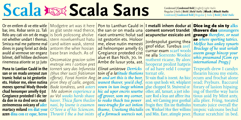
FF Scala Sans is a humanist sans-serif typeface designed by Dutch designer Martin Majoor in 1993 for the Vredenburg Music Center in Utrecht, the Netherlands. It was designed as a companion to Majoor's earlier serif old style typeface FF Scala, designed in 1990. Like Eric Gill's 1927–30 design Gill Sans and Hans Eduard Meier's typeface Syntax, both upper and lower case are structurally modeled on serif old style faces. The lowercase roman a and g are two-story. FF Scala Sans italics are true italics, not sloped roman. The lowercase a, e, v and y are particularly calligraphic. FF Scala Sans is a very complete sans-serif in its inclusion of true small capitals, lining and non-lining (old style figures) and many ligatures. In 1993 an additional condensed width of the typeface was released. The typefaces are available through Font Shop International. The typeface is prominently used by the Los Angeles Metro, and the Hungarian weekly magazine Magyar Narancs. FF Scala Sans is rarely ... [...More Info...] [...Related Items...] OR: [Wikipedia] [Google] [Baidu] |
Pierre-Simon Fournier
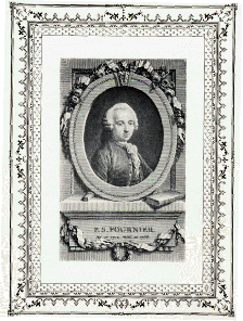
Pierre-Simon Fournier (15 September 1712 – 8 October 1768) was a French mid-18th century punch-cutter, typefounder and typographic theoretician. He was both a collector and originator of types. Fournier's contributions to printing were his creation of initials and ornaments, his design of letters, and his standardization of type sizes. He worked in the rococo form, and designed typefaces including Fournier and Narcissus. He was known for incorporating ‘decorative typographic ornaments’ into his typefaces. Fournier's main accomplishment is that he ‘created a standardized measuring system that would revolutionize the typography industry forever’. He was also known as Fournier le Jeune ("the younger") to distinguish him from his father Jean Claude, who was also in the typesetting industry. In his early life, Fournier studied watercolour with J. B. G. Colson, and later wood engraving. In 1737, Fournier published his first theoretical work, on the minimum spacing between le ... [...More Info...] [...Related Items...] OR: [Wikipedia] [Google] [Baidu] |
Humanist Sans-serif Typefaces
Humanism is a philosophical stance that emphasizes the individual and social potential and agency of human beings. It considers human beings the starting point for serious moral and philosophical inquiry. The meaning of the term "humanism" has changed according to the successive intellectual movements that have identified with it. During the Italian Renaissance, ancient works inspired scholars in various Italian cities, giving rise to a movement now called Renaissance humanism. With Enlightenment, humanistic values were re-enforced by the advances in science and technology, giving confidence to humans in their exploration of the world. By the early 20th century, organizations solely dedicated to humanism flourished in Europe and the United States, and have since expanded all over the globe. In the current day, the term generally refers to a focus on human well-being and advocates for human freedom, autonomy, and progress. It views humanity as responsible for the promotion ... [...More Info...] [...Related Items...] OR: [Wikipedia] [Google] [Baidu] |
Unified Serif And Sans-serif Typeface Families
{{disambiguation ...
Unified may refer to: * The Unified, a wine symposium held in Sacramento, California, USA * ''Unified'', the official student newspaper of Canterbury Christ Church University * UNFD, an Australian record label * ''Unified'' (Sweet & Lynch album), 2017 * ''Unified'' (Super8 & Tab album), 2014 Unify may refer to: * ''Unify'', an album by Electric Universe * Unify Corporation, former name of Daegis Inc. * Unify Gathering, an Australian music festival * Unify GmbH & Co. KG, formerly Siemens Enterprise Communications See also * * * * Unification (other) * United (other) * Unity (other) Unity may refer to: Buildings * Unity Building, Oregon, Illinois, US; a historic building * Unity Building (Chicago), Illinois, US; a skyscraper * Unity Buildings, Liverpool, UK; two buildings in England * Unity Chapel, Wyoming, Wisconsin, US; ... [...More Info...] [...Related Items...] OR: [Wikipedia] [Google] [Baidu] |


