proportional symbol map on:
[Wikipedia]
[Google]
[Amazon]
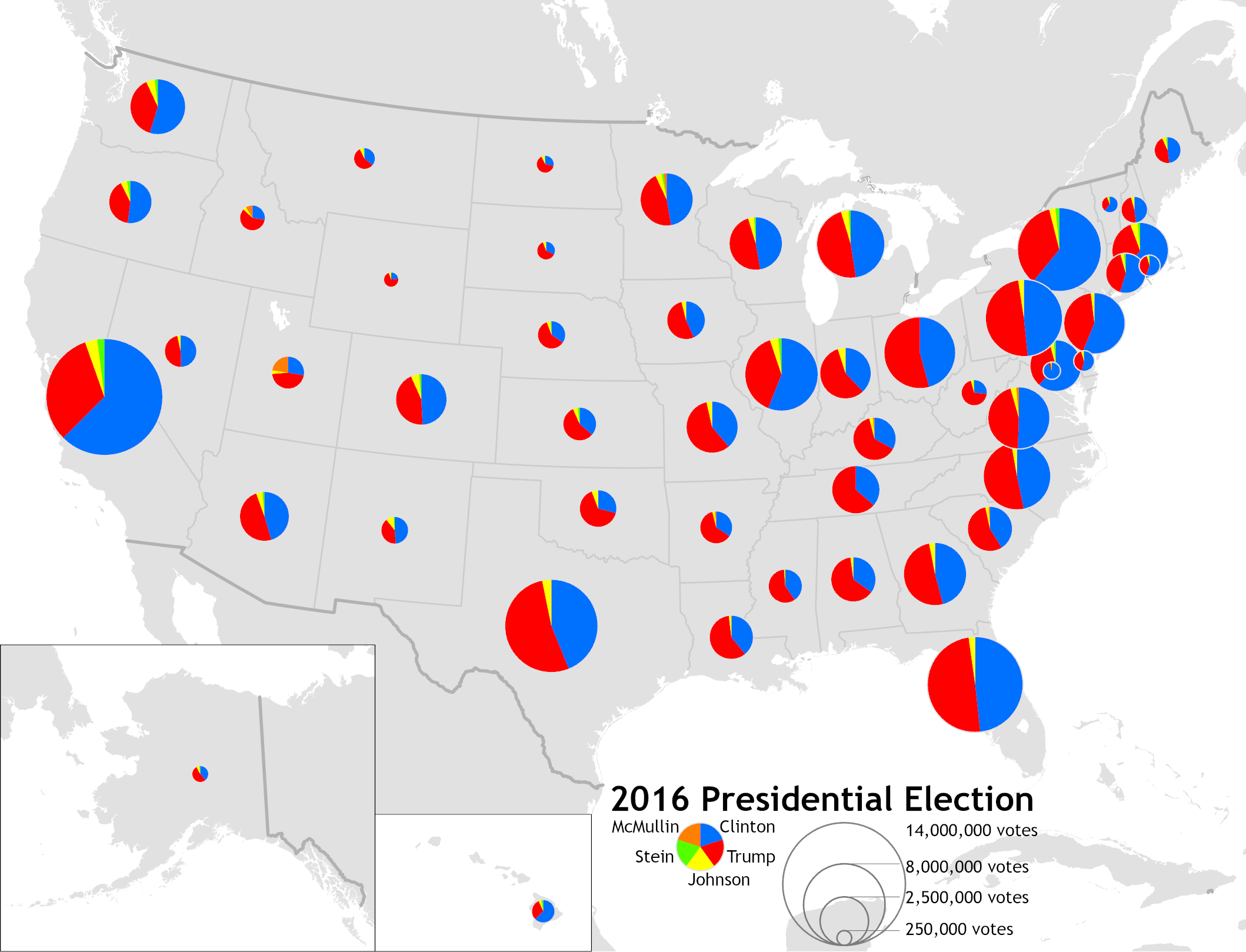 A proportional symbol map or proportional point symbol map is a type of

 As cartography arose as an academic discipline in the early 20th Century, textbooks included detailed instructions on constructing proportional symbol maps, including calculating circle sizes.Raisz, Erwin, ''General Cartography'', 2nd Edition, McGraw-Hill, 1948, p.253. Several cartography professors began to experiment with new mapping techniques, notably the use of spheres with a proportional volume rather than area by Sten de Geer (1922) and Guy-Harold Smith (1928), and the use of transparency to resolve overlapping circles by Smith (1928) and Floyd Stilgenbauer (1932), the latter of which included a unique legend.
The rise of the map communication paradigm in academic cartography led to a number of psychophysical experiments on the effectiveness of
Esri ArcGIS Online
an
CARTO
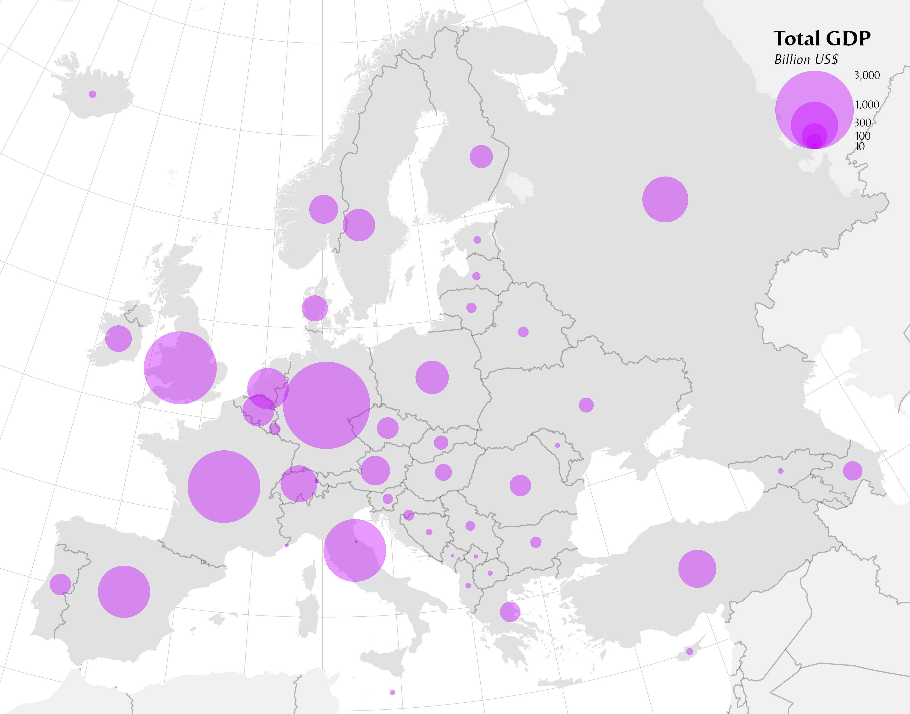 The second part of the proportional symbol map is the choice of variable to represent by symbol size. The best variables to use in this technique are ones in which size will be interpreted intuitively by most map readers. In ''Semiology of Graphics'',
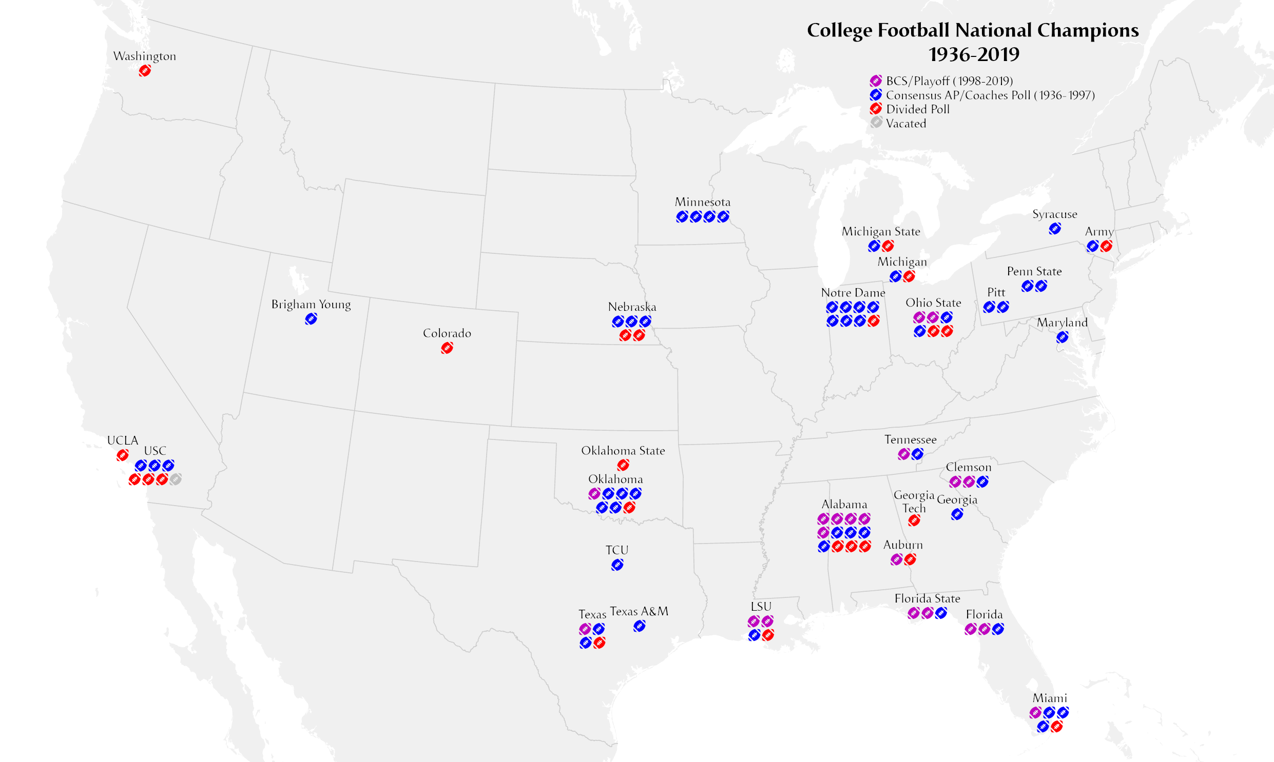 A very different approach to proportional symbols is the isotype symbol, named after an approach to information graphics developed by Austrian Otto Neurath in the 1930s. This uses a composite point symbol composed of a multitude of small point symbols (pictographic or geometric) to represent the value of the variable. The technique is most effective when the variable represents a relatively small number of distinct individuals, rather than a mass amount (which is better visualized as a single mass shape, like a circle).
 A proportional symbol map or proportional point symbol map is a type of
 thematic map
A thematic map is a type of map that portrays the geographic pattern of a particular subject matter (theme) in a geographic area. This usually involves the use of map symbols to visualize selected properties of geographic features that are n ...
that uses map symbols that vary in size to represent a quantitative variable. For example, circles may be used to show the location of cities within the map, with the size of each circle sized proportionally to the population of the city. Typically, the size of each symbol is calculated so that its area is mathematically proportional to the variable, but more indirect methods (e.g., categorizing symbols as "small," "medium," and "large") are also used.
While all dimension
In physics and mathematics, the dimension of a mathematical space (or object) is informally defined as the minimum number of coordinates needed to specify any point within it. Thus, a line has a dimension of one (1D) because only one coord ...
s of geometric primitive
In vector computer graphics, CAD systems, and geographic information systems, geometric primitive (or prim) is the simplest (i.e. 'atomic' or irreducible) geometric shape that the system can handle (draw, store). Sometimes the subroutines that d ...
s (i.e., points, lines, and regions) on a map can be resized according to a variable, this term is generally only applied to point symbols, and different design techniques are used for other dimensionalities. A cartogram
A cartogram (also called a value-area map or an anamorphic map, the latter common among German-speakers) is a thematic map of a set of features (countries, provinces, etc.), in which their geographic size is altered to be directly proportiona ...
is a map that distorts region size proportionally, while a flow map represents lines, often using the width of the symbol
A symbol is a mark, sign, or word that indicates, signifies, or is understood as representing an idea, object, or relationship. Symbols allow people to go beyond what is known or seen by creating linkages between otherwise very different conc ...
(a form of size) to represent a quantitative variable. That said, there are gray areas between these three types of proportional map: a Dorling cartogram essentially replaces the polygons of area features with a proportional point symbol (usually a circle), while a linear cartogram is a kind of flow map that distorts the length of linear features proportional to a variable (often travel time).
History

Arthur H. Robinson
Arthur H. Robinson (January 5, 1915 – October 10, 2004) was an American geographer and cartographer, who was professor in the Geography Department at the University of Wisconsin–Madison from 1947 until he retired in 1980. He was a prolific w ...
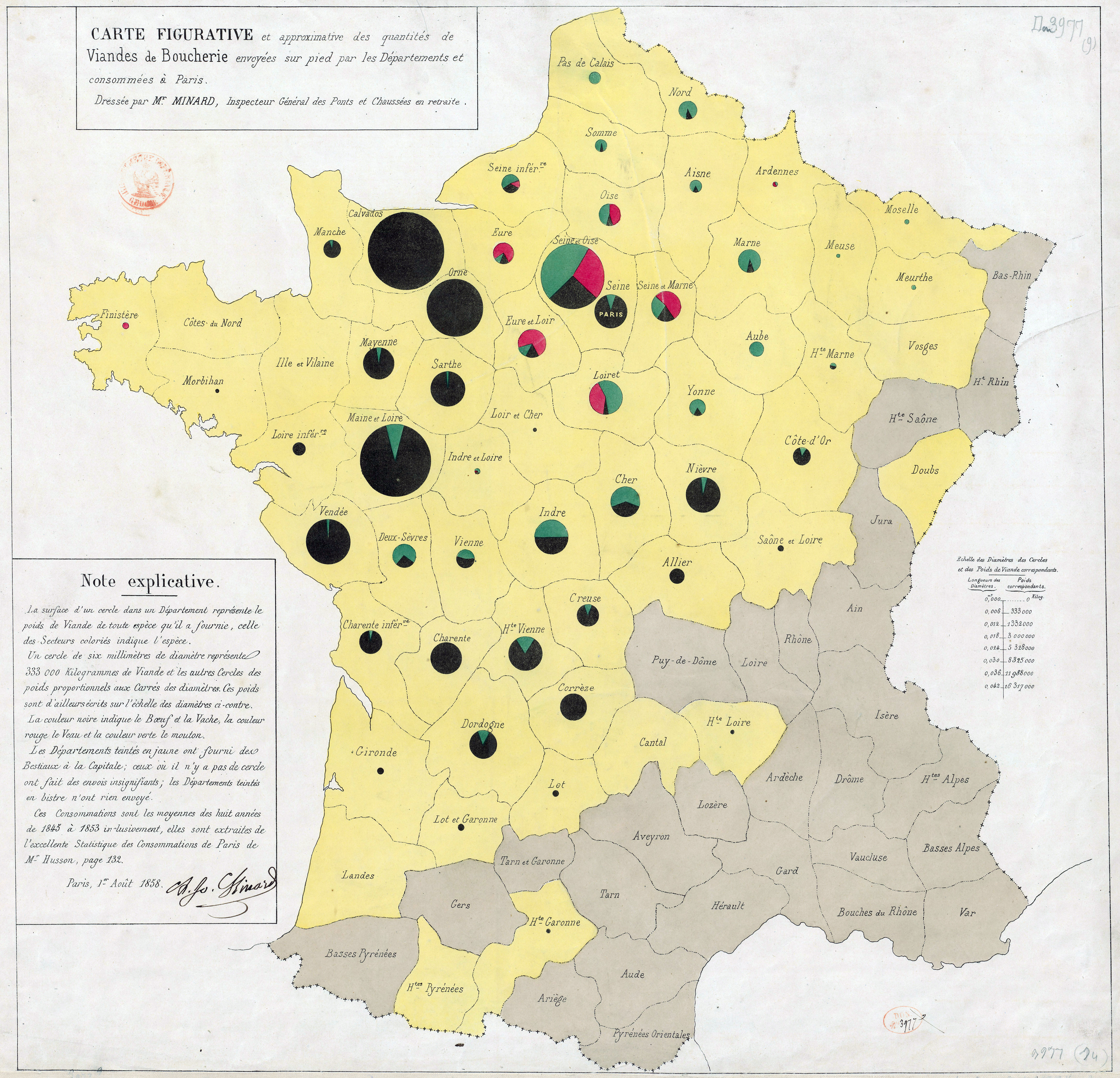
credited Henry Drury Harness with the first map to clearly attempt to portray point sizes proportionally, on an 1838 map of cargo traffic in Ireland (with proportional widths) that showed city population. The technique was soon replicated and enhanced by other cartographers. The official report of the 1851 Census of Great Britain included several maps drawn by a W. Bone, showing significant towns sized proportionally to population (apparently range-graded), including one of the first useful legends. Charles Joseph Minard
Charles Joseph Minard (; ; 27 March 1781 – 24 October 1870) was a French civil engineer recognized for his significant contribution in the field of information graphics in civil engineering and statistics. Minard was, among other things, noted ...
produced several proportional symbol maps, including the innovations of using them to represent regions rather than points, and incorporating color and statistical charts in the point symbols.
 As cartography arose as an academic discipline in the early 20th Century, textbooks included detailed instructions on constructing proportional symbol maps, including calculating circle sizes.Raisz, Erwin, ''General Cartography'', 2nd Edition, McGraw-Hill, 1948, p.253. Several cartography professors began to experiment with new mapping techniques, notably the use of spheres with a proportional volume rather than area by Sten de Geer (1922) and Guy-Harold Smith (1928), and the use of transparency to resolve overlapping circles by Smith (1928) and Floyd Stilgenbauer (1932), the latter of which included a unique legend.
The rise of the map communication paradigm in academic cartography led to a number of psychophysical experiments on the effectiveness of
 map symbol
A map symbol or cartographic symbol is a graphical device used to visually represent a real-world feature on a map, working in the same fashion as other forms of symbols. Map symbols may include point markers, lines, regions, continuous fields, ...
s. One of the earliest and most well-known of these studies was the PhD dissertation of James J. Flannery, who studied the ability of people to judge the relative areas of proportional circles, finding that Stevens's power law
Stevens' power law is an empirical relationship in psychophysics between an increased intensity or strength in a physical stimulus and the perceived magnitude increase in the sensation created by the stimulus. It is often considered to supersede ...
applied such that map readers underestimated circle area by a fairly predictable amount, leading to the Flannery Scaling Adjustment still in use today.Flannery, James J., ''The Graduated Circle: A Description, Analysis and Evaluation of a Quantitative Map Symbol'', Ph.D. Dissertation, University of Wisconsin, 1956; summarized in Robinson, Arthur H., ''Elements of Cartography'', 2nd Edition, New York: Wiley, 1960.
Starting in the early 1990s, almost all proportional symbol maps have been created using geographic information system
A geographic information system (GIS) is a type of database containing geographic data (that is, descriptions of phenomena for which location is relevant), combined with software tools for managing, analyzing, and visualizing those data. In a ...
(GIS) and graphics software
In computer graphics, graphics software refers to a program or collection of programs that enable a person to manipulate images or models visually on a computer.
Computer graphics can be classified into two distinct categories: raster graphics a ...
, with increasing capability for professional design. The rise of the Internet and web mapping
Web mapping or an online mapping is the process of using maps, usually created through geographic information systems (GIS), on the Internet, more specifically in the World Wide Web (WWW). A web map or an online map is both served and consumed, ...
, especially modern tiled services with API access starting in 2005, have enabled the creation of interactive proportional symbol maps, including cloud mapping platforms such aEsri ArcGIS Online
an
CARTO
Point locations
Proportional symbol maps represent a set of related geographic phenomena (e.g., cities) as point symbols. These point locations can have two different sources and meanings:T. Slocum, R. McMaster, F. Kessler, H. Howard (2009). Thematic Cartography and Geovisualization, Third Edn, page 252. Pearson Prentice Hall: Upper Saddle River, NJ. * A ''Point dataset'' includes a point location (i.e., a single coordinate) for each geographic feature. A variety of features may be represented this way, but common point datasets include cities, personal residences, and businesses. This does not mean that these geographic features are zero-dimensional in reality—cities are two-dimensional and buildings are three-dimensional—just that the source data consists of points that are reasonable representations of the location of the geographic features at the chosen map scale. * An ''aggregation district dataset'' consists of predefined regions in which data about individuals has been aggregated to create summary statistical attributes (e.g. total population); that is, it is the same structure as is used in achoropleth map
A choropleth map () is a type of statistical thematic map that uses pseudocolor, i.e., color corresponding with an aggregate summary of a geographic characteristic within spatial enumeration units, such as population density or per-capita in ...
. In this case, the proportional symbol map will have a point representing the district rather than any point location therein.
Variables
 The second part of the proportional symbol map is the choice of variable to represent by symbol size. The best variables to use in this technique are ones in which size will be interpreted intuitively by most map readers. In ''Semiology of Graphics'',
 Jacques Bertin
Jacques Bertin (27 July 1918 – 3 May 2010) was a French cartographer and theorist, known from his book ''Semiologie Graphique'' (''Semiology of Graphics''), published in 1967. This monumental work, based on his experience as a cartographer and ...
argued that of all of his visual variables, size was most intimately tied to a single interpretation.Bertin, Jacque, ''Sémiologie Graphique. Les diagrammes, les réseaux, les cartes''. With Marc Barbut t al.
T, or t, is the twentieth letter in the Latin alphabet, used in the modern English alphabet, the alphabets of other western European languages and others worldwide. Its name in English is ''tee'' (pronounced ), plural ''tees''. It is der ...
Paris : Gauthier-Villars. ''Semiology of Graphics'', English Edition, Translation by William J. Berg, University of Wisconsin Press, 1983.) That is, a larger symbol looks like more of something and thus more important, and it is very difficult to interpret it any other way (e.g., as qualitatively different nominal categories). A second tendency is for users to interpret relative sizes: a symbol that is twice as large (in area or length) will be interpreted as representing twice the quantity. The absence of a circle would be interpreted as the complete absence of the phenomenon, and negative values cannot be shown.
Based on these principles, only ''ratio'' variables (per Stevens' levels of measurement
Level of measurement or scale of measure is a classification that describes the nature of information within the values assigned to variables. Psychologist Stanley Smith Stevens developed the best-known classification with four levels, or scal ...
) are appropriate to represent with size, specifically those in which negative values are not possible. Within this set, the most intuitive are those that measure the total amount/count/volume of something, such as total population, volume or weight of agricultural production, or shipping tonnage. These are all ''spatially extensive'' variables, which happen to be the most problematic choices for choropleth maps, making these two thematic mapping techniques complimentary.
Some ratio variables can be appropriate for both choropleth and proportional symbol maps, especially those that are ''spatially intensive'' (i.e., fields) but still represent an amount or count in some way. A common type of variable that meets these criteria is an ''allotment'', calculating how one amount is theoretically distributed among individuals, such as GDP per capita
Lists of countries by GDP per capita list the countries in the world by their gross domestic product (GDP) per capita. The lists may be based on nominal or purchasing power parity GDP. Gross national income (GNI) per capita accounts for inflo ...
or the crude birth rate
The birth rate for a given period is the total number of live human births per 1,000 population divided by the length of the period in years. The number of live births is normally taken from a universal registration system for births; populati ...
(births per 1,000 population). Other non-negative spatially intensive ratio variables can technically be mapped as proportional symbols, such as proportions (e.g., Percent ages 0–17), but can lead to misinterpretations because they do not represent amounts (although proportions can be represented using proportional pie charts). Ordinal qualitative variables can also be appropriate, if the goal is a simple representation of "small," "medium," and "large."
Variables that are inappropriate for proportional symbols include those that may include negative values (e.g., population growth rate) and qualitative categories. Another consideration in selecting a variable is the degree of variance in the statistical distribution. If there is a high degree of variation (i.e., a ratio of high values to low values of more than 1,000:1), the largest symbols will be overcrowded and entirely overlapping while the smallest symbols will be nearly invisible. If there is a low degree of variation (i.e., a ratio of less than 10), most of the symbols will look nearly the same size and the map will be relatively uninformative.

Symbol design
The primary goal in selecting a pointsymbol
A symbol is a mark, sign, or word that indicates, signifies, or is understood as representing an idea, object, or relationship. Symbols allow people to go beyond what is known or seen by creating linkages between otherwise very different conc ...
to use in a proportional symbol map is that users should be able to accurately judge sizes, both in comparison to the legend to estimate data values, and in comparison to each other to judge relative patterns. Secondary goals include aesthetic appeal and an intuitive shape that is easy to interpret.
The point symbols that represent each data value can be of any shape
A shape or figure is a graphical representation of an object or its external boundary, outline, or external surface, as opposed to other properties such as color, texture, or material type.
A plane shape or plane figure is constrained to lie ...
. In most proportional symbol maps, the shape does not vary, so it does not represent any information on its own. Differences in shape can be used to represent a nominal variable (say, circles for wheat production and squares for maize production) can make judging relative sizes more difficult. ''Pictorial'' or ''pictographic'' symbols, which use an iconic shape (usually a silhouette) that evokes the represented phenomenon (e.g., a shaft of wheat to represent wheat production) can give the map an intuitive look, but their complexity can increase the overall feel of clutter, and it can be more difficult to judge their size than simple ''geometric'' shapes like circles or squares, especially if they are in a congested area where individual symbols overlap. This difference is lessened if the shape is compact (e.g., more like a geometric shape).
Among geometric symbols, circles have been the predominant shape since this type of thematic map was invented. Several advantages of circles over other geometric shapes have been cited, such as:
* The simple shape does not attract attention itself, instead diverting attention to judging individual sizes and recognizing broad distribution patterns among circles.
* When circles overlap, they are easy to distinguish.
* Their compact form minimizes the overall amount of underlying map space they obscure.
* They are relatively easy to scale and draw (which was more important before the digital era).
* They are easy to combine with other visual variables to represent additional attributes, such as colors and pie charts.
However, disadvantages of circles have also been raised, especially that circles are aesthetically uninteresting, and that psychophysical studies have suggested that people are worse at judging the relative areas of circles than other shapes, especially squares. The best way to increase the reader's ability to correctly estimate the size of a circle is through effective legend design, including providing examples of different sized circles which will be shown in the map.
Three dimensional symbols, such as spheres or cubes, are sometimes used. They can add an aesthetic appeal, but they were originally designed for their function, to allow large symbols to be smaller because the value would be proportional to volume rather than area. However, it appears that most map readers will interpret a three dimensional symbol by projected area, not by volume, so they are only useful as decorative two dimensional symbols.
Isotype maps
 A very different approach to proportional symbols is the isotype symbol, named after an approach to information graphics developed by Austrian Otto Neurath in the 1930s. This uses a composite point symbol composed of a multitude of small point symbols (pictographic or geometric) to represent the value of the variable. The technique is most effective when the variable represents a relatively small number of distinct individuals, rather than a mass amount (which is better visualized as a single mass shape, like a circle).
 Eduard Imhof
Eduard Imhof (25 January 1895 – 27 April 1986) was a professor of cartography at the Swiss Federal Institute of Technology, Zürich, from 1925 to 1965. His fame, which extends far beyond the Institute of Technology, stems from his relief shadi ...
argued against this technique (which he called ''count frame diagrams'') for point locations, on the grounds that it tends to be much larger and more complex than a simple point symbol, covering more of the underlying geography; however, he found them effective on region locations, especially if the count consists of different types of individuals.
Chart maps
A strategy to represent complex information is to create a statistical chart of related attributes for each feature, and use the entire chart as a point symbol, usually using linear (height/width) or areal scaling of the entire chart according to an overall total amount. This approach is thus a form of multivariate map. The most common technique, first appearing in the 1850s, is to start with a proportional circle sized according to some total amount, and turn it into apie chart
A pie chart (or a circle chart) is a circular statistical graphic, which is divided into slices to illustrate numerical proportion. In a pie chart, the arc length of each slice (and consequently its central angle and area) is proportional t ...
to visualize the relative composition of the total, such as the percentage of a total population belonging to various ethnic groups. Other options include bar chart
A bar chart or bar graph is a chart or graph that presents categorical data with rectangular bars with heights or lengths proportional to the values that they represent. The bars can be plotted vertically or horizontally. A vertical bar chart i ...
s and line chart
A line chart or line graph or curve chart is a type of chart which displays information as a series of data points called 'markers' connected by straight line segments. It is a basic type of chart common in many fields. It is similar to a ...
s, which are often used to represent trends over time or relative amounts of related variables for each feature (e.g., agricultural products).
Scaling techniques
Theoretically, the proportional symbol map works because the "size" of the symbol appears to be proportional to its value, with size generally interpreted as two-dimensional area. However, making this work in practice can lead to some challenges, so several methods of scaling have been developed.Absolute scaling
This method calculates the exact area of the symbol and resizes it so that its area is mathematically directly proportional to the represented value. For example, if circles are being used to represent GDP on a global map, then a country with a value of 58 would have a circle with twice the area as a country with a value of 29. If circles are being used, the sizes of all symbols are calculated based on a chosen size for any one of the symbols (often, but not necessarily, the minimum value). Say the cartographer decides that a value ''v''0 will have a circle of radius ''r''0. Then for any other value ''v'', the radius ''r'' is determined by setting the areas in direct proportion to the values: This can then be solved for ''r'':Apparent magnitude (Flannery) scaling
In his 1956 PhD Dissertation, James Flannery conducted psychophysical experiments into how well map readers judged the relative size of proportional circles. He found that it conformed to a response power law that was soon after formalized (in general) asStevens's power law
Stevens' power law is an empirical relationship in psychophysics between an increased intensity or strength in a physical stimulus and the perceived magnitude increase in the sensation created by the stimulus. It is often considered to supersede ...
. While people are fairly adept at judging relative length, they are typically much worse at judging relative area. In testing circles, Flannery's subjects underestimated the ratio of area between large circles and smaller circles by a fairly consistent amount. He and Arthur H. Robinson
Arthur H. Robinson (January 5, 1915 – October 10, 2004) was an American geographer and cartographer, who was professor in the Geography Department at the University of Wisconsin–Madison from 1947 until he retired in 1980. He was a prolific w ...
immediately began encouraging cartographers to compensate for this effect by increasing the difference between circle sizes accordingly, using a technique called ''apparent magnitude scaling''.Robinson, Arthur, ''Elements of Cartography'', Wiley, 1960 According to Flannery's results, this can be accomplished by increasing the exponent of the scaling factor slightly, replacing the above formula with the following:
The acceptance of Flannery's method for circles has been mixed. Various studies have resulted in different magnitudes of the effect, and some have argued that the effect is not large enough to require the effort of compensation, that map readers can make adequate judgments with absolute scaling, as long as a clear legend is provided to help.
Flannery's research focused only on circles, and subsequent research has found other symbol types to have different magnitudes of areal underestimation. Squares have been found to be judged fairly accurately, but for spheres and other three-dimensional shapes, volume is estimated extremely poorly; basically, readers judge their two-dimensional area.
Interpolated scaling
One criticism of the absolute scaling method is that it does not work well for very large ranges of values, in which the largest symbols will be overwhelming and the smallest symbols will be nearly invisible. Some software, such as EsriArcGIS Pro
ArcGIS Pro is desktop GIS software developed by Esri, which replaces their ArcMap
ArcMap is the main component of Esri's ArcGIS suite of geospatial processing programs, and is used primarily to view, edit, create, and analyze geospatial data. ...
, allow for the option to control the size of both ends of the value range. Rather than calculating a true proportionality, the area of the symbol of each intervening value is calculated using a Linear interpolation
In mathematics, linear interpolation is a method of curve fitting using linear polynomials to construct new data points within the range of a discrete set of known data points.
Linear interpolation between two known points
If the two known poi ...
:
in which ''A'' is the symbol area, ''v'' is the value of the variable, ''L'' is the largest value, ''S'' is the smallest value, and ''i'' is the value with a symbol size to be determined. The advantage of this method is complete control over the entire range of symbol sizes, but true proportionality is lost, and judgments of relative size can only be made by frequent reference to the legend.
Range grading
In this method, the size of the symbol is not directly mathematically connected to the value. Instead, the range of possible values is classified as it would be in achoropleth map
A choropleth map () is a type of statistical thematic map that uses pseudocolor, i.e., color corresponding with an aggregate summary of a geographic characteristic within spatial enumeration units, such as population density or per-capita in ...
, and a single size of symbol is assigned to each class. This allows the cartographer to have more control over the range of sizes, and is therefore used when absolute scaling produces an undesirable range of sizes. However, it has inherent issues, in that it makes similar values appear identical, and that apparent size differences cannot be interpreted as a ratio; that is, a value of one feature being twice that of another feature is not necessarily represented as a symbol of twice the size.
Managing symbol overlap
Most proportional symbol maps will have occasional overlap between symbols, typically around the largest symbols or in regions with a high density of features. This can lead to errors in size interpretations, and when a mass of symbols obscures too much of the underlying geographical reference map, it can be difficult to recognize feature each symbol is representing. That said, there is general consensus that some overlap is acceptable, because eliminating all overlap would often require reducing symbol size so much that it would be difficult to judge size, or reducing the number of features to the degree that the map would be uninformative. A common rule of thumb is that the scaling should be large enough that some symbols overlap, but the center of most symbols are not covering another symbol. In situations of overlap, smaller symbols are generally drawn on top of larger symbols, because the smaller symbol will obscure a smaller proportion of the larger symbol. When overlap occurs, it is crucial that the individual symbols can be distinctly recognized and the relative sizes of each symbol judged. This is typically accomplished by outlining each symbol (usually either a darker or lighter shade than the main symbol), or making the symbols semi-transparent; research has shown both methods to be effective for discriminating symbols and judging sizes as long as there is not too much overlap; map readers are generally divided in their aesthetic preferences for one or the other.Legend
The primary purpose of the legend for a proportional circle map, as with any thematic map, is for the map reader to clearly understand the meaning of the features and variable being represented, and to assist in the interpretation of the particular values represented by each symbol. In this case, it is not feasible to show every possible symbol size (although some have tried, using wedge-shaped continuous legends), so most proportional symbol legends include a set of sample sizes with their respective values, usually the largest value, one of the smallest value, and one or more in between. Usually, these samples are placed in a ''linear form'', in a vertical or horizontal line, or a ''nested form'', in which the smaller symbols are placed on top of the larger symbols (usually aligned at their bottoms, not centered).{{rp, 144References