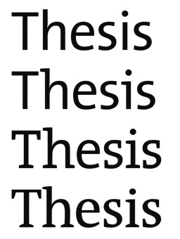
Thesis (typeface) on:
[Wikipedia]
[Google]
[Amazon]
Thesis is a large typeface family designed by
 It is a slab serif font family. It included fonts in 8 weights and 1 width, with complementary italic fonts.
 Offshoot font families of the Thesis font superfamily include TheAntiqua, Nebulae, and JesusLovesYouAll.
TheAntiqua is a variant based on TheSerif. It included fonts in 7 weights and 1 width, with complementary italic fonts. OpenType feature includes small caps (roman only). TheAntiqua won an award in 1999 from

 *
*
 *
*
Thesis super familyTheSansTheSansTypewriterTheSansMonoTheMixTheMixMonoTheSerif
TheAntiquaB
identifont.com: FontFabrik
* ttp://www.29letters.com/new/files/fonts.php?type=fam&id=18 29 Arabic Letters: TheMix Arabic* Fonts In Use
TheSansTheSerifTheAntiquaTheMix
Humanist sans-serif typefaces Typefaces with text figures Unified serif and sans-serif typeface families Typefaces designed by Luc(as) de Groot
Luc(as) de Groot
Lucas de Groot (born in Noordwijkerhout, the Netherlands), known professionally as Luc(as) de Groot, is a Dutch type designer. He is the head of the type foundry Fontfabrik, also trading as LucasFonts.
De Groot is particularly known for the very ...
. The typeface
A typeface (or font family) is the design of lettering that can include variations in size, weight (e.g. bold), slope (e.g. italic), width (e.g. condensed), and so on. Each of these variations of the typeface is a font.
There are list of type ...
s were designed between 1994 and 1999 to provide a modern humanist family. Each typeface is available in a variety of weights as well as in italic. Originally released by FontFont
FontShop International was an international manufacturer of digital typefaces ( fonts), based in Berlin. It was one of the largest digital type foundries.
The ''FontFont'' library of fonts contains designs by 160 type designers, among them renow ...
, it is now sold by de Groot through his imprint LucasFonts.
Thesis fonts have become popular and can be seen in various publications or logotypes.
To create a varied range of fonts of different thicknesses and levels of condensation, Thesis was developed using multiple master technology, in which weights were created by 'averaging' and extending the trend between a thick and thin design to create a smooth, continuous trend in styles from thin to very bold. The fonts also include a large number of stylistic alternate
In metal typesetting, a font is a particular size, weight and style of a typeface. Each font is a matched set of type, with a piece (a " sort") for each glyph. A typeface consists of a range of such fonts that shared an overall design.
In mod ...
characters.
The family is a font superfamily
{{unsourced, date=March 2019
In typography, a font superfamily or typeface superfamily is a font family containing
fonts that fall into multiple classifications.
The norm in a superfamily is to start from an identical character shape; class-spec ...
, since it includes both serif
In typography, a serif () is a small line or stroke regularly attached to the end of a larger stroke in a letter or symbol within a particular font or family of fonts. A typeface or "font family" making use of serifs is called a serif typeface ...
and sans-serif
In typography and lettering, a sans-serif, sans serif, gothic, or simply sans letterform is one that does not have extending features called "serifs" at the end of strokes. Sans-serif typefaces tend to have less stroke width variation than seri ...
designs.
TheSans
A humanist sans-serif font family, somewhat similar toSyntax
In linguistics, syntax () is the study of how words and morphemes combine to form larger units such as phrases and sentences. Central concerns of syntax include word order, grammatical relations, hierarchical sentence structure ( constituency) ...
(1968) and Frutiger (1976). It included fonts in 8 weights and 2 widths, with complementary italic fonts. A distinctive figure is the 'Q' with the detached tail, somewhat similar to that on Dwiggins' Metro
Metro, short for metropolitan, may refer to:
Geography
* Metro (city), a city in Indonesia
* A metropolitan area, the populated region including and surrounding an urban center
Public transport
* Rapid transit, a passenger railway in an urba ...
; an alternate is provided for when this is unsuitable.
In TheSans Condensed, each weight only includes roman and italic, but all 4 number styles can be found.
TheSansMono
It is a monospaced variant. 3 widths have been produced. All fonts use hanging monospaced figures.TheSansTypewriter
It is a monospaced variant with ragged strokes. It included fonts in regular and bold weights in the widest TheSansMono width, with complementary italic fonts. It uses hanging monospaced figures.TheSerif
TheMix
It is a slab serif font family, but using only serif on upper portion of small letters. It included fonts in 8 weights and 1 width, with complementary italic fonts.TheMixMono
It is a monospaced variant. Each weight only includes roman and italic. All fonts use hanging monospaced figures.TheMix Arabic
It is a variant designed by Lucas de Groot, Arab calligrapher and designer Mouneer Al-Shaarani, and with technical support from Pascal Zoghbi. Lucas designed the Bold version of the type, while Pascal finalized the Bold design by modifying some glyphs, spacing and encoding/scripting the font, and later developed TheMix Arabic Regular. The font was included in the Typographic Matchmaking Project organized by the Khatt Foundation.Offshoot font families
Type Directors Club
The Type Directors Club (TDC) is an international organization devoted to typography and type design, founded in 1946 in New York City. TDC believes that type drives culture, and that culture drives type—and is dedicated to cataloging, showcas ...
.
Collections
Each of the family are categorized in following family collections: Classic, Basic, Office. Classic family includes all 8 font weights, with roman, italic, small caps roman, small caps italic, expert, expert italic in each weight. It includes hanging proportional, hanging monospaced, lining proportional, lining monospaced figures; and additional f-ligatures. Expert fonts include arrows, swashes, fraction figures, alternate styles, mathematic symbols, ornaments. Basic family includes all 8 font weights, but without small caps and expert fonts. It includes lining proportional figures (smaller than in classic). Office family only includes Regular and Bold weights, with only roman and italic in each weight. It includes hanging monospaced figures. de Groot's choice of weights to release was developed using an "interpolation theory". The optical interpolation ''b'', in the three stems ''a'' (thinnest), ''b'' (interpolation) and ''c'' (thickest), is set to thegeometric mean
In mathematics, the geometric mean is a mean or average which indicates a central tendency of a set of numbers by using the product of their values (as opposed to the arithmetic mean which uses their sum). The geometric mean is defined as the ...
of ''a'' and ''c'', i.e. ''b''² = ''ac'' (as opposed to the linear arithmetic mean
In mathematics and statistics, the arithmetic mean ( ) or arithmetic average, or just the ''mean'' or the ''average'' (when the context is clear), is the sum of a collection of numbers divided by the count of numbers in the collection. The colle ...
).
As an amusement, de Groot also developed a number of parodic reworkings of Thesis, including Nebulae and JesusLovesYouAll.
Uses of Thesis fonts

 *
* BG Group
BG Group plc was a British multinational oil and gas company headquartered in Reading, United Kingdom. On 8 April 2015, Royal Dutch Shell announced that it had reached an agreement to acquire BG Group for $70 billion, subject to regulatory and ...
– now taken over
* University of Zurich
The University of Zürich (UZH, german: Universität Zürich) is a public research university located in the city of Zürich, Switzerland. It is the largest university in Switzerland, with its 28,000 enrolled students. It was founded in 1833 f ...
- TheSans
* Marque Bretagne
A brand is a name, term, design, symbol or any other feature that distinguishes one seller's good or service from those of other sellers. Brands are used in business, marketing, and advertising for recognition and, importantly, to create a ...
— TheMix
* Office Depot
The ODP Corporation is an American office supply holding company headquartered in Boca Raton, Florida. The company has combined annual sales of approximately $11 billion, and employs about 38,000 associates with businesses in the United States. ...
— TheSerif
* Swisscom
Swisscom AG is a major telecommunications provider in Switzerland. Its headquarters are located in Ittigen near Bern. The Swiss government owns 51.0 percent of Swisscom AG. According to its own published data, Swisscom holds a market share of 56 ...
— TheSans and TheSerif
* Victoria and Albert Museum
The Victoria and Albert Museum (often abbreviated as the V&A) in London is the world's largest museum of applied arts, decorative arts and design, housing a permanent collection of over 2.27 million objects. It was founded in 1852 and nam ...
— TheSans (custom variant)
* Branding for the World Exposition 2000 in Hannover, Germany – TheSans
* Deutsche Welle
Deutsche Welle (; "German Wave" in English), abbreviated to DW, is a German public, state-owned international broadcaster funded by the German federal tax budget. The service is available in 32 languages. DW's satellite television service con ...
- TheAntiqua
* ARD - TheSans and TheAntiqua
See also
 *
* Typography
Typography is the art and technique of arranging type to make written language legible, readable and appealing when displayed. The arrangement of type involves selecting typefaces, point sizes, line lengths, line-spacing ( leading), and ...
References
* Middendorp, Jan. ''Dutch Type.'' 010 Publishers: 2004. . {{ReflistExternal links
Thesis super family
TheAntiquaB
identifont.com: FontFabrik
* ttp://www.29letters.com/new/files/fonts.php?type=fam&id=18 29 Arabic Letters: TheMix Arabic* Fonts In Use
TheSans
Humanist sans-serif typefaces Typefaces with text figures Unified serif and sans-serif typeface families Typefaces designed by Luc(as) de Groot