Janson on:
[Wikipedia]
[Google]
[Amazon]
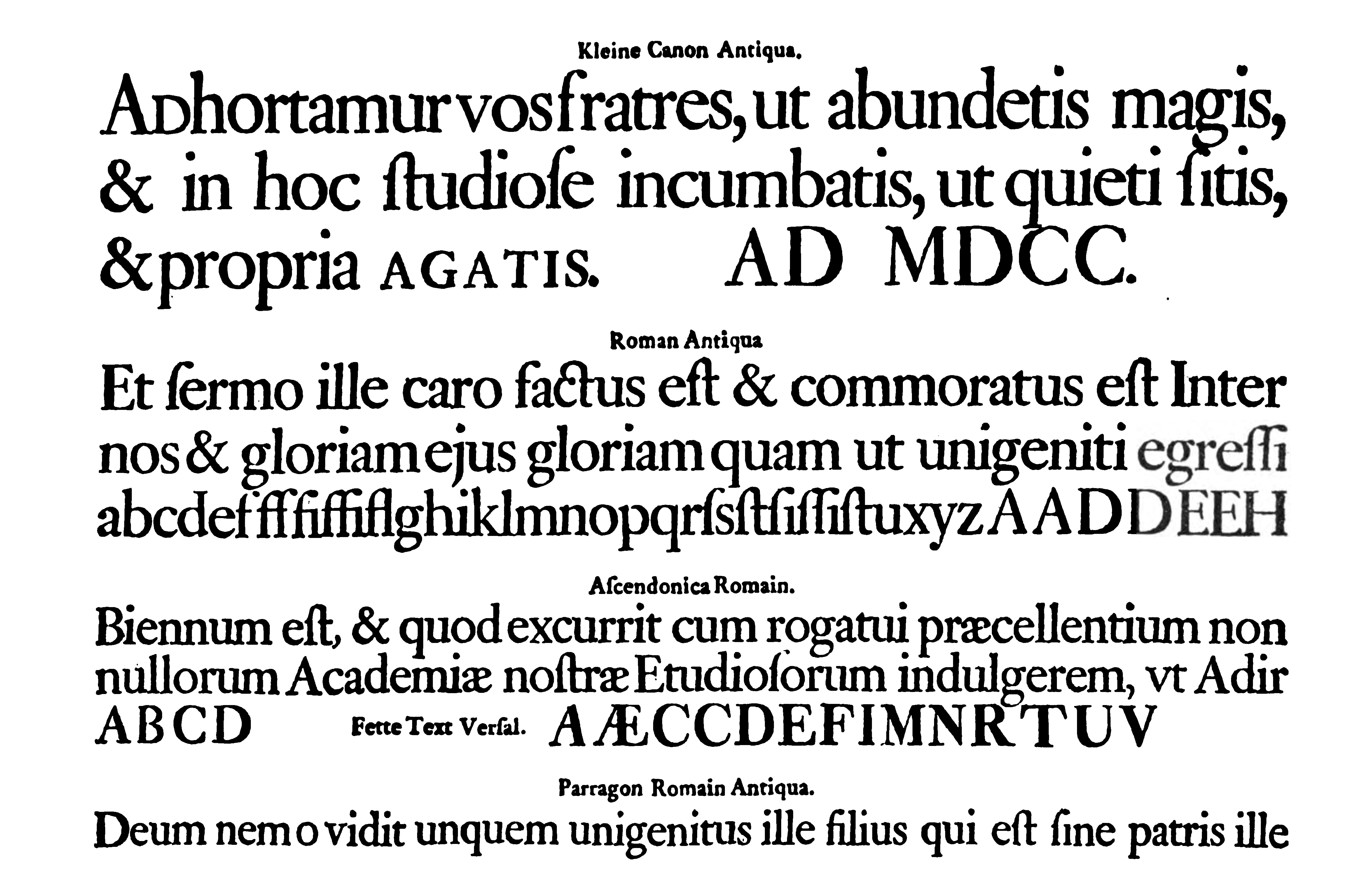
Janson is the name given to a set of

 Miklós Kis, a
 The Janson type was popular with twentieth-century typographers including Updike and
Colophon on Janson on the textism site
On other Kis/Janson revivals: On Ehrhardt:
Monotype Recorder from 1949, set in Ehrhardt
Ehrhardt digitisations:
Ehrhardt typeface family at MyFonts.com
Kis FB
(as of 2015 no online sale)
Ehrhardt typeface family at MyFonts.com
Old style serif typefaces Typefaces with text figures Linotype typefaces Letterpress typefaces Photocomposition typefaces Digital typefaces Typefaces and fonts introduced in 1937 Typefaces designed by Chauncey H. Griffith
old-style serif
In typography, a serif () is a small line or stroke regularly attached to the end of a larger stroke in a letter or symbol within a particular font or family of fonts. A typeface or "font family" making use of serifs is called a serif typeface ( ...
typeface
A typeface (or font family) is the design of lettering that can include variations in size, weight (e.g. bold), slope (e.g. italic), width (e.g. condensed), and so on. Each of these variations of the typeface is a font.
There are list of type ...
s from the Dutch Baroque
Dutch Baroque architecture is a variety of Baroque architecture that flourished in the Dutch Republic and its colonies during the Dutch Golden Age of the 17th century. (Dutch painting during the period is covered by Dutch Golden Age painting).
L ...
period, and modern revivals from the twentieth century. Janson is a crisp, relatively high-contrast serif design, most popular for body text.
Janson is based on surviving matrices from Leipzig
Leipzig ( , ; Upper Saxon: ) is the most populous city in the German state of Saxony. Leipzig's population of 605,407 inhabitants (1.1 million in the larger urban zone) as of 2021 places the city as Germany's eighth most populous, as wel ...
that were named for Anton Janson
Anton Janson (January 17, 1620 in Wanden/Wauden? in Friesland – November 18, 1687 in Leipzig) was a Dutch type founder and printer.
The typeface Janson
Janson is the name given to a set of old-style serif typefaces from the Dutch Baroq ...
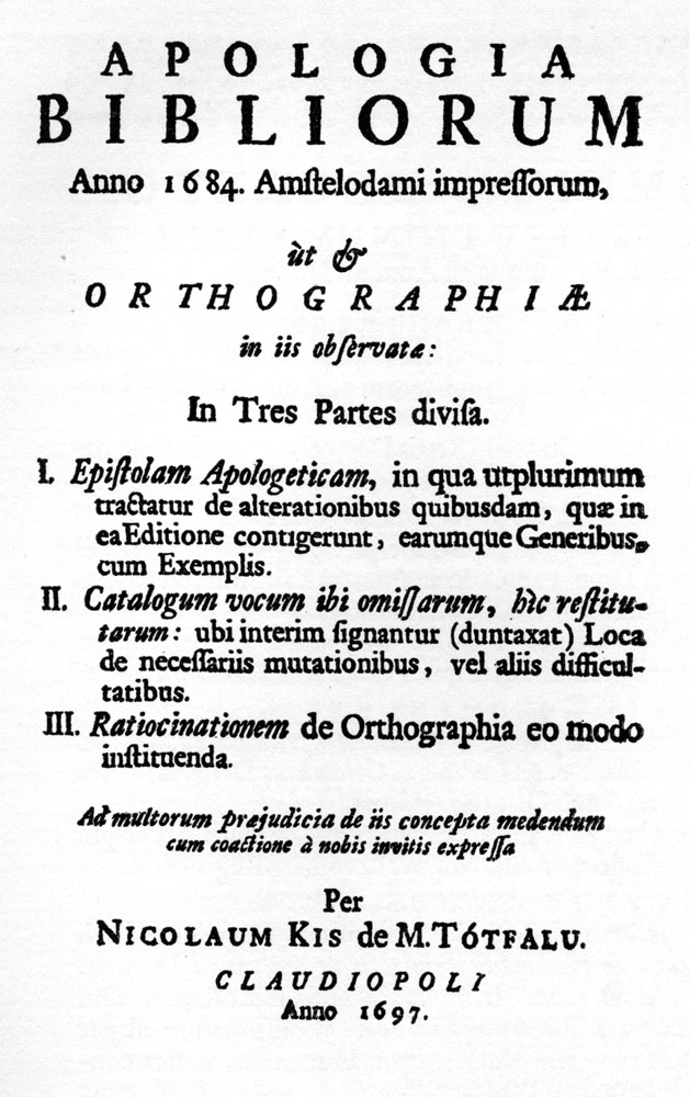
(1620–1687), a Leipzig-based printer and punch-cutter from the Netherlands who was believed to have created them. In 1954 Harry Carter and George Buday published an essay asserting that the designer of the Janson typeface was in fact a Hungarian-Transylvanian schoolmaster and punchcutter
Punchcutting is a craft used in traditional typography to cut letter punches in steel as the first stage of making metal type. Steel punches in the shape of the letter would be used to stamp matrices into copper, which were locked into a mould sh ...
, Miklós (Nicholas) Tótfalusi Kis (1650–1702).
Historical background

 Miklós Kis, a
 Transylvania
Transylvania ( ro, Ardeal or ; hu, Erdély; german: Siebenbürgen) is a historical and cultural region in Central Europe, encompassing central Romania. To the east and south its natural border is the Carpathian Mountains, and to the west the Ap ...
n Protestant
Protestantism is a Christian denomination, branch of Christianity that follows the theological tenets of the Reformation, Protestant Reformation, a movement that began seeking to reform the Catholic Church from within in the 16th century agai ...
pastor and schoolmaster, became deeply interested in printing after being sent to Amsterdam to help print a Hungarian Protestant translation of the Bible. This was a period of considerable prosperity for the Netherlands and a time when its styles of printing were very influential across Europe, making it a centre for the creation of new typefaces. He developed a second career as a punchcutter
Punchcutting is a craft used in traditional typography to cut letter punches in steel as the first stage of making metal type. Steel punches in the shape of the letter would be used to stamp matrices into copper, which were locked into a mould sh ...
, an engraver of the punches used as a master for stamping matrices for casting metal type, selling his work to printers in the Netherlands and abroad. The style he worked in was based on French serif typefaces of the previous century, but with boosted x-height and higher stroke contrast, creating a higher-contrast, sharper effect. It was later called the "Dutch taste
In typography, a serif () is a small line or stroke regularly attached to the end of a larger stroke in a letter or symbol within a particular font or family of fonts. A typeface or "font family" making use of serifs is called a serif typeface ( ...
" (''goût hollandois''), a term originating from the writings of Pierre Simon Fournier
Pierre-Simon Fournier (15 September 1712 – 8 October 1768) was a French mid-18th century punch-cutter, typefounder and typographic theoretician. He was both a collector and originator of types. Fournier's contributions to printing were his cre ...
in the next century. Kis is considered to have been one of the most talented engravers active during this period, and perhaps uniquely wrote about his work in later life, allowing greater insight into his work than other earlier engravers. Kis also cut typefaces for other languages including Greek
Greek may refer to:
Greece
Anything of, from, or related to Greece, a country in Southern Europe:
*Greeks, an ethnic group.
*Greek language, a branch of the Indo-European language family.
**Proto-Greek language, the assumed last common ancestor ...
and Hebrew
Hebrew (; ; ) is a Northwest Semitic language of the Afroasiatic language family. Historically, it is one of the spoken languages of the Israelites and their longest-surviving descendants, the Jews and Samaritans. It was largely preserved ...
typefaces.
Kis returned to Transylvania around 1689 and may have left matrices
Matrix most commonly refers to:
* ''The Matrix'' (franchise), an American media franchise
** ''The Matrix'', a 1999 science-fiction action film
** "The Matrix", a fictional setting, a virtual reality environment, within ''The Matrix'' (franchis ...
(the moulds used to cast type) in Leipzig on his way home. The Ehrhardt type foundry of Leipzig released a surviving specimen sheet of them around 1720, leading to the attribution to Janson.
Kis's surviving matrices were first acquired by Stempel Stempel is a surname. Notable people with the surname include:
* Gary Stempel (born 1957), English-Panamanian football manager
* Herbert Stempel (1926-2020), television game show contestant who exposed the rigging of results in the 1950s quiz sho ...
, and are now held in the collection of the Druckmuseum (Museum of Printing), Darmstadt
Darmstadt () is a city in the States of Germany, state of Hesse in Germany, located in the southern part of the Frankfurt Rhine Main Area, Rhine-Main-Area (Frankfurt Metropolitan Region). Darmstadt has around 160,000 inhabitants, making it th ...
. Kis's identity as the maker of the typefaces was rediscovered in the 1950s by comparison with type from Hungarian archive sources (including his autobiography) on which his name was identified. Due to their survival, the Janson typefaces became popular with fine printers of the late Arts and Crafts period such as Updike, who could print books from them using hand-set type cast from surviving original matrices. In his book ''Printing Types: Their History, Forms and Uses'', Updike commented that "although heavy, they retain considerable vivacity of line and have great capabilities when used with taste."
Despite its 17th-century origins, Janson is used in a wide variety of modern-day text applications. As of the magazine's 2011 redesign, ''Architectural Digest
''Architectural Digest'' is an American monthly magazine founded in 1920. Its principal subjects are interior design and landscaping, rather than pure external architecture. The magazine is published by Condé Nast, which also publishes internati ...
'' uses Janson for body text in all of its articles; so does ''Philosophy Now
''Philosophy Now'' is a bimonthly philosophy magazine sold from news-stands and book stores in the United States, United Kingdom, Australia, and Canada; it is also available on digital devices, and online. It aims to appeal to the wider public, ...
''. It has also been used for the Journal of the British Printing Historical Society The Printing Historical Society or 'PHS' is a learned society devoted to the study of the history of printing, in all its forms.
History
The Society was founded in London in 1964 by a group of teachers, scholars, students of design and bibliography ...
.
Revivals
 The Janson type was popular with twentieth-century typographers including Updike and
 Stanley Morison
Stanley Arthur Morison (6 May 1889 – 11 October 1967) was a British typographer, printing executive and historian of printing. Largely self-educated, he promoted higher standards in printing and an awareness of the best printing and typefaces o ...
, who admired its design as something different to the Didone and neo-medieval types dominant in the nineteenth century, and several revivals were made in the twentieth century for the hot metal typesetting
In printing and typography, hot metal typesetting (also called mechanical typesetting, hot lead typesetting, hot metal, and hot type) is a technology for typesetting text in letterpress printing. This method injects molten type metal into a mol ...
systems of the period.
A revival of the face was designed in 1937 by Chauncey H. Griffith
Chauncey H. Griffith (1879–1956) was an American printer and typeface designer.
Griffith was born in a small town near Ironton, Ohio, and began his career as a compositor and pressman in Lexington, Kentucky, where his family moved when he was ...
of the Mergenthaler Linotype foundry
A foundry is a factory that produces metal castings. Metals are cast into shapes by melting them into a liquid, pouring the metal into a mold, and removing the mold material after the metal has solidified as it cools. The most common metals pr ...
. The revival was taken from the original matrices, held since 1919 by the Stempel Type Foundry
D. Stempel AG was a German typographic foundry founded by David Stempel (1869–1927), in Frankfurt am Main, Germany. Many important font designers worked for the Stempel foundry, including Hans Bohn, Warren Chappell, F. H. Ehmcke, Friedric ...
, which were Mergenthaler's exclusive agent in Europe. Griffith was a great admirer of the Janson designs, writing to Carl Rollins of Yale University Press
Yale University Press is the university press of Yale University. It was founded in 1908 by George Parmly Day, and became an official department of Yale University in 1961, but it remains financially and operationally autonomous.
, Yale Universi ...
that "I am so anxious to have the Linotype face worthy of its name. If I cannot succeed in satisfying myself that our interpretation of Janson will be worthy of the honored name it bears, we shall not hesitate a moment to scrap the whole work and forget it."
The most common digital version, Janson Text, comes from a metal version produced by Hermann Zapf in the 1950s at Stempel Stempel is a surname. Notable people with the surname include:
* Gary Stempel (born 1957), English-Panamanian football manager
* Herbert Stempel (1926-2020), television game show contestant who exposed the rigging of results in the 1950s quiz sho ...
. This was based on Kis' original matrices. Digitisations are available from Linotype, Adobe, Bitstream
A bitstream (or bit stream), also known as binary sequence, is a sequence of bits.
A bytestream is a sequence of bytes. Typically, each byte is an 8-bit quantity, and so the term octet stream is sometimes used interchangeably. An octet may ...
(adding Cyrillic glyphs), URW++
URW Type Foundry GmbH (formerly URW++ Design & Development GmbH) is a type foundry based in Hamburg, Germany. The foundry has its own library with more than 500 font families. The company specializes in customized corporate typefaces and the d ...
(adding an additional light and black weights) and others. A separate digital version is Elsner+Flake
Elsner+Flake is a trademark used by German type foundry originally called EF Designstudios but later renamed Elsner+Flake Type Consulting GmbH and is currently based in Hamburg. The company was founded in 1986 by Veronika Elsner and Günther Flake ...
's Kis Antiqua Now. Described by Paul Shaw as the best digital version, it was designed by Hildegard Korger and Erhard Kaiser and originates from Korger's revival for the East German foundry VEB Typoart
VEB Typoart was the only type foundry of East Germany. It was a state-owned enterprise ("Volkseigener Betrieb") located in Dresden. The foundry's most influential art directors were Herbert Thannhäuser (until 1963) and Albert Kapr (until 1987).
...
.
A separate common revival of the Janson types is Ehrhardt, created by Monotype
Monotyping is a type of printmaking made by drawing or painting on a smooth, non-absorbent surface. The surface, or matrix, was historically a copper etching plate, but in contemporary work it can vary from zinc or glass to acrylic glass. The ...
in the 1930s. Somewhat more condensed than most Janson revivals, giving it a crisp, vertical appearance, it is a popular book typeface, particularly often used in the UK. Besides a number of revivals specifically of Ehrhardt (described in that article), two more by Linotype and Berthold have been sold under the name of Kis.
Random House
Random House is an American book publisher and the largest general-interest paperback publisher in the world. The company has several independently managed subsidiaries around the world. It is part of Penguin Random House, which is owned by Germ ...
's Modern Library
The Modern Library is an American book publishing imprint and formerly the parent company of Random House. Founded in 1917 by Albert Boni and Horace Liveright as an imprint of their publishing company Boni & Liveright, Modern Library became an ...
Classics collection has some of its books printed in a digitized version of Janson typeface.
References
*Carter, Rob, Day, Ben, Meggs,Philip. ''Typographic Design: Form and Communication, Second Edition.'' Van Nostrand Reinhold, Inc: 1993 . * Molnár, József. ''Misztótfalusi Kis Miklós''. Európai Protestáns Szabadegyetem: 2000. .External links
{{Commons category, JansonColophon on Janson on the textism site
On other Kis/Janson revivals: On Ehrhardt:
Ehrhardt digitisations:
Ehrhardt typeface family at MyFonts.com
Kis FB
(as of 2015 no online sale)
Ehrhardt typeface family at MyFonts.com
Old style serif typefaces Typefaces with text figures Linotype typefaces Letterpress typefaces Photocomposition typefaces Digital typefaces Typefaces and fonts introduced in 1937 Typefaces designed by Chauncey H. Griffith