|
Type Designers
A type designer is a person who designs typefaces. (The term "typographer" is sometimes misapplied to type designers: a typographer is a person who arranges existing typefaces to lay out a pagesee typography) A partial list of notable type designers follows by country, with a signature typeface (or two for significant designers). Australia * Stephen Banham Brazil * Eduardo Recife Canada * Gerald Giampa * Ray Larabie * Jim Rimmer * Nick Shinn Czech Republic * František Štorm * Vojtěch Preissig * Petr Blažek France * George Auriol ( Auriol) * Michel Bouvet * Louis Braille * Adolphe Mouron Cassandre ( Peignot, 1937) * Charles Nicolas Cochin * Simon de Colines * Firmin Didot * François Didot * François-Ambroise Didot * Henri Didot * Pierre Didot * Xavier Dupré * Roger Excoffon * Pierre Simon Fournier * Claude Garamond (Garamond) * Robert Granjon * Hector Guimard * Nicolas Jenson * Christophe Plantin * Jean-François Porchez * Jacques Sabon * Wynkyn de Worde ... [...More Info...] [...Related Items...] OR: [Wikipedia] [Google] [Baidu] |
Type Design
Type design is the art and process of designing typefaces. This involves drawing each letterform using a consistent style. The basic concepts and design variables are described below. A typeface differs from other modes of graphic production such as handwriting and drawing in that it is a fixed set of alphanumeric characters with specific characteristics to be used repetitively. Historically, these were physical elements, called sorts, placed in a wooden frame; modern typefaces are stored and used electronically. It is the art of a type designer to develop a pleasing and functional typeface. In contrast, it is the task of the typographer (or typesetter) to lay out a page using a typeface that is appropriate to the work to be printed or displayed. History The technology of printing text using movable type was invented in China, but the vast number of Chinese characters, and the esteem with which calligraphy was held, meant that few distinctive, complete typefaces were created ... [...More Info...] [...Related Items...] OR: [Wikipedia] [Google] [Baidu] |
Charles Nicolas Cochin
Charles-Nicolas Cochin (22 February 1715 – 29 April 1790) was a French engraver, designer, writer, and art critic. To distinguish him from his father of the same name, he is variously called Charles-Nicolas Cochin le Jeune (the Younger), Charles-Nicolas Cochin le fils (the son), or Charles-Nicolas Cochin II. Early life Cochin was born in Paris, the son of Charles-Nicolas Cochin the Elder (1688–1754), under whom he studied engraving.Charles-Nicolas Cochin the Younger at britannica.com (accessed 11 February 2008) His mother was Louise-Magdeleine Horthemels (1686–1767), who herself was an important engraver in Paris for some fifty years. [...More Info...] [...Related Items...] OR: [Wikipedia] [Google] [Baidu] |
Hector Guimard
Hector Guimard (, 10 March 1867 – 20 May 1942) was a French architect and designer, and a prominent figure of the Art Nouveau style. He achieved early fame with his design for the Castel Beranger, the first Art Nouveau apartment building in Paris, which was selected in an 1899 competition as one of the best new building facades in the city. He is best known for the glass and iron ''edicules'' or canopies, with ornamental Art Nouveau curves, which he designed to cover the entrances of the first stations of the Paris Metro. Between 1890 and 1930, Guimard designed and built some fifty buildings, in addition to one hundred and forty-one subway entrances for Paris Metro, as well as numerous pieces of furniture and other decorative works. However, in the 1910s Art Nouveau went out of fashion and by the 1960s most of his works had been demolished, and only two of his original Metro edicules were still in place. Guimard's critical reputation revived in the 1960s, in part due to ... [...More Info...] [...Related Items...] OR: [Wikipedia] [Google] [Baidu] |
Robert Granjon
Robert Granjon (1513-November 16, 1589/March 1590) was a French type designer and printer. He worked in Paris, Lyon, Frankfurt, Antwerp, and Rome for various printers. He is best known for having introduced the typeface Civilité and for his italic type form, the design of which in modern days is used in Garamond Italic. He worked in Lyon as a librarian, printer, and engraver of typefaces. He married the daughter of Bernard Salomon. The first book in his typeface, Civilité, was ''Dialogue de la vie et de la mort'' by Ringhieri (1557). The invention made such an impact that King Henry II, on December 26, 1557, gave him an exclusive privilege to use the type for ten years. Granjon's italic had a greater slant angle, slanted roman capitals, and reduced weight and rigor. These qualities and its contrasting thick and thin strokes gave it a dazzling appearance that made it difficult to read. It was nevertheless the main influence for italic type design until the Arrighi model was rev ... [...More Info...] [...Related Items...] OR: [Wikipedia] [Google] [Baidu] |
Garamond
Garamond is a group of many serif typefaces, named for sixteenth-century Parisian engraver Claude Garamond, generally spelled as Garamont in his lifetime. Garamond-style typefaces are popular and particularly often used for book printing and body text. Garamond's types followed the model of an influential typeface cut for Venetian printer Aldus Manutius by his punchcutter Francesco Griffo in 1495, and are in what is now called the old-style of serif letter design, letters with a relatively organic structure resembling handwriting with a pen, but with a slightly more structured, upright design. Following an eclipse in popularity in the eighteenth and nineteenth century, many modern revival faces in the Garamond style have been developed. It is common to pair these with italics based on those created by his contemporary Robert Granjon, who was well known for his proficiency in this genre. However, although Garamond himself remains considered a major figure in French printing ... [...More Info...] [...Related Items...] OR: [Wikipedia] [Google] [Baidu] |
Claude Garamond
Claude Garamont (–1561), known commonly as Claude Garamond, was a French type designer, publisher and punch-cutter based in Paris. Garamond worked as an engraver of punches, the masters used to stamp matrices, the moulds used to cast metal type. He worked in the tradition now called old-style serif design, which produced letters with a relatively organic structure resembling handwriting with a pen but with a slightly more structured and upright design. Considered one of the leading type designers of all time, he is recognised to this day for the elegance of his typefaces. Many old-style serif typefaces are collectively known as Garamond, named after the designer. Garamond was one of the first independent punchcutters, specialising in type design and punch-cutting as a service to others rather than working in house for a specific printer. His career therefore helped to define the future of commercial printing with typefounding as a distinct industry to printing books. Early ... [...More Info...] [...Related Items...] OR: [Wikipedia] [Google] [Baidu] |
Pierre Simon Fournier
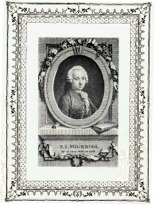
Pierre-Simon Fournier (15 September 1712 – 8 October 1768) was a French mid-18th century punch-cutter, typefounder and typographic theoretician. He was both a collector and originator of types. Fournier's contributions to printing were his creation of initials and ornaments, his design of letters, and his standardization of type sizes. He worked in the rococo form, and designed typefaces including Fournier and Narcissus. He was known for incorporating ‘decorative typographic ornaments’ into his typefaces. Fournier's main accomplishment is that he ‘created a standardized measuring system that would revolutionize the typography industry forever’. He was also known as Fournier le Jeune ("the younger") to distinguish him from his father Jean Claude, who was also in the typesetting industry. In his early life, Fournier studied watercolour with J. B. G. Colson, and later wood engraving. In 1737, Fournier published his first theoretical work, on the minimum spacing between le ... [...More Info...] [...Related Items...] OR: [Wikipedia] [Google] [Baidu] |
Roger Excoffon
Roger Excoffon (7 September 1910 – 30 May 1983) was a French typeface designer and graphic designer. Excoffon was born in Marseille, studied law at the University of Aix-en-Provence, and then moved to Paris to apprentice in a print shop. In 1947, he formed his own advertising agency and concurrently became design director of a small foundry in Marseille called Fonderie Olive. Later, he co-founded the prestigious Studio U+O, named in reference to "Urbi et Orbi". Excoffon's best-known faces are Mistral and Antique Olive, the latter which he designed between 1962 and 1966. Air France, one of Excoffon's largest and most prestigious clients, used a customized variant of Antique Olive in its wordmark and livery until 2009, when a new logo was introduced. Excoffon's faces, even the sober Antique Olive, have an organic vibrancy not found in similar sans-serif types of the period. His typefaces gave voice to an exuberant body of contemporary French and European graphic design. He ... [...More Info...] [...Related Items...] OR: [Wikipedia] [Google] [Baidu] |
Xavier Dupré
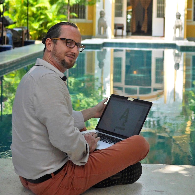
Xavier Dupré is a typeface designer born in Aubenas (Ardèche), France in 1977. Dupré is notable for the recognition he has received for his typeface designs in the 2000s. According to several similar online biographies Dupré studied graphic design and applied arts in Paris. He also studied calligraphy and typography at the Scriptorium de Toulouse :fr:Scriptorium de Toulouse. Dupré lived in Cambodia from 2001 to 2004 where he designed Latin typefaces (i.e. fonts used for western European languages) as well as Khmer typefaces. While Dupré has been a prolific designer since about 2001, three of his typefaces have earned special distinction by the Type Directors Club The Type Directors Club (TDC) is an international organization devoted to typography and type design, founded in 1946 in New York City. TDC believes that type drives culture, and that culture drives type—and is dedicated to cataloging, showcas ...: FF Angkoon in 200 FF Absara in 200and Vista Sans in 200 Mo ... [...More Info...] [...Related Items...] OR: [Wikipedia] [Google] [Baidu] |
Pierre Didot
Didot is the name of a family of French printers, punch-cutters and publishers. Through its achievements and advancements in printing, publishing and typography, the family has lent its name to typographic measurements developed by François-Ambroise Didot and the Didot typeface developed by Firmin Didot. The Didot company of France was ultimately incorporated into the modern CPI printing group. First generation François Didot François Didot (son of Denis Didot) was a merchant who was born in Paris in 1689 and died in 1757. In 1713 he opened a bookstore called "À la Bible d'or" (which could be translated "The Golden Bible") on the Quai des Grands-Augustins. The celebrated Abbé de Bernis served for a time there as a clerk after leaving the seminary. François Didot was a learned man, and held by his colleagues in such great esteem that he was elected to the dignity of Syndic of the Booksellers' Corporation in 1735. He received his printer's charter from the king in 1754. Amo ... [...More Info...] [...Related Items...] OR: [Wikipedia] [Google] [Baidu] |
Henri Didot
Didot is the name of a family of French printers, punch-cutters and publishers. Through its achievements and advancements in printing, publishing and typography, the family has lent its name to typographic measurements developed by François-Ambroise Didot and the Didot typeface developed by Firmin Didot. The Didot company of France was ultimately incorporated into the modern CPI printing group. First generation François Didot François Didot (son of Denis Didot) was a merchant who was born in Paris in 1689 and died in 1757. In 1713 he opened a bookstore called "À la Bible d'or" (which could be translated "The Golden Bible") on the Quai des Grands-Augustins. The celebrated Abbé de Bernis served for a time there as a clerk after leaving the seminary. François Didot was a learned man, and held by his colleagues in such great esteem that he was elected to the dignity of Syndic of the Booksellers' Corporation in 1735. He received his printer's charter from the king in 1754. Amo ... [...More Info...] [...Related Items...] OR: [Wikipedia] [Google] [Baidu] |
François-Ambroise Didot
Didot is the name of a family of French printers, punch-cutters and publishers. Through its achievements and advancements in printing, publishing and typography, the family has lent its name to typographic measurements developed by François-Ambroise Didot and the Didot typeface developed by Firmin Didot. The Didot company of France was ultimately incorporated into the modern CPI printing group. First generation François Didot François Didot (son of Denis Didot) was a merchant who was born in Paris in 1689 and died in 1757. In 1713 he opened a bookstore called "À la Bible d'or" (which could be translated "The Golden Bible") on the Quai des Grands-Augustins. The celebrated Abbé de Bernis served for a time there as a clerk after leaving the seminary. François Didot was a learned man, and held by his colleagues in such great esteem that he was elected to the dignity of Syndic of the Booksellers' Corporation in 1735. He received his printer's charter from the king in 1754. Amo ... [...More Info...] [...Related Items...] OR: [Wikipedia] [Google] [Baidu] |


