|
Matrix (printing)
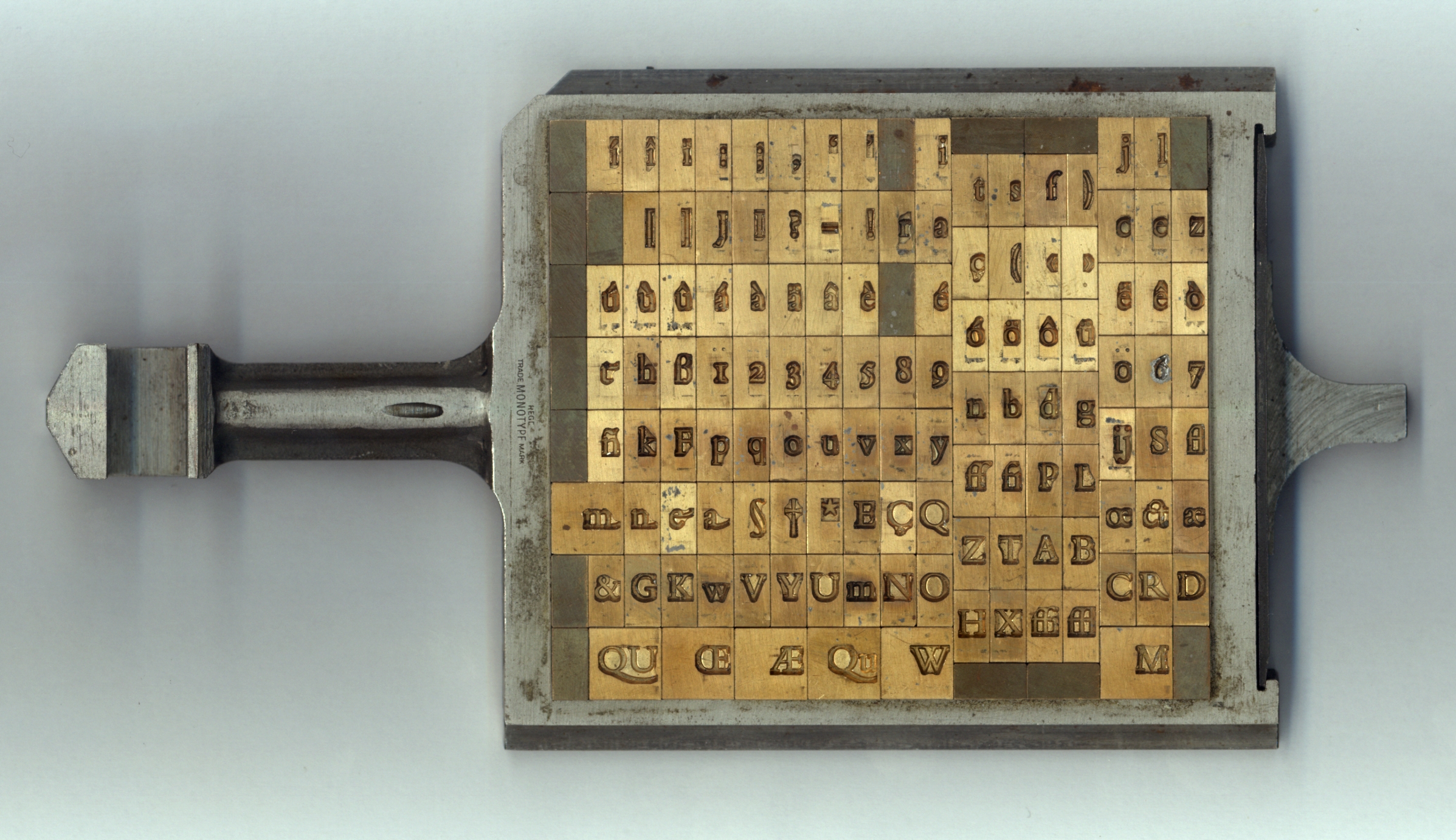
In the manufacture of metal type used in letterpress printing, a matrix (from the Latin meaning ''womb'' or ''a female breeding animal'') is the mould used to cast a letter, known as a sort (typesetting), sort. Matrices for printing types were made of copper. However, in printmaking the matrix is whatever is used, with ink, to hold the image that makes up the print, whether a plate in etching and engraving or a woodblock in woodcut. Description In letterpress or "cold metal" typesetting, used from the beginning of printing to the late nineteenth century, the matrix of one letter is inserted into the bottom of an adjustable-width hand mould, the mould is locked and molten type metal is poured into a straight-sided vertical cavity above the matrix. When the metal has cooled and solidified the mould is unlocked and the newly cast metal sort is removed. The matrix can then be reused to produce more copies of the sort.Meggs, Philip B. ''A History of Graphic Design.'' John Wiley & Sons ... [...More Info...] [...Related Items...] OR: [Wikipedia] [Google] [Baidu] |
Wood Type
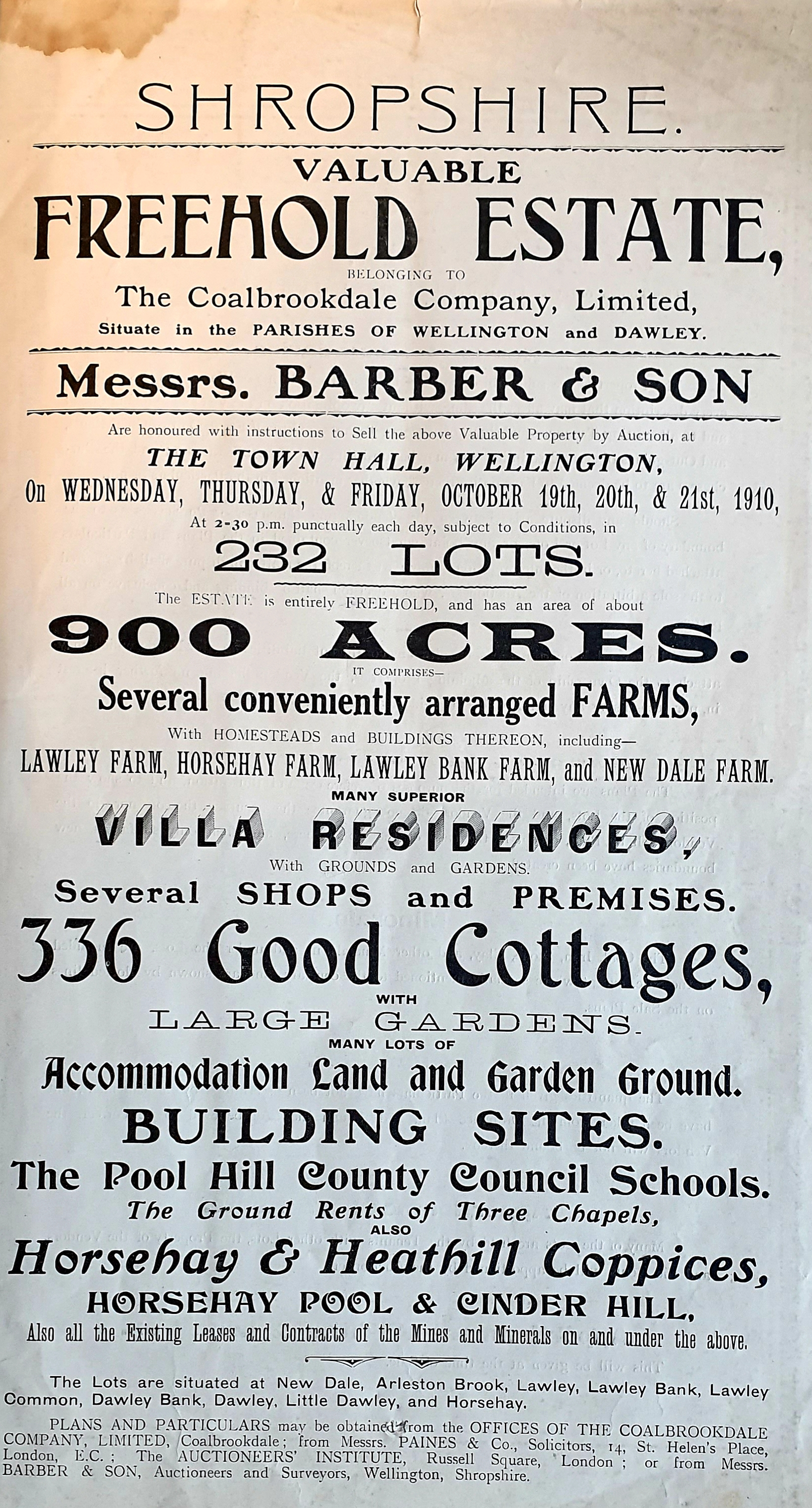
In letterpress printing, wood type is movable type made out of wood. First used in China for printing body text, wood type became popular during the nineteenth century for making large display typefaces for printing posters, because it was lighter and cheaper than large sizes of metal type. Wood has been used since the earliest days of European printing for woodcut decorations and emblems, but it was not generally used for making typefaces due to the difficulty of reproducing the same shape many times for printing. In the 1820s, Darius Wells introduced Mechanization, mechanised wood type production using the powered Router (woodworking), router, and William Leavenworth in 1834 added a second major innovation of using a pantograph to cut a letter's shape from a pattern. This made it possible to mass-produce the same design in wood repeatedly. Wood type was manufactured and used worldwide in the nineteenth century for display use. In the twentieth century lithography, phototype ... [...More Info...] [...Related Items...] OR: [Wikipedia] [Google] [Baidu] |
Digital Print Matrix
A digital print matrix is the digital state from which a print art object can be instanced with original intent. The traditional term '' print matrix'' is the physical surface from which an image is printed, woodblock, plate, stone or screen. Although these may in themselves be produced digitally they comprise a traditional (physical) matrix. A digital matrix however is a repository of material which, stored digitally, is combined by the artist's hand and instanced with original intent; Philip George's “fluid diary” providing an early example.{{cite journal , author-last=George , author-first=Philip , date=April 2002 , title=Mnemonic Notations: A Decade of Art Practice within a Digital Environment. , journal= Leonardo , volume=35 , number=2 , pages=121–127 Technically the digital matrix comprises stable digital storage mechanisms (which retain the data when switched off) rather than volatile random access memory Random-access memory (RAM; ) is a form of electronic ... [...More Info...] [...Related Items...] OR: [Wikipedia] [Google] [Baidu] |
History Of Western Typography
Modern typographers view typography as a craft with a very long History of printing, history tracing its origins back to the first punches and dies used to make Seal (emblem), seals and coinage currency in Ancient history, ancient times. The basic elements of typography are at least as old as civilization and the earliest writing systems—a series of key developments that were eventually drawn together into one systematic craft. While woodblock printing and movable type had History of typography in East Asia, precedents in East Asia, typography in the Western world developed after the invention of the printing press by Johannes Gutenberg in the mid-15th century. The initial Global spread of the printing press, spread of printing throughout Germany and Italy led to the enduring legacy and continued use of blackletter, Roman type, roman, and italic types. Medieval design roots Typography, type-founding, and typeface design began as closely related crafts in mid-15th-century ... [...More Info...] [...Related Items...] OR: [Wikipedia] [Google] [Baidu] |
Font
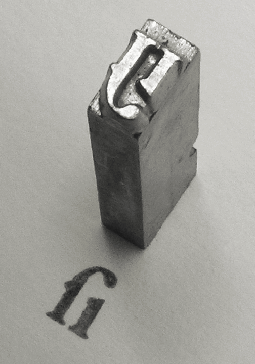
In metal typesetting, a font is a particular size, weight and style of a ''typeface'', defined as the set of fonts that share an overall design. For instance, the typeface Bauer Bodoni (shown in the figure) includes fonts " Roman" (or "regular"), "" and ""; each of these exists in a variety of sizes. In the digital description of fonts ( computer fonts), the terms "font" and "typeface" are often used interchangeably. For example, when used in computers, each style is stored in a separate digital font file. In both traditional typesetting and computing, the word "font" refers to the delivery mechanism of an instance of the typeface. In traditional typesetting, the font would be made from metal or wood type: to compose a page may require multiple fonts from the typeface or even multiple typefaces. Spelling and etymology The word ''font'' (US) or ''fount'' (traditional UK, CAN; in any case pronounced ) derives from Middle French ''fonte'', meaning "cast iron". The term re ... [...More Info...] [...Related Items...] OR: [Wikipedia] [Google] [Baidu] |
Metro (typeface)
Metro is a sans-serif typeface family created by William Addison Dwiggins and released by the Mergenthaler Linotype Company in 1929. Metro was Dwiggins's first typeface, which he created at the age of 49 after establishing himself as one of the pre-eminent lettering artists and book designers of the early 20th century. In 1928, Dwiggins wrote ''Layout in Advertising'', in which he criticized the lack of "good" sans-serif types available. Harry L. Gage, assistant director of typography at Linotype, reviewed the book, and in 1929 he offered to hire Dwiggins to design the "good" sans-serif he felt was lacking. Dwiggins was brought in as a consultant and quickly established a rapport with Chauncey H. Griffith, the company's head of type design, who would manage the production of all his typefaces for the rest of his career. Metro was inspired by a wave of new "geometric" sans-serif designs such as Futura, which had attracted attention for their basis on simple geometric shapes like ... [...More Info...] [...Related Items...] OR: [Wikipedia] [Google] [Baidu] |
Body Text
__NOTOC__ Body text or body copy, or running text, is the text forming the main content of a book, magazine, web page, or any other printed or digital work. This is as a contrast to both additional components such as headings, images, charts, footnotes etc. on each page, and also the pages of front matter that form the introduction to a book. Body text has two slightly different meanings, depending on context. A book designer, concerned with the overall sequence of a book, regards it as those pages that form the majority of a book, containing the ''body of text'' or '' body matter''. A typesetter concerned instead with the layout of text on a page sees 'body text' as being those sections of the main text that are flowed into columns or justified as paragraphs, as distinct from the headings and any pictures that are floated out of the main body. Book design The 'body matter' is the group of pages that contain the body of the text of the book. The front matter comes before it, co ... [...More Info...] [...Related Items...] OR: [Wikipedia] [Google] [Baidu] |
Pantograph
A pantograph (, from their original use for copying writing) is a Linkage (mechanical), mechanical linkage connected in a manner based on parallelograms so that the movement of one pen, in tracing an image, produces identical movements in a second pen. If a line drawing is traced by the first point, an identical, enlarged, or miniaturized copy will be drawn by a pen fixed to the other. Using the same principle, different kinds of pantographs are used for other forms of duplication in areas such as sculpting, Mint (facility), minting, engraving, and Milling (machining), milling. History The ancient Greek engineer Hero of Alexandria described pantographs in his work ''Mechanics''. In 1603, Christoph Scheiner used a pantograph to copy and scale diagrams, and wrote about the invention over 27 years later, in ''"Pantographice seu Ars delineandi res quaslibet per parallelogrammum lineare seu cavum"'' (Rome 1631). One arm of the pantograph contained a small pointer, while the oth ... [...More Info...] [...Related Items...] OR: [Wikipedia] [Google] [Baidu] |
Display Typeface
A display typeface is a typeface that is intended for use in display type (display copy) at large sizes for titles, headings, pull quotes, and other eye-catching elements, rather than for extended passages of body text. Display typefaces will often have more eccentric and variable designs than the simple, relatively restrained typefaces generally used for body text. They may take inspiration from other genres of lettering, such as handpainted signs, calligraphy or an aesthetic appropriate to their use, perhaps ornamented, exotic, abstracted or drawn in the style of a different writing system. Several genres of font are particularly associated with display setting, such as slab serif, script font, reverse-contrast and to a lesser extent sans serif. Walter Tracy defines display typefaces in the metal type sense as "sizes of type over 14 point" and in design that "text types when enlarged can be used for headings, display types, if reduced, cannot be used for text setting." ... [...More Info...] [...Related Items...] OR: [Wikipedia] [Google] [Baidu] |
Matrix (journal)
Whittington Court is an Elizabethan manor house, five miles east of Cheltenham in Gloucestershire, England. Adjacent to the house is the Whittington parish church which dates from the 12th century and now dedicated to St Bartholomew. The origins of the manor site are unclear, but probably date back to Anglo-Saxon times; however, in 1948 the remains of a Roman villa were found in an adjacent field. The current building was probably begun by Richard Cotton's son John Cotton in 1556 on an earlier moated site. It was completed in anticipation of Queen Elizabeth I's visit to the house in 1592 en route to Sudeley Castle. It passed to Sir John Denham by his marriage to Anne Cotton (died 1646); Sir John, who became Surveyor General to Charles II, died in 1669. Whittington Court then passed through the female line to the Earls of Derby, and by the mid-late 18th century belonged to Thomas Tracey, Member of Parliament for Gloucester, who died in 1770. The Misses Timbrell and Mrs. ... [...More Info...] [...Related Items...] OR: [Wikipedia] [Google] [Baidu] |
Justin Howes
Justin Howes (1963–2005) was a British historian of printing and lettering. Howes was a curator of the Type Museum of London and wrote on the work of Edward Johnston and William Caslon; his book ''Johnston's Underground Type'' on the Johnston lettering commissioned and used by London Underground The London Underground (also known simply as the Underground or as the Tube) is a rapid transit system serving Greater London and some parts of the adjacent home counties of Buckinghamshire, Essex and Hertfordshire in England. The Undergro ... and its predecessors remains the standard work on the topic. He also worked as a book and font designer and was working on a PhD at the time of his death. The St Bride Foundation holds the annual Justin Howes Memorial Lecture at which scholars and practitioners of typography are invited to present a talk. References External links Tyndale Society obituary Microsoft Typography linkson Howes' work English historians English art ... [...More Info...] [...Related Items...] OR: [Wikipedia] [Google] [Baidu] |


