|
Guardian Egyptian
Guardian Egyptian is a slab-serif typeface commissioned by Mark Porter for the UK newspaper ''The Guardian'' and designed by Paul Barnes and Christian Schwartz between 2004 and 2005 and published by their company Commercial Type. It was an essential element in The Guardian's move to the Berliner format and was the typeface used in the masthead until 2018. It is part of the ''Guardian'' font family A typeface (or font family) is the design of lettering that can include variations in size, weight (e.g. bold), slope (e.g. italic), width (e.g. condensed), and so on. Each of these variations of the typeface is a font. There are thousands o ..., which also includes Guardian Sans, Guardian Text Egyptian, Guardian Text Sans and Guardian Agate, all of which are also used by ''The Guardian''. References External links Guardian Egyptian Headline available for licensing at Commercial Type(Weights: Hairline, Thin, Light, Regular, Medium, Semibold, Bold, Black (with italics). ... [...More Info...] [...Related Items...] OR: [Wikipedia] [Google] [Baidu] |
Slab Serif
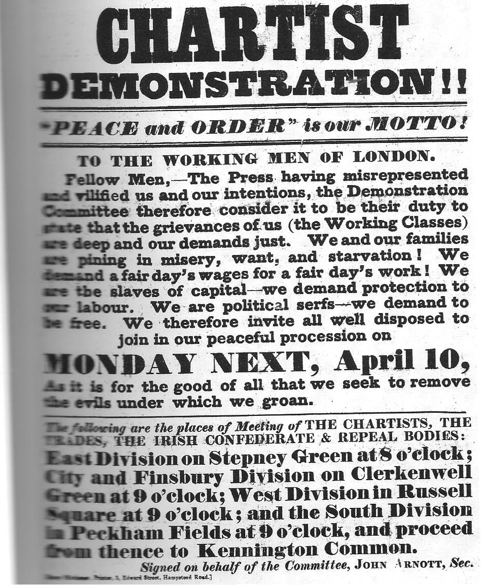
In typography, a slab serif (also called ''mechanistic'', ''square serif'', ''antique'' or ''Egyptian'') typeface is a type of serif typeface characterized by thick, block-like serifs. Serif terminals may be either blunt and angular ( Rockwell), or rounded (Courier). Slab serifs were introduced in the early nineteenth century. Slab serifs form a large and varied genre. Some such as Memphis and Rockwell have a geometric design with minimal variation in stroke width: they are sometimes described as sans-serif fonts with added serifs. Others such as those of the Clarendon genre have a structure more like most other serif fonts, though with larger and more obvious serifs. These designs may have bracketed serifs which increase width along their length before merging with the main strokes of the letters, while on geometrics the serifs have a constant width. Display-oriented slab serifs are often extremely bold, intended to grab the reader's attention on a poster, while slab serifs or ... [...More Info...] [...Related Items...] OR: [Wikipedia] [Google] [Baidu] |
Paul Barnes (designer)
Paul Barnes (born 1970, Harlow, England) is a graphic designer and typographer. He has designed several new typefaces. Career After an education at the University of Reading, in 1992 he emigrated to the United States to work with Roger Black. In 1995 he left Roger Black and began work as a freelance designer in London. He has worked with many large corporations, making logos for such well known companies as Givenchy, ABC television and the English bands New Order, Electronic and Joy Division. With Christian Schwartz he designed the very large Guardian Egyptian family typefaces for The Guardian newspaper and operates the digital type design company Commercial Type. In April 2007 he designed the logo for Kate Moss with Saville. Awards In September 2006 he was named one of the 40 most influential designers under 40 in '' Wallpaper'' and in September 2007 The Guardian named him one of the top 50 designers in Britain. Typefaces designed by Paul Barnes *Austin - 2003 *Brune ... [...More Info...] [...Related Items...] OR: [Wikipedia] [Google] [Baidu] |
Christian Schwartz
Christian Schwartz (born December 30, 1977 in Concord, New Hampshire, United States) is an American type designer. He has been awarded the German Design Award and the Prix Charles Peignot. Life A graduate of the Communication Design program at Carnegie Mellon University, Schwartz first worked at MetaDesign Berlin, developing typefaces for Volkswagen and logos for various corporations. He then returned to the US and joined the design staff at Font Bureau. Schwartz has worked independently in 2001, first forming Orange Italic with product designer Dino Sanchez and recently Schwartzco Inc. He has released commercial fonts with Village, FontFont, Emigre, House Industries and Font Bureau. Many of Schwartz’s typefaces have been proprietary designs for corporations such as Bosch and Deutsche Bahn, both with noted designer Erik Spiekermann, and EMI, for the marketing of George Harrison’s posthumous final album. Schwartz has also designed typefaces for many publications includi ... [...More Info...] [...Related Items...] OR: [Wikipedia] [Google] [Baidu] |
Mark Porter (designer)
Mark Porter (born 15 March 1960, Aberdeen, Scotland) is a British publication designer and art director, and former creative director of ''The Guardian''. Formerly he was the art director of the ''Evening Standard'', the UK edition of ''Wired'', and ''Colors''. He directed the redesign of ''The Guardian'', which was voted best-designed newspaper in the world by the US-based Society for News Design The Society for News Design (SND), formerly known as the Society of Newspaper Design, is an international organization for professionals working in the news sector of the media industry, specifically those involved with graphic design, illustration ... in 2006. References Scottish designers Living people 1960 births People from Aberdeen {{designer-stub ... [...More Info...] [...Related Items...] OR: [Wikipedia] [Google] [Baidu] |
The Guardian
''The Guardian'' is a British daily newspaper. It was founded in 1821 as ''The Manchester Guardian'', and changed its name in 1959. Along with its sister papers ''The Observer'' and ''The Guardian Weekly'', ''The Guardian'' is part of the Guardian Media Group, owned by the Scott Trust. The trust was created in 1936 to "secure the financial and editorial independence of ''The Guardian'' in perpetuity and to safeguard the journalistic freedom and liberal values of ''The Guardian'' free from commercial or political interference". The trust was converted into a limited company in 2008, with a constitution written so as to maintain for ''The Guardian'' the same protections as were built into the structure of the Scott Trust by its creators. Profits are reinvested in journalism rather than distributed to owners or shareholders. It is considered a newspaper of record in the UK. The editor-in-chief Katharine Viner succeeded Alan Rusbridger in 2015. Since 2018, the paper's main news ... [...More Info...] [...Related Items...] OR: [Wikipedia] [Google] [Baidu] |
Slab-serif
In typography, a slab serif (also called ''mechanistic'', ''square serif'', ''antique'' or ''Egyptian'') typeface is a type of serif typeface characterized by thick, block-like serifs. Serif terminals may be either blunt and angular ( Rockwell), or rounded (Courier). Slab serifs were introduced in the early nineteenth century. Slab serifs form a large and varied genre. Some such as Memphis and Rockwell have a geometric design with minimal variation in stroke width: they are sometimes described as sans-serif fonts with added serifs. Others such as those of the Clarendon genre have a structure more like most other serif fonts, though with larger and more obvious serifs. These designs may have bracketed serifs which increase width along their length before merging with the main strokes of the letters, while on geometrics the serifs have a constant width. Display-oriented slab serifs are often extremely bold, intended to grab the reader's attention on a poster, while slab serifs or ... [...More Info...] [...Related Items...] OR: [Wikipedia] [Google] [Baidu] |
Typeface
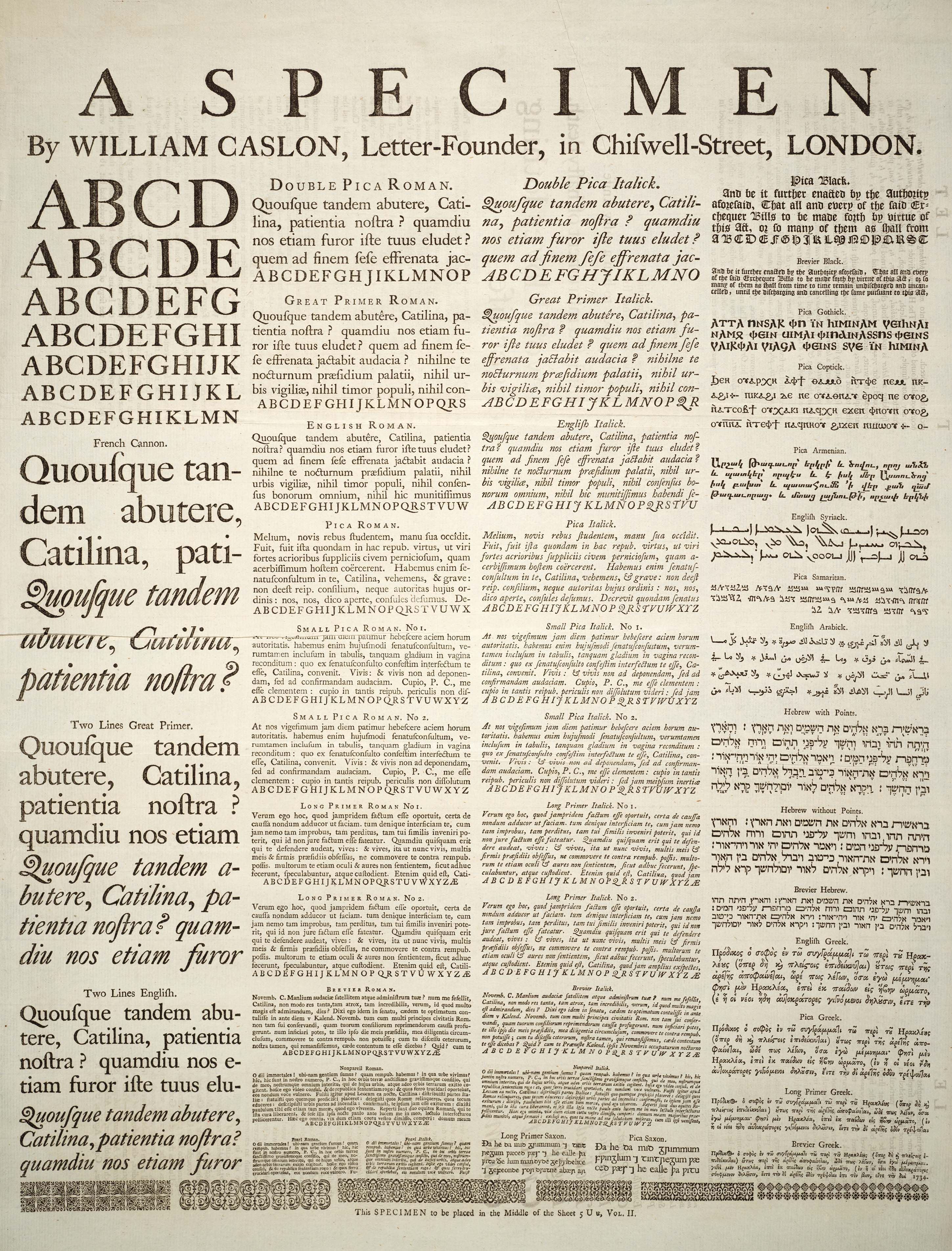
A typeface (or font family) is the design of lettering that can include variations in size, weight (e.g. bold), slope (e.g. italic), width (e.g. condensed), and so on. Each of these variations of the typeface is a font. There are list of typefaces, thousands of different typefaces in existence, with new ones being developed constantly. The art and craft of designing typefaces is called ''type design''. Designers of typefaces are called ''type designers'' and are often employed by ''type foundry, type foundries''. In desktop publishing, type designers are sometimes also called ''font developers'' or ''font designers''. Every typeface is a collection of glyphs, each of which represents an individual letter, number, punctuation mark, or other symbol. The same glyph may be used for character (symbol), characters from different scripts, e.g. Roman uppercase A looks the same as Cyrillic uppercase А and Greek uppercase alpha. There are typefaces tailored for special applications, s ... [...More Info...] [...Related Items...] OR: [Wikipedia] [Google] [Baidu] |
Newspaper
A newspaper is a periodical publication containing written information about current events and is often typed in black ink with a white or gray background. Newspapers can cover a wide variety of fields such as politics, business, sports and art, and often include materials such as opinion columns, weather forecasts, reviews of local services, obituaries, birth notices, crosswords, editorial cartoons, comic strips, and advice columns. Most newspapers are businesses, and they pay their expenses with a mixture of subscription revenue, newsstand sales, and advertising revenue. The journalism organizations that publish newspapers are themselves often metonymically called newspapers. Newspapers have traditionally been published in print (usually on cheap, low-grade paper called newsprint). However, today most newspapers are also published on websites as online newspapers, and some have even abandoned their print versions entirely. Newspapers developed in the 17th century ... [...More Info...] [...Related Items...] OR: [Wikipedia] [Google] [Baidu] |
Commercial Type
Commercial Type is a digital type foundry established in 2007 by type designers Paul Barnes and Christian Schwartz. Its work includes typefaces for ''The Guardian'', such as the Guardian Egyptian series, and other retail and commissioned typefaces. It created the open-source Roboto Serif typeface for Google and several of its typefaces are bundled with macOS macOS (; previously OS X and originally Mac OS X) is a Unix operating system developed and marketed by Apple Inc. since 2001. It is the primary operating system for Apple's Mac computers. Within the market of desktop and lapt .... References External links * * {{authority control Commercial type foundries Design companies established in 2007 Graphic design studios Companies based in Manhattan 2007 establishments in New York City ... [...More Info...] [...Related Items...] OR: [Wikipedia] [Google] [Baidu] |
Berliner (format)
Berliner, or "midi", is a newspaper format with pages normally measuring about . The Berliner format is slightly taller and marginally wider than the tabloid/compact format; and is both narrower and shorter than the broadsheet format. Origin The Berliner format is an innovation in press and an alternative to the broadsheet format. The name refers to the city of Berlin, and was originally contrasted with "North German" and "French" sizes in the early 20th century. European newspapers The Berliner format is used by many European newspapers, including dailies such as ''Le Monde'' and ''Le Figaro'' in France, ''Le Temps'' in Switzerland, ''La Repubblica'' and '' La Stampa'' in Italy, ''De Morgen'', ''Le Soir'' and '' Het Laatste Nieuws'' in Belgium, ''Oslobođenje'' in Bosnia, ''Mladá fronta Dnes'' and ''Lidové noviny'' in the Czech Republic, and others such as ''Expresso'' in Portugal and ''Jurnalul Național'' or ''Evenimentul Zilei'' in Romania. The French business newspap ... [...More Info...] [...Related Items...] OR: [Wikipedia] [Google] [Baidu] |
Masthead (British Publishing)
The nameplate (American English) or masthead (British English)The Guardian: ''Newspaper terminology'' Linked 2013-06-16 of a or is its designed title as it appears on the front page or cover. Another very common term for it in the newspaper industry is "the flag". It is part of the publication's ing, with a specific |
Font Family (HTML)
The font family selection in (X)HTML, CSS, and derived systems specifies a list of prioritized fonts and generic family names; in conjunction with correlating font properties, this list determines the particular font face used to render characters. The family selection is available in two forms: in the deprecated (X)HTML element with its attribute, and in the CSS property. The CSS term ''font family'' is matched with the typographical term ''typeface'', which is a grouping of fonts defined by shared design styles. A ''font'' is a particular set of ''glyphs'' (character shapes), differentiated from other fonts in the same family by additional properties such as stroke weight, slant, relative width, etc. The CSS term ''font face'' is matched with "font"; it is decided by a combination of the font family and the additional properties. In both HTML and CSS, the list is separated by commas. To avoid unexpected results, the last font family on the font list should be one of the ge ... [...More Info...] [...Related Items...] OR: [Wikipedia] [Google] [Baidu] |


.jpg)


