|
Colin Brignall
Colin Brignall (born 1942) is an English type designer and photographer. In addition to designing typefaces himself, he has worked as a type director and typographic consultant to Letraset and the International Typeface Corporation (ITC), selecting and overseeing other designers' typefaces. Early life and career Brignall was born in 1942 in Warwickshire. He began his career as a press photographer on Fleet Street in London, and in 1963 joined the type design studio Letraset as a photographic technician. While working at Letraset, he developed an interest in typography and began to design his own typefaces, despite having no formal training. He produced numerous typefaces for Letraset's dry transfer range beginning in the 1960s, including Aachen (1969), Premier Shaded (1970), Harlow (1977) and Superstar (1977). He later designed Italia (1977), Romic (1979), Corinthian (1981) and Edwardian (1983), which were designed for use in text rather than display, in contrast to his earlier work ... [...More Info...] [...Related Items...] OR: [Wikipedia] [Google] [Baidu] |
Type Designer
Type design is the art and process of designing typefaces. This involves drawing each letterform using a consistent style. The basic concepts and design variables are described below. A typeface differs from other modes of graphic production such as handwriting and drawing in that it is a fixed set of alphanumeric characters with specific characteristics to be used repetitively. Historically, these were physical elements, called sorts, placed in a wooden frame; modern typefaces are stored and used electronically. It is the art of a type designer to develop a pleasing and functional typeface. In contrast, it is the task of the typographer (or typesetter) to lay out a page using a typeface that is appropriate to the work to be printed or displayed. History The technology of printing text using movable type was invented in China, but the vast number of Chinese characters, and the esteem with which calligraphy was held, meant that few distinctive, complete typefaces were created ... [...More Info...] [...Related Items...] OR: [Wikipedia] [Google] [Baidu] |
Letraset
Letraset was a company known mainly for manufacturing sheets of typefaces and other artwork elements using the dry transfer method. Letraset has been acquired by the Colart group and become part of its subsidiary Winsor & Newton. Corporate history Letraset was founded in London in 1959, with the launch of the Letraset Type Lettering System. In 1961, Letraset came out with their dry transfer lettering system, which pioneered the technique. Starting in 1964, Letraset also applied the dry rub-down transfer technique to create a children's game called Action Transfers, which would later develop into Kalkitos (marketed by Gillette) and many other series of transferable figures that were very popular up to the 1980s.LETRASET was squired by the Swedish stationary company Esselte until 2000 when it was sold to a Management buyout headed up by Martin Gibbs and Michael Travers. Eventually sold to ColArt in 2012. Seeing a decline in the sales of its materials in the early 1990s, Letrase ... [...More Info...] [...Related Items...] OR: [Wikipedia] [Google] [Baidu] |
International Typeface Corporation
The International Typeface Corporation (ITC) was a type manufacturer founded in New York in 1970 by Aaron Burns, Herb Lubalin and Edward Rondthaler. The company was one of the world's first type foundries to have no history in the production of metal type. It is now a wholly owned brand or subsidiary of Monotype Imaging. History The company was founded to design, license and market typefaces for filmsetting and computer set types internationally. The company issued both new designs and revivals of older or classic faces, invariably re-cut to be suitable for digital typesetting use and produced in families of different weights. Although it is claimed that the designers took care to preserve the style and character of the original typefaces, several ITC revivals, such as ITC Bookman and ITC Garamond in particular, have received criticism that the end result was related in name only to the original faces. Among the company's notable type designers was Ed Benguiat, the creator of Tif ... [...More Info...] [...Related Items...] OR: [Wikipedia] [Google] [Baidu] |
Warwickshire
Warwickshire (; abbreviated Warks) is a county in the West Midlands region of England. The county town is Warwick, and the largest town is Nuneaton. The county is famous for being the birthplace of William Shakespeare at Stratford-upon-Avon and Victorian novelist George Eliot, (born Mary Ann Evans), at Nuneaton. Other significant towns include Rugby, Leamington Spa, Bedworth, Kenilworth and Atherstone. The county offers a mix of historic towns and large rural areas. It is a popular destination for international and domestic tourists to explore both medieval and more recent history. The county is divided into five districts of North Warwickshire, Nuneaton and Bedworth, Rugby, Warwick and Stratford-on-Avon. The current county boundaries were set in 1974 by the Local Government Act 1972. The historic county boundaries included Coventry, Sutton Coldfield and Solihull, as well as much of Birmingham and Tamworth. Geography Warwickshire is bordered by Leicestershire to the nort ... [...More Info...] [...Related Items...] OR: [Wikipedia] [Google] [Baidu] |
Press Photographer
Photojournalism is journalism that uses images to tell a news story. It usually only refers to still images, but can also refer to video used in broadcast journalism. Photojournalism is distinguished from other close branches of photography (such as documentary photography, social documentary photography, war photography, street photography and celebrity photography) by having a rigid ethical framework which demands an honest but impartial approach that tells a story in strictly journalistic terms. Photojournalists contribute to the news media, and help communities connect with one other. They must be well-informed and knowledgeable, and are able to deliver news in a creative manner that is both informative and entertaining. Similar to a writer, a photojournalist is a reporter, but they must often make decisions instantly and carry photographic equipment, often while exposed to significant obstacles, among them immediate physical danger, bad weather, large crowds, and limited phy ... [...More Info...] [...Related Items...] OR: [Wikipedia] [Google] [Baidu] |
Fleet Street
Fleet Street is a major street mostly in the City of London. It runs west to east from Temple Bar at the boundary with the City of Westminster to Ludgate Circus at the site of the London Wall and the River Fleet from which the street was named. The street has been an important through route since Roman times. During the Middle Ages, businesses were established and senior clergy lived there; several churches remain from this time including Temple Church and St Bride's. The street became known for printing and publishing at the start of the 16th century, and it became the dominant trade so that by the 20th century most British national newspapers operated from here. Much of that industry moved out in the 1980s after News International set up cheaper manufacturing premises in Wapping, but some former newspaper buildings are listed and have been preserved. The term ''Fleet Street'' remains a metonym for the British national press, and pubs on the street once frequented by jo ... [...More Info...] [...Related Items...] OR: [Wikipedia] [Google] [Baidu] |
Type Directors Club
The Type Directors Club (TDC) is an international organization devoted to typography and type design, founded in 1946 in New York City. TDC believes that type drives culture, and that culture drives type—and is dedicated to cataloging, showcasing, and exhibiting typography worldwide. Founding member Milton Zudek described the club's goals at their first exhibit opening in 1947: Timeline 1943: The club was started as an unofficial gathering in 1943. Founding member Milton Zudeck described the club’s goals: “We simply want to make more and more advertising people aware of the important of the agency typographer. We want them to realize that the selection of type for an advertisement demands a sixth sense that goes beyond the basic knowledge of typefaces.” 1946: The Type Directors Club organization was formed by several leading NY art directors, including Aaron Burns, Louis Dorfsman and Milton Zudeck. 1960: The TDC was composed of men for many years until 1960 when ... [...More Info...] [...Related Items...] OR: [Wikipedia] [Google] [Baidu] |
Dry Transfer
Dry transfers (also called rub-ons or rubdowns) are decals that can be applied without the use of water or other solvent. The decal itself is on a backing material such as paper or plastic sheeting much like a transparency. The dry transfer is placed in the desired location with the backing side up. The decal is then applied by burnishing the backing with a stylus or similar object such as a ballpoint pen. The contact side of the decal includes a pressure-sensitive adhesive; the combination of heat and pressure causes the decal to stick more strongly to the new surface than to the backing. When the backing is removed, the decal remains. This allows for ink only where needed even if the pattern is delicate, because the backing supports the decal while it is being applied. Dry transfers are used in manual technical drawing when standard graphic elements such as title blocks, forms, patterned lines, shading, piping or electronic schematic symbols need to be repetitively used. Use ... [...More Info...] [...Related Items...] OR: [Wikipedia] [Google] [Baidu] |
Harlow (typeface)
Harlow is a typeface intended for display use. Designed by Colin Brignall and originally published by Letraset, it is inspired by lettering in the Streamline Moderne style of the 1930s and 1940s. The solid weight, sometimes named Harlow Solid Italic, is included with Microsoft software such as Microsoft Office Microsoft Office, or simply Office, is the former name of a family of client software, server software, and services developed by Microsoft. It was first announced by Bill Gates on August 1, 1988, at COMDEX in Las Vegas. Initially a marketin .... A shadowed weight is sold commercially by ITC. References {{reflist, 30em Microsoft typefaces Display typefaces Letraset typefaces ... [...More Info...] [...Related Items...] OR: [Wikipedia] [Google] [Baidu] |
Charles Rennie Mackintosh
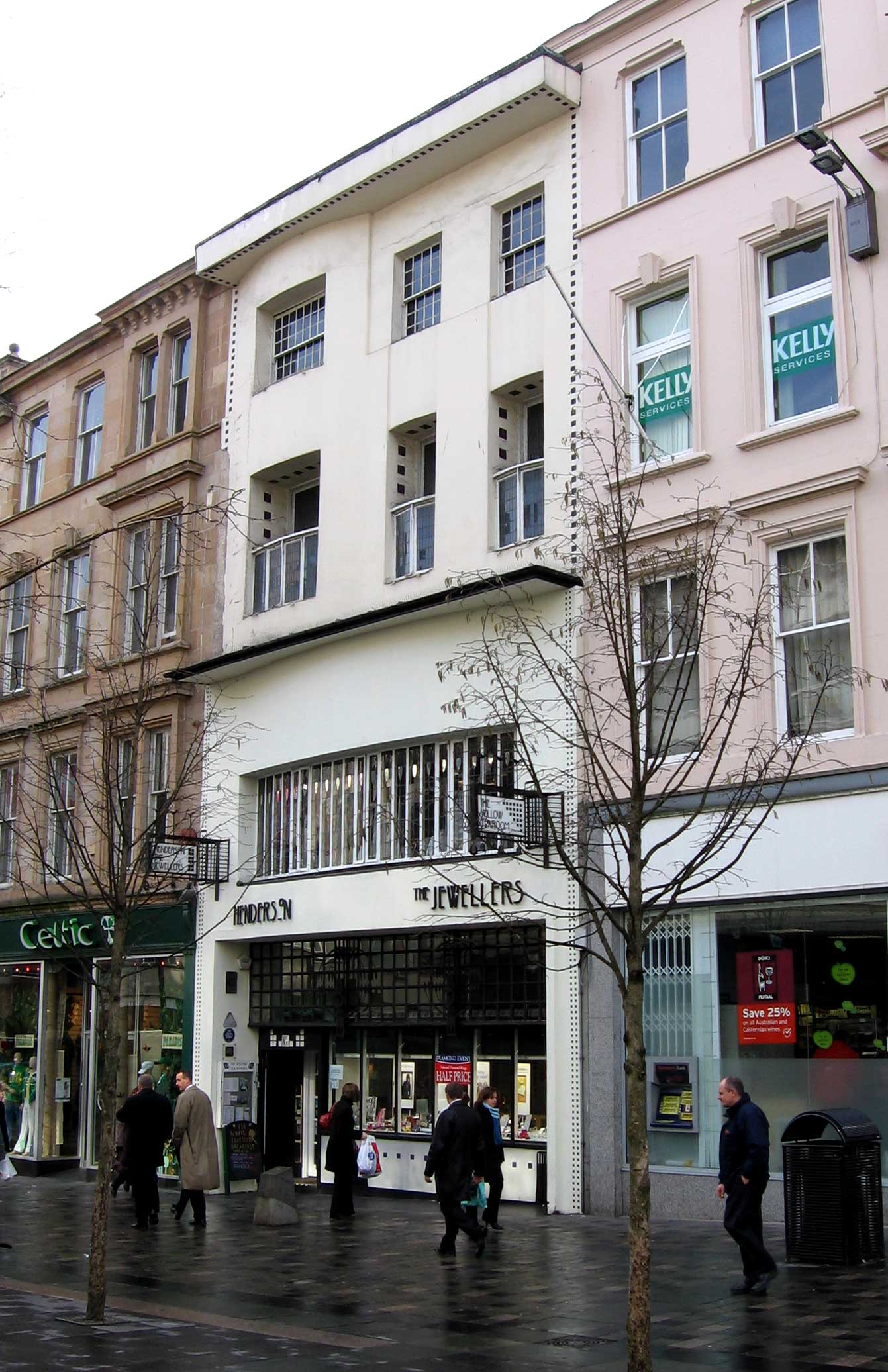
Charles Rennie Mackintosh (7 June 1868 – 10 December 1928) was a Scottish architect, designer, water colourist and artist. His artistic approach had much in common with European Symbolism. His work, alongside that of his wife Margaret Macdonald, was influential on European design movements such as Art Nouveau and Secessionism and praised by great modernists such as Josef Hoffmann. Mackintosh was born in Glasgow and died in London. He is among the most important figures of Modern Style (British Art Nouveau style). Early life and education Charles Rennie Mackintosh was born at 70 Parson Street, Townhead, Glasgow, on 7 June 1868, the fourth of eleven children and second son of William McIntosh, a superintendent and chief clerk of the City of Glasgow Police. He attended Reid's Public School and the Allan Glen's Institution from 1880 to 1883. William's wife Margaret Mackintosh née 'Rennie' grew up in the Townhead and Dennistoun (Firpark Terrace) areas of Glasgow. Name He cha ... [...More Info...] [...Related Items...] OR: [Wikipedia] [Google] [Baidu] |
Golden Cockerel Press
The Golden Cockerel Press was an English fine press operating between 1920 and 1961. History The private press made handmade limited editions of classic works. The type was hand-set and the books were printed on handmade paper, and sometimes on vellum. A feature of Golden Cockerel books was the original illustrations, usually wood engravings, contributed by artists including Eric Gill, Robert Gibbings, Peter Claude Vaudrey Barker-Mill, John Buckland Wright, Blair Hughes-Stanton, Agnes Miller Parker, David Jones, Mark Severin, Dorothea Braby, Lettice Sandford, Gwenda Morgan, Mary Elizabeth Groom and Eric Ravilious. Hal Taylor's foundation (1920–1924) The Golden Cockerel Press was founded by Harold (Hal) Midgley Taylor (1893–1925) in 1920 and was first in Waltham St Lawrence in Berkshire where he had unsuccessfully tried fruit farming. Taylor bought an army surplus hut and assembled it in Waltham St Lawrence as a combined workshop and living quarters. The Press was set ... [...More Info...] [...Related Items...] OR: [Wikipedia] [Google] [Baidu] |
Caslon
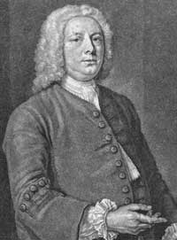
Caslon is the name given to serif typefaces designed by William Caslon I (c. 1692–1766) in London, or inspired by his work. Caslon worked as an engraver of punches, the masters used to stamp the moulds or matrices used to cast metal type. He worked in the tradition of what is now called old-style serif letter design, that produced letters with a relatively organic structure resembling handwriting with a pen. Caslon established a tradition of engraving type in London, which previously had not been common, and was influenced by the imported Dutch Baroque typefaces that were popular in England at the time. His typefaces established a strong reputation for their quality and their attractive appearance, suitable for extended passages of text. The letterforms of Caslon's roman, or upright type include an "A" with a concave hollow at top left and a "G" without a downwards-pointing spur at bottom right. The sides of the "M" are straight. The "W" has three terminals at the top ... [...More Info...] [...Related Items...] OR: [Wikipedia] [Google] [Baidu] |


.jpg)
