|
Amiri (typeface)
Amiri ( ar, أميري) is a naskh typeface for Arabic script designed by Khaled Hosny. The beta was released December 2011. As of October 22, 2019, it is hosted on 67,000 websites, and is served by the Google Fonts API approximately 74.8 million times per week. Inspiration Amiri is a revival of a naskh typeface pioneered by the Bulaq Press (), also called ''al-Mataabi' al-Amiriya'' (), in 1905. It was famously used to print the Cairo edition, one of the first typographically-composed printed editions of the Quran to be certified by an Islamic authority—Al-Azhar—in 1924. On the 1905 typeface and of challenges of digitizing Arabic script, Dr. Hosny wrote: "One of the most novel features of the Bulaq typeface is maintaining the aesthetics of Naskh calligraphy while meeting the requirements (and limitations) of typesetting, a balance that is not easily achieved." The Amiri project was supported by Google Web Fonts, TeX Users Group, and donations from users. Features Amir ... [...More Info...] [...Related Items...] OR: [Wikipedia] [Google] [Baidu] |
Naskh (script)
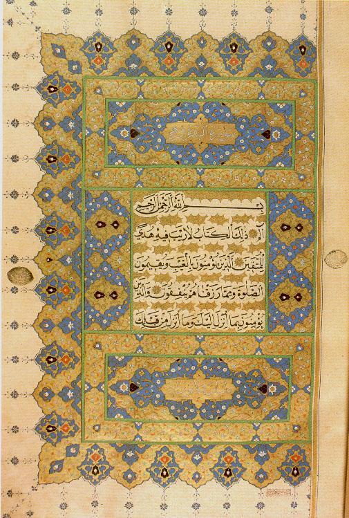
Naskh ( ar, , qalam an-naskh, from the verb , , 'to copy', from n-s-kh root (ن-س-خ)) is a smaller, round script of Islamic calligraphy. Naskh is one of the first scripts of Islamic calligraphy to develop, commonly used in writing administrative documents and for transcribing books, including the Qur’an, because of its easy legibility. In his 1617 ''Grammatica Arabica'', Thomas van Erpe defined naskhī characters as the "noblest and true writing style". Origin Naskh style of writing can be found as early as within the first century of the Islamic calendar. Round scripts became the most popular in the eleventh, twelfth and thirteenth centuries, due to their use by scribes. Ibn Muqla is credited with standardizing the "Six Pens" of Islamic calligraphy, also including , , , , and . These are known as "the proportioned scripts" () or "the six scripts" (). Kufic is commonly believed to predate naskh, but historians have traced the two scripts as coexisting long before their ... [...More Info...] [...Related Items...] OR: [Wikipedia] [Google] [Baidu] |
Orthographic Ligature
In writing and typography, a ligature occurs where two or more graphemes or letters are joined to form a single glyph. Examples are the characters æ and œ used in English and French, in which the letters 'a' and 'e' are joined for the first ligature and the letters 'o' and 'e' are joined for the second ligature. For stylistic and legibility reasons, 'f' and 'i' are often merged to create 'fi' (where the tittle on the 'i' merges with the hood of the 'f'); the same is true of 's' and 't' to create 'st'. The common ampersand (&) developed from a ligature in which the handwritten Latin letters 'E' and 't' (spelling , Latin for 'and') were combined. History The earliest known script Sumerian cuneiform and Egyptian hieratic both include many cases of character combinations that gradually evolve from ligatures into separately recognizable characters. Other notable ligatures, such as the Brahmic abugidas and the Germanic bind rune, figure prominently throughout ancient manus ... [...More Info...] [...Related Items...] OR: [Wikipedia] [Google] [Baidu] |
Vim (text Editor)
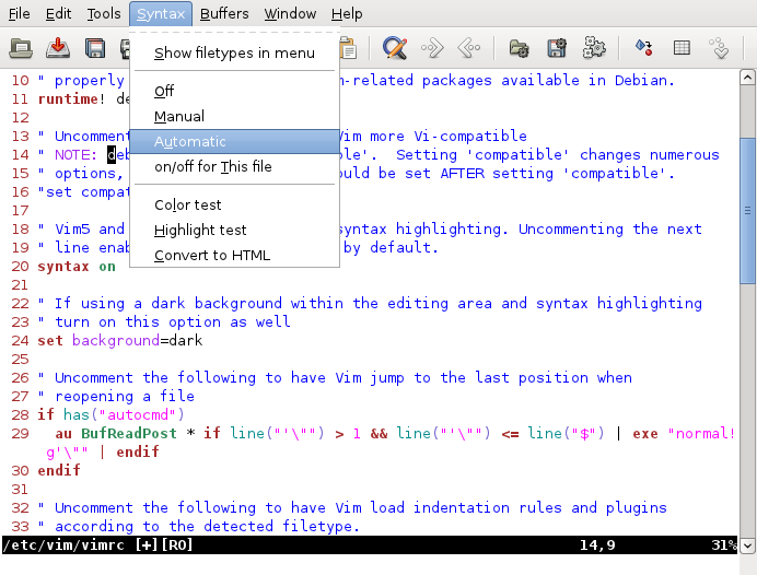
Vim (; "Vim is pronounced as one word, like Jim, not vi-ai-em. It's written with a capital, since it's a name, again like Jim." a contraction of ''Vi IMproved'') is a free and open-source, program. It is an improved clone of 's vi. Vim's author, Bram Moolenaar, derived Vim from a port of the [...More Info...] [...Related Items...] OR: [Wikipedia] [Google] [Baidu] |
Python (programming Language)
Python is a high-level, general-purpose programming language. Its design philosophy emphasizes code readability with the use of significant indentation. Python is dynamically-typed and garbage-collected. It supports multiple programming paradigms, including structured (particularly procedural), object-oriented and functional programming. It is often described as a "batteries included" language due to its comprehensive standard library. Guido van Rossum began working on Python in the late 1980s as a successor to the ABC programming language and first released it in 1991 as Python 0.9.0. Python 2.0 was released in 2000 and introduced new features such as list comprehensions, cycle-detecting garbage collection, reference counting, and Unicode support. Python 3.0, released in 2008, was a major revision that is not completely backward-compatible with earlier versions. Python 2 was discontinued with version 2.7.18 in 2020. Python consistently ranks as ... [...More Info...] [...Related Items...] OR: [Wikipedia] [Google] [Baidu] |
Inkscape
Inkscape is a free and open-source vector graphics editor used to create vector images, primarily in Scalable Vector Graphics (SVG) format. Other formats can be imported and exported. Inkscape can render primitive vector shapes (e.g. rectangles, ellipses, polygons, arcs, spirals, stars and 3D boxes) and text. These objects may be filled with solid colors, patterns, radial or linear color gradients and their borders may be stroked, both with adjustable transparency. Embedding and optional tracing of raster graphics is also supported, enabling the editor to create vector graphics from photos and other raster sources. Created shapes can be further manipulated with transformations, such as moving, rotating, scaling and skewing. History Inkscape began in 2003 as a code fork of the Sodipodi project. Sodipodi, developed since 1999, was itself based on Raph Levien's Gill (GNOME Illustration Application). One of the main priorities of the Inkscape project was interface consistency an ... [...More Info...] [...Related Items...] OR: [Wikipedia] [Google] [Baidu] |
Hindu–Arabic Numeral System
The Hindu–Arabic numeral system or Indo-Arabic numeral system Audun HolmeGeometry: Our Cultural Heritage 2000 (also called the Hindu numeral system or Arabic numeral system) is a positional decimal numeral system, and is the most common system for the symbolic representation of numbers in the world. It was invented between the 1st and 4th centuries by Indian mathematicians. The system was adopted in Arabic mathematics by the 9th century. It became more widely known through the writings of the Persian mathematician Al-Khwārizmī: "Historians have speculated on al-Khwarizmi's native language. Since he was born in a former Persian province, he may have spoken the Persian language. It is also possible that he spoke Khwarezmian, a language of the region that is now extinct." (''On the Calculation with Hindu Numerals'', ) and Arab mathematician Al-Kindi (''On the Use of the Hindu Numerals'', ). The system had spread to medieval Europe by the High Middle Ages. The system is base ... [...More Info...] [...Related Items...] OR: [Wikipedia] [Google] [Baidu] |
Text Figures
Text figures (also known as non-lining, lowercase, old style, ranging, hanging, medieval, billing, or antique figures or numerals) are numerals designed with varying heights in a fashion that resembles a typical line of running text, hence the name. They are contrasted with lining figures (also called titling or modern figures), which are the same height as upper-case letters. Georgia is an example of a popular typeface that employs text figures by default. Design In text figures, the shape and positioning of the numerals vary as those of lowercase letters do. In the most common scheme, '' 0'', '' 1'', and '' 2'' are of x-height, having neither ascenders nor descenders; '' 6'' and '' 8'' have ascenders; and '' 3'', '' 4'', '' 5'', '' 7'', and '' 9'' have descenders. Other schemes exist; for example, the types cut by the Didot family of punchcutters and typographers in France between the late 18th and early 19th centuries typically had an ascending ''3'' and ''5'', a form pr ... [...More Info...] [...Related Items...] OR: [Wikipedia] [Google] [Baidu] |
āyah
An Ayah ( ar, آية, ʾĀyah, ; ) is a "verse" in the Quran, one of the statements of varying length that make up the chapters (''surah'') of the Quran and are marked by a number. In the Quranic context the word means "evidence," "sign" or "miracle," and in Islam may refer to things other than Quranic verses, such as religious obligations (''ayat taklifiyyah'') or cosmic phenomena (''ayat takwiniyyah''). In the Quran it is referred to in several verses such as: Overview of the meaning Although meaning "verse" when using the Quran, it is doubtful whether "''ayah''" means anything other than "sign," "proof," or "remarkable event" in the Quran's text. The "signs" refer to various phenomena, ranging from the universe, its creation, the alternation between day and night, rainfall, and the life and growth of plants. Other references are to miracles or to the rewards of belief and the fate of unbelievers. For example: : "And of his signs is the creation of the heavens and earth ... [...More Info...] [...Related Items...] OR: [Wikipedia] [Google] [Baidu] |
Kerning
In typography, kerning is the process of adjusting the spacing between Character (symbol), characters in a Typeface#Proportion, proportional font, usually to achieve a visually pleasing result. Kerning adjusts the space between individual letterforms, while Letter-spacing, tracking (letter-spacing) adjusts spacing uniformly over a range of characters. In a well-kerned font, the two-dimensional blank spaces between each pair of characters all have a visually similar area. The term "keming" is sometimes used informally to refer to poor kerning (the letters r and n placed too close together being easily mistaken for the letter m). The related term ''kern'' denotes a part of a type letter that overhangs the edge of the Movable type, type block. Metal typesetting The source of the word ''kern'' is from the French word , meaning "projecting angle, quill of a pen". The French term originated from the Latin , , meaning "hinge". In the days when all type was cast metal, the parts ... [...More Info...] [...Related Items...] OR: [Wikipedia] [Google] [Baidu] |
OpenType
OpenType is a format for scalable computer fonts. It was built on its predecessor TrueType, retaining TrueType's basic structure and adding many intricate data structures for prescribing typographic behavior. OpenType is a registered trademark of Microsoft Corporation. The specification germinated at Microsoft, with Adobe Systems also contributing by the time of the public announcement in 1996. Because of wide availability and typographic flexibility, including provisions for handling the diverse behaviors of all the world's writing systems, OpenType fonts are used commonly on major computer platforms. History OpenType's origins date to Microsoft's attempt to license Apple's advanced typography technology GX Typography in the early 1990s. Those negotiations failed, motivating Microsoft to forge ahead with its own technology, dubbed "TrueType Open" in 1994. Adobe joined Microsoft in those efforts in 1996, adding support for the glyph outline technology used in its Type 1 fonts ... [...More Info...] [...Related Items...] OR: [Wikipedia] [Google] [Baidu] |
SIL Open Font License
The SIL Open Font License (or OFL in short) is one of the major open font licenses, which allows embedding, or "bundling", of the font in commercially sold products. OFL is a free and open source license. It was created by SIL International, the organization behind ''Ethnologue.'' History The Open Font License was created by SIL International employees Victor Gaultney and Nicolas Spalinger. Gaultney had previously designed the Gentium font and was unsatisfied with existing font licenses. The Open Font License was designed for use with many of SIL's Unicode fonts, including Gentium Plus, Charis SIL, and Andika. The license was in a "public review" stage between 2005 and 2007 and version 1.1 was published in February 2007. Prior to the release of the OFL, the Bitstream Vera fonts had been released in 2003 under most of the same terms and conditions. Open-source fonts are a popular choice among designers, and most open-source fonts utilize the Open Font License. For ex ... [...More Info...] [...Related Items...] OR: [Wikipedia] [Google] [Baidu] |


