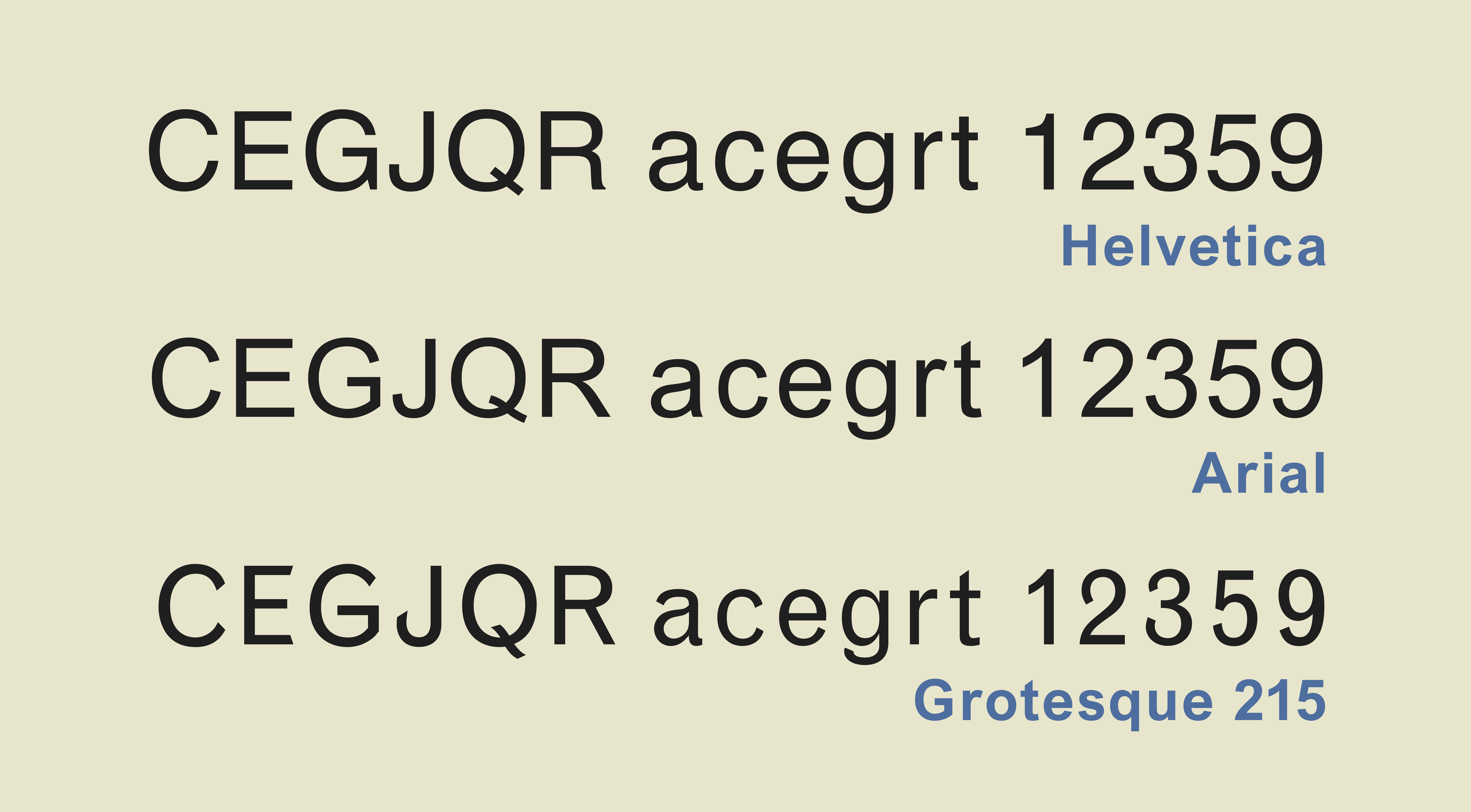
|
Helvetica
Helvetica, also known by its original name Neue Haas Grotesk, is a widely-used sans-serif typeface developed in 1957 by Swiss typeface designer Max Miedinger and Eduard Hoffmann. Helvetica is a neo-grotesque design, one influenced by the famous 19th-century (1890s) typeface Akzidenz-Grotesk and other German and Swiss designs. Its use became a hallmark of the International Typographic Style that emerged from the work of Swiss designers in the 1950s and 1960s, becoming one of the most popular typefaces of the mid-20th century. Over the years, a wide range of variants have been released in different weights, widths, and sizes, as well as matching designs for a range of non-Latin alphabets. Notable features of Helvetica as originally designed include a high x-height, the termination of strokes on horizontal or vertical lines and an unusually tight spacing between letters, which combine to give it a dense, solid appearance. Developed by the ''Haas'sche Schriftgiesserei'' ( Haa ... [...More Info...] [...Related Items...] OR: [Wikipedia] [Google] [Baidu] |
Akzidenz-Grotesk
Akzidenz-Grotesk is a sans-serif typeface family originally released by the Berthold Type Foundry of Berlin in 1898. ' indicates its intended use as a typeface for commercial print runs such as publicity, tickets and forms, as opposed to fine press, fine printing, and "grotesque" was a standard name for sans-serif typefaces at the time. Originating during the late nineteenth century, Akzidenz-Grotesk belongs to a tradition of general-purpose, unadorned sans-serif types that had become dominant in German printing during the nineteenth century. Relatively little-known for a half-century after its introduction, it achieved iconic status in the post-war period as the preferred typeface of many Switzerland, Swiss graphic designers in what became called the International Typographic Style, "International" or "Swiss" design style which became popular across the Western world in the 1950s and 1960s. Its simple, neutral design has also influenced many later typefaces. It has sometimes bee ... [...More Info...] [...Related Items...] OR: [Wikipedia] [Google] [Baidu] |
Arial
Arial is a sans-serif typeface in the Sans-serif#Neo-grotesque, neo-grotesque style. Fonts from the Arial family are included with all versions of Microsoft Windows after Windows 3.1, as well as in other Microsoft programs, Apple's macOS, and many PostScript#PostScript 3, PostScript 3 Computer printer, printers. In Office 2007, Arial was replaced by Calibri as the default typeface in Microsoft PowerPoint, PowerPoint, Microsoft Excel, Excel, and Microsoft Outlook, Outlook. The typeface was designed in 1982 by Robin Nicholas and Patricia Saunders, for Monotype Corporation, Monotype Typography. It is metrically compatible with Helvetica, enabling documents to use either typeface without affecting the visual layout. Because of their similar appearance, Arial and Helvetica are commonly mistaken for each other. Etymology The name Arial was derived from the word "aerial", introduced as a trademark by Monotype. Design characteristics Embedded in version 3.0 of the OpenType version ... [...More Info...] [...Related Items...] OR: [Wikipedia] [Google] [Baidu] |
Max Miedinger
Max Miedinger (24 December 1910 – 8 March 1980) was a Swiss typeface designer, best known for creating the ''Neue Haas Grotesk'' typeface in 1957, renamed Helvetica in 1960. Marketed as a symbol of cutting-edge Swiss technology, Helvetica achieved immediate global success. Between 1926 and 1930 Miedinger trained as a typesetter in Zurich, after which he attended evening classes at the Kunstgewerbeschule Zürich. By the time Miedinger died in 1980, his Helvetica idea, for which the company Linotype paid him royalties until the time of his death, had become a huge part of the typographical landscape. Early career From the age of 16, from 1926 to 1930, Miedinger apprenticed as a typographic composer with the printer Jacques Bollmann in Zurich. After completing his apprenticeship, he worked from 1930 to 1936 for various companies, while attending evening classes at the Kunstgewerbeschule Zürich, Kunstgewerbeschule in Zurich. At 26 he went to work as a typographer in the advert ... [...More Info...] [...Related Items...] OR: [Wikipedia] [Google] [Baidu] |
Univers
Univers () is a sans-serif typeface family designed by Adrian Frutiger and released by his employer Deberny & Peignot in 1957. Classified as a Grotesque (typeface classification), neo-grotesque sans-serif, one based on the model of nineteenth-century German typefaces such as Akzidenz-Grotesk, it was notable for its availability from the moment of its launch in a comprehensive range of weights and widths. The original marketing for Univers deliberately referenced the periodic table to emphasise its scope. Univers was one of the first typeface families to fulfil the idea that a typeface should form a family of consistent, related designs. Past sans-serif designs such as Gill Sans had much greater differences between weights, while loose families such as American Type Founders' Franklin Gothic family often were advertised under different names for each style, to emphasise that they were not completely matching. By creating a matched range of styles and weights, Univers allowed docume ... [...More Info...] [...Related Items...] OR: [Wikipedia] [Google] [Baidu] |
Sans-serif
In typography and lettering, a sans-serif, sans serif (), gothic, or simply sans letterform is one that does not have extending features called "serifs" at the end of strokes. Sans-serif typefaces tend to have less stroke width variation than serif typefaces. They are often used to convey simplicity and Modern typography, modernity or minimalism. For the purposes of type classification, sans-serif designs are usually divided into these major groups: , , , , and . Sans-serif typefaces have become the most prevalent for display of text on computer screens. On lower-resolution digital displays, fine details like serifs may disappear or appear too large. The term comes from the French word , meaning "without" and "serif" of uncertain origin, possibly from the Dutch word meaning "line" or pen-stroke. In printed media, they are more commonly used for Display typeface, display use and less for body text. Before the term "sans-serif" became standard in English typography, a number of ... [...More Info...] [...Related Items...] OR: [Wikipedia] [Google] [Baidu] |
Haas Type Foundry
Haas Type Foundry (''Haas'sche Schriftgiesserei'') was a Swiss manufacturer of foundry type. First the factory was located in Basel Basel ( ; ), also known as Basle ( ), ; ; ; . is a city in northwestern Switzerland on the river Rhine (at the transition from the High Rhine, High to the Upper Rhine). Basel is Switzerland's List of cities in Switzerland, third-most-populo ..., in the 1920s they relocated to Münchenstein. History Haas traces its origins back to the printer Jean Exertier who began casting type during the second half of the 16th century, later passing to the Genath family. In 1718, Johann Wilhelm Haas (1698–1764) from Nuremberg was hired. He later inherited the company as recognition of his efforts. After 1740, the business was run under the Haas name. In 1927 the Stempel Foundry acquired a shareholding in the Haas foundry and the two foundries begin to share matrices. Haas purchased the French foundries Deberny & Peignot in 1972, and Fonderie Olive ... [...More Info...] [...Related Items...] OR: [Wikipedia] [Google] [Baidu] |
Paul Shaw (design Historian)
Paul Shaw is an American designer, calligrapher and historian of design who lives in New York City. He has written a book on the history of the design of the New York City Subway The New York City Subway is a rapid transit system in New York City serving the New York City boroughs, boroughs of Manhattan, Brooklyn, Queens, and the Bronx. It is owned by the government of New York City and leased to the New York City Tr ... system, ''Helvetica and the New York Subway System: The True (Maybe) Story'', on the work of William Addison Dwiggins, and for ''Print'' magazine. His book on the New York subway is known as one of the best modern design books. He received the annual SoTA Typography Award of 2019. Paul Shaw is Editor-in-Chief of Codex, Journal of Letterforms and The Eternal Letter Design. His work has won awards from the AIGA Directors Club and the Art Directors Club of New York. References External links *Helvetica and the New York City Subway System(book website ... [...More Info...] [...Related Items...] OR: [Wikipedia] [Google] [Baidu] |
Typeface Family
A typeface (or font family) is a design of letters, numbers and other symbols, to be used in printing or for electronic display. Most typefaces include variations in size (e.g., 24 point), weight (e.g., light, bold), slope (e.g., italic), width (e.g., condensed), and so on. Each of these variations of the typeface is a font. There are thousands of different typefaces in existence, with new ones being developed constantly. The art and craft of designing typefaces is called type design. Designers of typefaces are called type designers and are often employed by type foundries. In desktop publishing, type designers are sometimes also called "font developers" or "font designers" (a typographer is someone who ''uses'' typefaces to design a page layout). Every typeface is a collection of glyphs, each of which represents an individual letter, number, punctuation mark, or other symbol. The same glyph may be used for characters from different writing systems, e.g. Roman uppercase A ... [...More Info...] [...Related Items...] OR: [Wikipedia] [Google] [Baidu] |
Typeface
A typeface (or font family) is a design of Letter (alphabet), letters, Numerical digit, numbers and other symbols, to be used in printing or for electronic display. Most typefaces include variations in size (e.g., 24 point), weight (e.g., light, bold), slope (e.g., italic), width (e.g., condensed), and so on. Each of these variations of the typeface is a font. There are list of typefaces, thousands of different typefaces in existence, with new ones being developed constantly. The art and craft of designing typefaces is called type design. Designers of typefaces are called type designers and are often employed by type foundry, type foundries. In desktop publishing, type designers are sometimes also called "font developers" or "font designers" (a typographer is someone who ''uses'' typefaces to design a page layout). Every typeface is a collection of glyphs, each of which represents an individual letter, number, punctuation mark, or other symbol. The same glyph may be used for ch ... [...More Info...] [...Related Items...] OR: [Wikipedia] [Google] [Baidu] |
Helvetia
Helvetia () is a national personification of Switzerland, officially , the Swiss Confederation. The allegory is typically pictured in a flowing clothing, with a spear and a shield emblazoned with the Flag of Switzerland, Swiss flag, and commonly with braided hair and a wreath as a symbol of confederation. The name is a derivation of the ethnonym , the name of the Gauls, Gaulish tribe inhabiting the Swiss Plateau before the Switzerland in the Roman era, Roman conquest. History The fashion of depicting the Swiss Confederacy in terms of female allegories arose in the 17th century. This replaced an earlier convention, popular in the 1580s, of representing Switzerland as a bull (). In the first half of the 17th century, no single allegory was identified as ''Helvetia''. Rather, several allegories represented both virtues and vices of the confederacy. On the title page of his 1642 ''Topographia'', Matthäus Merian the Elder, Matthäus Merian depicted two allegorical figures seate ... [...More Info...] [...Related Items...] OR: [Wikipedia] [Google] [Baidu] |
International Typographic Style
The International Typographic Style is a systemic approach to graphic design that emerged during the 1930s–1950s but continued to develop internationally. It is considered the basis of the Swiss style. It expanded on and formalized the modernist typographic innovations of the 1920s that emerged in part out of art movements such as Constructivism (Russia), De Stijl (The Netherlands) and at the Bauhaus (Germany). The International Typographic Style has had profound influence on graphic design as a part of the modernist movement, impacting many design-related fields including architecture and art. It emphasizes simplicity, clarity, readability, and objectivity. Hallmarks of the style are asymmetric layouts, use of a grid, sans-serif typefaces like Akzidenz Grotesk and Helvetica, and flush left, ragged right text. The style is also associated with a preference for photography in place of illustrations or drawings. Many of the early International Typographic Style works featu ... [...More Info...] [...Related Items...] OR: [Wikipedia] [Google] [Baidu] |


