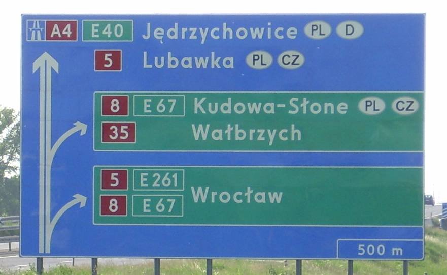
Drogowskaz on:
[Wikipedia]
[Google]
[Amazon]
 Polish road signs typeface ( pl, Polskie liternictwo znaków drogowych) – geometrical
 Polish road signs typeface ( pl, Polskie liternictwo znaków drogowych) – geometrical
 typeface
A typeface (or font family) is the design of lettering that can include variations in size, weight (e.g. bold), slope (e.g. italic), width (e.g. condensed), and so on. Each of these variations of the typeface is a font.
There are thousands o ...
meant to making text on Polish road signs, according to Attachment 1 of ''Regulation on detailed technical conditions for road signs and signals as well as road safety devices and conditions for their placement on roads''. The regulation defines a construction of digits, all of the letters
Letter, letters, or literature may refer to:
Characters typeface
* Letter (alphabet), a character representing one or more of the sounds used in speech; any of the symbols of an alphabet.
* Letterform, the graphic form of a letter of the alphabe ...
of Polish alphabet
The Polish alphabet ( Polish: ''alfabet polski'', ''abecadło'') is the script of the Polish language, the basis for the Polish system of orthography. It is based on the Latin alphabet but includes certain letters with diacritics: the ''kreska ...
and the letter V (not including Q and X), and the punctuation marks: hyphen
The hyphen is a punctuation mark used to join words and to separate syllables of a single word. The use of hyphens is called hyphenation. ''Son-in-law'' is an example of a hyphenated word. The hyphen is sometimes confused with dashes ( figure ...
, round brackets, comma, full stop (period) and exclamation mark
The exclamation mark, , or exclamation point (American English), is a punctuation mark usually used after an interjection or exclamation to indicate strong feelings or to show emphasis. The exclamation mark often marks the end of a sentence, f ...
.
The typeface has been created by Marek Sigmund, who made the project commissioned by the state authorities in 1975, while the ''Instruction about road signs and signals'' ( pl, Instrukcja o znakach i sygnałach drogowych) was being implemented. The typeface has been designed in six weeks. According to the designer's assumptions, the typeface included creating text on boards by using the freehand and stencil techniques.
This typeface has poor readability when trying to read a small text while driving at high speed.
Electronic versions
There are threefonts
In metal typesetting, a font is a particular size, weight and style of a typeface. Each font is a matched set of type, with a piece (a " sort") for each glyph. A typeface consists of a range of such fonts that shared an overall design.
In mod ...
that imitate road signs typeface. Two of them are available as non-commercial
A non-commercial (also spelled noncommercial) activity is an activity that does not, in some sense, involve commerce, at least relative to similar activities that do have a commercial objective or emphasis. For example, advertising-free community ...
freeware
Freeware is software, most often proprietary, that is distributed at no monetary cost to the end user. There is no agreed-upon set of rights, license, or EULA that defines ''freeware'' unambiguously; every publisher defines its own rules for t ...
:
* Liternictwo Drogowe – distributed by the company Centrum Rozwoju Explotrans S.A. that cooperates with Ministry of Infrastructure. It completely matches the Regulation. Meant mainly for the enterprises that produce road signs.
* Tabica drogowa – created in 2001 by Grzegorz Klimczewski. This version has all the markings that are defined in the Regulation and also additional ones (including ''Q'' and ''X'' letters). Some of not included marks ( quotation mark, question mark
The question mark (also known as interrogation point, query, or eroteme in journalism) is a punctuation mark that indicates an interrogative clause or phrase in many languages.
History
In the fifth century, Syriac Bible manuscripts used que ...
, percent sign
The percent sign (sometimes per cent sign in British English) is the symbol used to indicate a percentage, a number or ratio as a fraction of 100. Related signs include the permille (per thousand) sign and the permyriad (per ten thousand) ...
) have been replaced by arrows. At first, the font was distributed as a paid one but currently it is a non-commercial freeware.
* Drogowskaz – created in 2006 by Emil Wojtacki. Apart from the markings defined in the Regulation, it includes many more, designed in style of the original typeface, such as scribal abbreviations
Scribal abbreviations or sigla (singular: siglum) are abbreviations used by ancient and medieval scribes writing in various languages, including Latin, Greek, Old English and Old Norse. In modern manuscript editing (substantive and mechanic ...
and diacritics
A diacritic (also diacritical mark, diacritical point, diacritical sign, or accent) is a glyph added to a letter or to a basic glyph. The term derives from the Ancient Greek (, "distinguishing"), from (, "to distinguish"). The word ''diacriti ...
used in various languages. The font is distributed as non-commercial freeware.
References
{{Traffic signs Display typefaces Geometric sans-serif typefaces Government typefaces Grotesque sans-serif typefaces Sans-serif typefaces