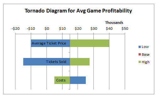
Tornado Diagram on:
[Wikipedia]
[Google]
[Amazon]
 Tornado diagrams, also called tornado plots, tornado charts or butterfly charts, are a special type of
 Tornado diagrams, also called tornado plots, tornado charts or butterfly charts, are a special type of
 Bar chart
A bar chart or bar graph is a chart or graph that presents categorical data with rectangular bars with heights or lengths proportional to the values that they represent. The bars can be plotted vertically or horizontally. A vertical bar chart is ...
, where the data categories are listed vertically instead of the standard horizontal presentation, and the categories are ordered so that the largest bar appears at the top of the chart, the second largest appears second from the top, and so on. They are so named because the final chart visually resembles either one half of or a complete tornado
A tornado is a violently rotating column of air that is in contact with both the surface of the Earth and a cumulonimbus cloud or, in rare cases, the base of a cumulus cloud. It is often referred to as a twister, whirlwind or cyclone, altho ...
.
Purpose
Tornado diagrams are useful for deterministicsensitivity analysis
Sensitivity analysis is the study of how the uncertainty in the output of a mathematical model or system (numerical or otherwise) can be divided and allocated to different sources of uncertainty in its inputs. A related practice is uncertainty anal ...
– comparing the relative importance of variables. For each variable/uncertainty considered, one needs estimates for what the low, base, and high outcomes would be. The sensitive variable is modeled as having an uncertain value while all other variables are held at baseline values (stable
A stable is a building in which livestock, especially horses, are kept. It most commonly means a building that is divided into separate stalls for individual animals and livestock. There are many different types of stables in use today; the ...
).PMBOK
The Project Management Body of Knowledge (PMBOK) is a set of standard terminology and guidelines (a body of knowledge) for project management. The body of knowledge evolves over time and is presented in ''A Guide to the Project Management Body of ...
Guide Fifth Edition (2013) pg. 338 (4th Ed., 2008, pg. 298) This allows testing the sensitivity/risk associated with one uncertainty/variable. For example, if a decision maker needs to visually compare 100 budgetary items, and wishes to identify the ten items one should focus on, it would be nearly impossible to do using a standard bar graph. In a tornado diagram of the budget items, the top ten bars would represent the items that contribute the most to the variability of the outcome, and therefore what the decision maker should focus on.
References
Further reading
*Technical note: constructing tornado diagrams with spreadsheets. Engineering Economist , June 22, 2006 , Eschenbach, Ted G {{Statistics Sensitivity analysis