Deepdene (typeface) on:
[Wikipedia]
[Google]
[Amazon]
Deepdene is a
 Goudy described the design as loosely inspired by "a Dutch type which had just been introduced;" Goudy's friend Paul Bennett suggested in later life that this was
 Deepdene has been digitised and released by several organisations and software companies. P22's digitisation under their LTC imprint perhaps uniquely includes the
Swamp Press specimen, Ed Rayher
(includes Deepdene in metal type on p. 32) Old style serif typefaces Typefaces designed by Frederic Goudy Monotype typefaces Letterpress typefaces
serif
In typography, a serif () is a small line or stroke regularly attached to the end of a larger stroke in a letter or symbol within a particular font or family of fonts. A typeface or "font family" making use of serifs is called a serif typeface ...
typeface
A typeface (or font family) is the design of lettering that can include variations in size, weight (e.g. bold), slope (e.g. italic), width (e.g. condensed), and so on. Each of these variations of the typeface is a font.
There are list of type ...
designed by Frederic Goudy
Frederic William Goudy (, March 8, 1865 – May 11, 1947) was an American printer, artist and type designer whose typefaces include Copperplate Gothic, Goudy Old Style and Kennerley. He was one of the most prolific of American type designers and ...
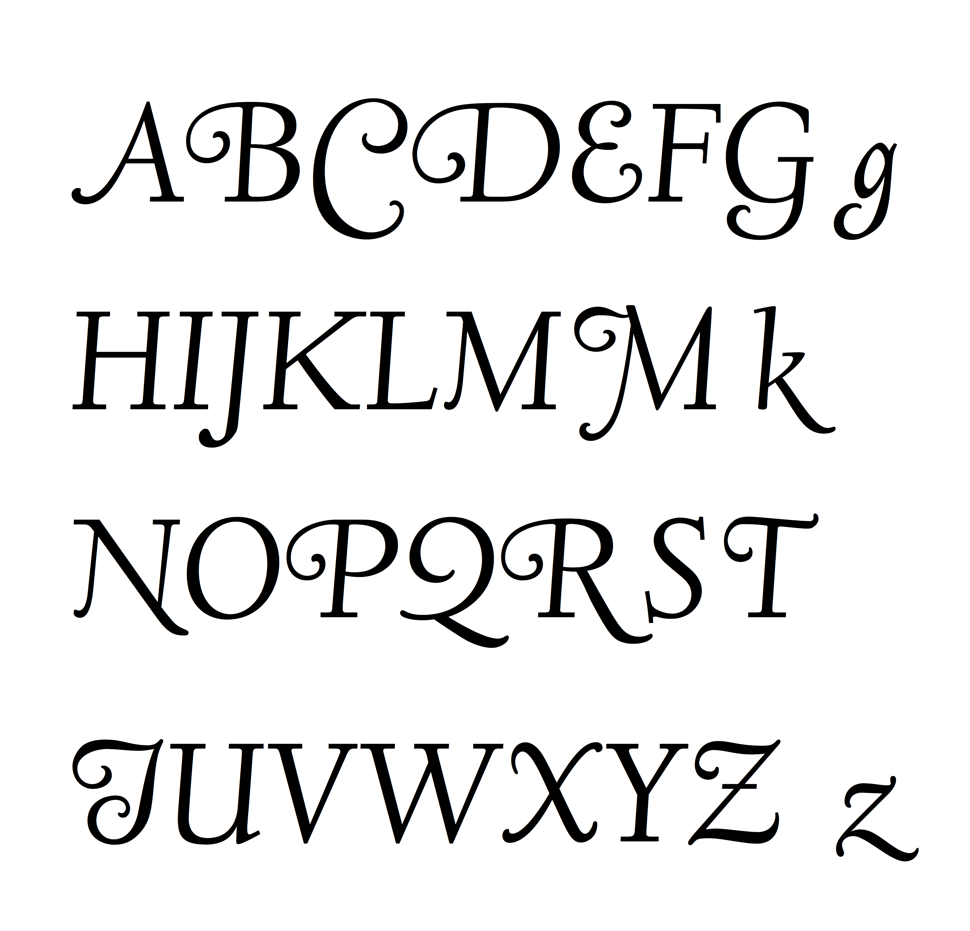
from 1927–1933. It belongs to the "old-style" of serif font design, with low contrast between strokes and an oblique axis. However, Deepdene has crisp serifs and a nearly upright italic, with much less of a slant than is normal for this style.
Issued by the American branch of Lanston Monotype
Monotype Imaging Holdings Inc., founded as Lanston Monotype Machine Company in 1887 in Philadelphia by Tolbert Lanston, is an American (historically Anglo-American) company that specializes in digital typesetting and typeface design for use with ...
, Deepdene was popular on its release and often used for the body text of books. Several digitisations have been created.
Deepdene is named after Goudy's home in Marlborough-on-Hudson. This was itself named for the road on which he previously lived in Queens
Queens is a borough of New York City, coextensive with Queens County, in the U.S. state of New York. Located on Long Island, it is the largest New York City borough by area. It is bordered by the borough of Brooklyn at the western tip of Long ...
, New York.
Design
 Goudy described the design as loosely inspired by "a Dutch type which had just been introduced;" Goudy's friend Paul Bennett suggested in later life that this was
 Jan van Krimpen
Jan, JaN or JAN may refer to:
Acronyms
* Jackson, Mississippi (Amtrak station), US, Amtrak station code JAN
* Jackson-Evers International Airport, Mississippi, US, IATA code
* Jabhat al-Nusra (JaN), a Syrian militant group
* Japanese Article Numb ...
's Lutetia although Walter Tracy
Walter Valentine Tracy RDI (14 February 1914 – 28 April 1995) was an English type designer, typographer and writer.
Biography
Walter Tracy was born in Islington, London and attended Shoreditch Secondary school. At the age of fourteen he wa ...
writes that the attribution cannot be certain. He also later created a medium weight, bold
In typography, emphasis is the strengthening of words in a text with a font in a different style from the rest of the text, to highlight them. It is the equivalent of prosody stress in speech.
Methods and use
The most common methods in W ...
and bold italic.
Goudy's biographer D. J. R. Bruckner praised the design as "the type that brings together the most characteristics of Goudy types the best".
Goudy later created a blackletter
Blackletter (sometimes black letter), also known as Gothic script, Gothic minuscule, or Textura, was a script used throughout Western Europe from approximately 1150 until the 17th century. It continued to be commonly used for the Danish, Norweg ...
design, Deepdene Open Text and the derived Deepdene Text, which was intended to complement it for purposes such as initial capitals. The designs are not related otherwise.
The family in metal type included:
* Deepdene (1927, Continental
Continental may refer to:
Places
* Continent, the major landmasses of Earth
* Continental, Arizona, a small community in Pima County, Arizona, US
* Continental, Ohio, a small town in Putnam County, US
Arts and entertainment
* ''Continental'' ( ...
, later rereleased by Lanston Monotype
Monotype Imaging Holdings Inc., founded as Lanston Monotype Machine Company in 1887 in Philadelphia by Tolbert Lanston, is an American (historically Anglo-American) company that specializes in digital typesetting and typeface design for use with ...
) Changes were made to fit Monotype's hot metal typesetting
In printing and typography, hot metal typesetting (also called mechanical typesetting, hot lead typesetting, hot metal, and hot type) is a technology for typesetting text in letterpress printing. This method injects molten type metal into a mol ...
system, which placed restrictions on what widths characters could be.
* Deepdene Italic (1929), matrices cut by Goudy's wife Bertha
Bertha is a female Germanic name, from Old High German ''berhta'' meaning "bright one". It was usually a short form of Anglo Saxon names ''Beorhtgifu'' meaning "bright gift" or ''Beorhtwynn'' meaning "bright joy".
The name occurs as a theonym, s ...
.
** Deepdene Medium (1931), designed for Lanston Monotype
Monotype Imaging Holdings Inc., founded as Lanston Monotype Machine Company in 1887 in Philadelphia by Tolbert Lanston, is an American (historically Anglo-American) company that specializes in digital typesetting and typeface design for use with ...
but apparently never cast.
* Deepdene Bold + Bold Italic (c. 1933-4, Lanston Monotype
Monotype Imaging Holdings Inc., founded as Lanston Monotype Machine Company in 1887 in Philadelphia by Tolbert Lanston, is an American (historically Anglo-American) company that specializes in digital typesetting and typeface design for use with ...
)
Digitisations
 Deepdene has been digitised and released by several organisations and software companies. P22's digitisation under their LTC imprint perhaps uniquely includes the
 swash capitals
A swash is a typography, typographical flourish, such as an exaggerated serif, terminal, tail, entry stroke, etc., on a glyph.
The use of swash characters dates back to at least the 16th century, as they can be seen in Ludovico Vicentino degli A ...
and small caps
In typography, small caps (short for "small capitals") are characters typeset with glyphs that resemble uppercase letters (capitals) but reduced in height and weight close to the surrounding lowercase letters or text figures. This is technicall ...
in italics. The open-source
Open source is source code that is made freely available for possible modification and redistribution. Products include permission to use the source code, design documents, or content of the product. The open-source model is a decentralized sof ...
"League of Movable Type" project has released an open-source digitisation, "Linden Hill", by Barry Schwartz, in regular and italic with swashes but without bold weights.
References
Notes
{{notelist, 30emExternal links
Swamp Press specimen, Ed Rayher
(includes Deepdene in metal type on p. 32) Old style serif typefaces Typefaces designed by Frederic Goudy Monotype typefaces Letterpress typefaces