Bembo on:
[Wikipedia]
[Google]
[Amazon]
Bembo is a serif


 The regular (roman) style of Bembo is based on Griffo's typeface for Manutius. Griffo, sometimes called Francesco da Bologna (of
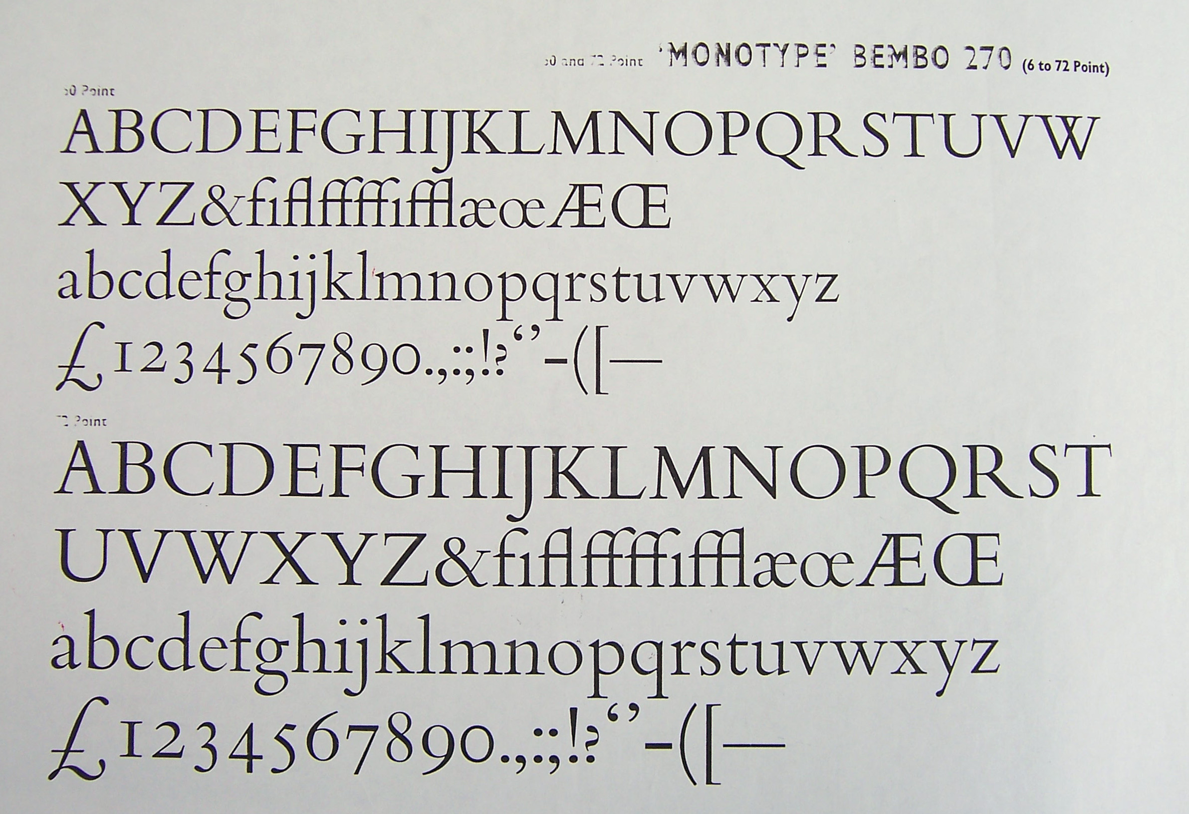
 Among Bembo's more distinctive characteristics, the capital "Q"s tail starts from the glyph's centre, the uppercase "J" has a slight hook and the sides of the "M" splay outwards slightly. The 'A' has a flat top. Many lowercase letters show subtle, sinuous curves; the termination of the arm of both the r and the e flare slightly upward and outward. The lowercase "c" and "e" push slightly forwards. Characters "h", "m", and "n" are not quite vertical on their right-hand stems, with a subtle curve towards the left going down the stroke. In italic, the ''k'' has an elegantly curved stroke in the lower-right and descenders on the ''p'', ''q'' and ''y'' end with a flat horizontal stroke. In the 1950s, Monotype noted that its features included: "serifs fine slab, fine-bracketed and in l.c. prolonged to right along baseline." This meant that many of the serifs (especially the horizontals, for example on the ''W'') are fine lines of quite uniform width, rather than forming an obvious curve leading into the main form of the letter. The ascenders reach above the cap height.
 In metal type, Bembo includes two capital "R"s, one with a long, extended leg following Griffo's original engraving, and another with a more tucked-in leg for body text if a printer preferred it.
Bembo does not attempt to strictly copy all the features of Renaissance printing, instead blending them with a twentieth-century sensibility and the expectations of contemporary design. An eccentricity of Griffo's first ''De Aetna'' capitals was an asymmetrical ''M'' that does not seem to have a serif at top right. So odd it has been suggested it may have been the result of faulty casting of type, it was nonetheless often copied in French imitations by Garamond and his contemporaries. The final release of Monotype's revival did not follow this, although it was available by special order. Monotype also did not copy the curving capital ''Y'' used by Manutius in the tradition of the Greek letter

 Monotype had already designed two other types inspired by the same period of Italian printing and calligraphy, the roman Poliphilus and italic Blado (both 1923). Made more eccentric and irregular than the sleek lines of Bembo to evoke the feel of antique printing, these remained in Monotype's catalogue and have been digitised, but are much less known today. Bembo can therefore be seen as an iteration of a preexisting design concept towards mass market appeal, taking the basic idea of the Griffo design and (unlike Poliphilus) updating its appearance to match the more sophisticated printing possible by the 1920s. Bembo's original working name was "Poliphilus Modernised".
Poliphilus is named after the book ''Hypnerotomachia Poliphili'', one of Manutius's most famous books in the Latin alphabet, which was printed with the same roman as ''De Aetna'' but recut capitals; it was made for the Medici Society, who planned to create an English translation. Blado is named after the printer Antonio Blado, a colleague of Arrighi. Morison preferred Bembo's roman and was somewhat dismissive of Poliphilus. Unlike Bembo, both in metal featured a Greek-influenced ''Y'' with a curving head, as in the original.
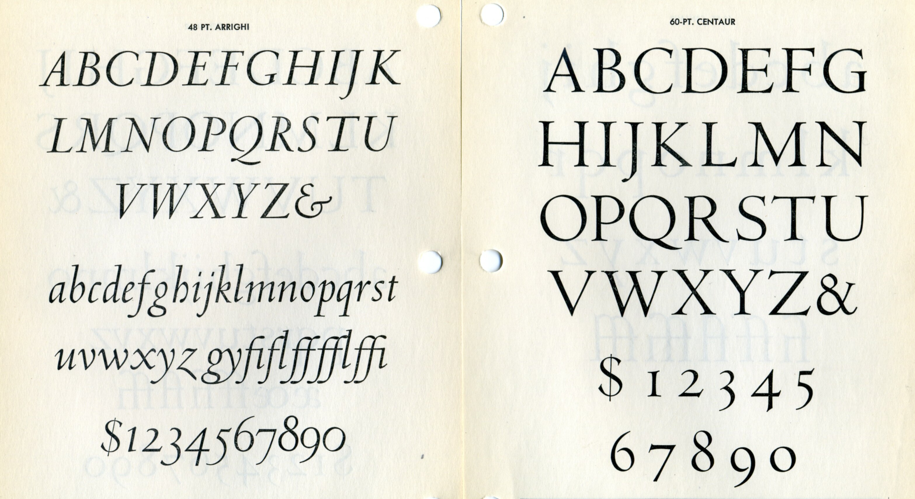 Monotype licensed and released the font Centaur around the same time as Bembo. It was drawn by the American book designer Bruce Rogers. Its roman is based on a slightly earlier period of Italian renaissance printing than Bembo, the work of Nicolas Jenson in Venice around 1470. Like Bembo, its italic (by Frederic Warde) comes from the 1520s, being again loosely based on the work of Arrighi from around 1520. Compared to Bembo it is somewhat lighter in structure, something particularly true in its digital facsimile. Penguin often used it for headings and titles of 'classic' editions, particularly its capitals and italic; its lower-case does not so effectively harmonise with Bembo due to the different letter shapes such as the tilted 'e'.
 Monotype created several titling designs based on Renaissance printing that could be considered complementary to Bembo: Bembo Titling (based directly on Bembo's capitals, but more delicate to suit a larger text size) and the more geometric Felix Titling in 1934, inspired by humanist capitals drawn by
 Bembo has been very popular in book publishing, particularly in Britain. It was also recommended by


(England)
(Ireland), §§ 84–85. Accessed January 31, 2013. Several unofficial versions were released during the phototypesetting period under alternate names; for example one unofficial phototypesetting version was named " Biretta" after the hat worn by Roman Catholic clergy, and another by Erhard Kaiser was created for the East German printing concern Typoart, outside the reach of Western intellectual property laws. In the digital period, Rubicon created a version named "Bentley" intended for small sizes and

Typowiki: Bembo
Monotype digital releases of Griffo-inspired typefaces
Borgia Pro
(3 pages)
Bembo type specimen from 1950
(Danish)
Swamp Press specimen
- with many other Monotype faces and images
Sample of Bembo Titling
Index of Monotype order numbers
Research Report on Bembo
(Vaishnavi Murthy, University of Reading; MA thesis)
Digital scan of ''De Aetna''
(Internet Archive, via
Five Hundred Years of Bembo
- Kevin Steele bibliography
Who Was Francesco da Bologna?
–
typeface
A typeface (or font family) is the design of lettering that can include variations in size, weight (e.g. bold), slope (e.g. italic), width (e.g. condensed), and so on. Each of these variations of the typeface is a font.
There are thousands o ...
created by the British branch of the Monotype Corporation in 1928–1929 and most commonly used for body text
__NOTOC__
The body text or body copy is the text forming the main content of a book, magazine, web page, or any other printed or digital work. This is as a contrast to both additional components such as headings, images, charts, footnotes etc. on ...
. It is a member of the " old-style" of serif fonts, with its regular or roman
Roman or Romans most often refers to:
*Rome, the capital city of Italy
*Ancient Rome, Roman civilization from 8th century BC to 5th century AD
*Roman people, the people of ancient Rome
*'' Epistle to the Romans'', shortened to ''Romans'', a lette ...
style based on a design cut around 1495 by Francesco Griffo Francesco Griffo (1450–1518), also called Francesco da Bologna, was a fifteenth-century Italian punchcutter. He worked for Aldus Manutius, designing the printer's more important humanist typefaces, including the first italic type. He cut Roman, ...
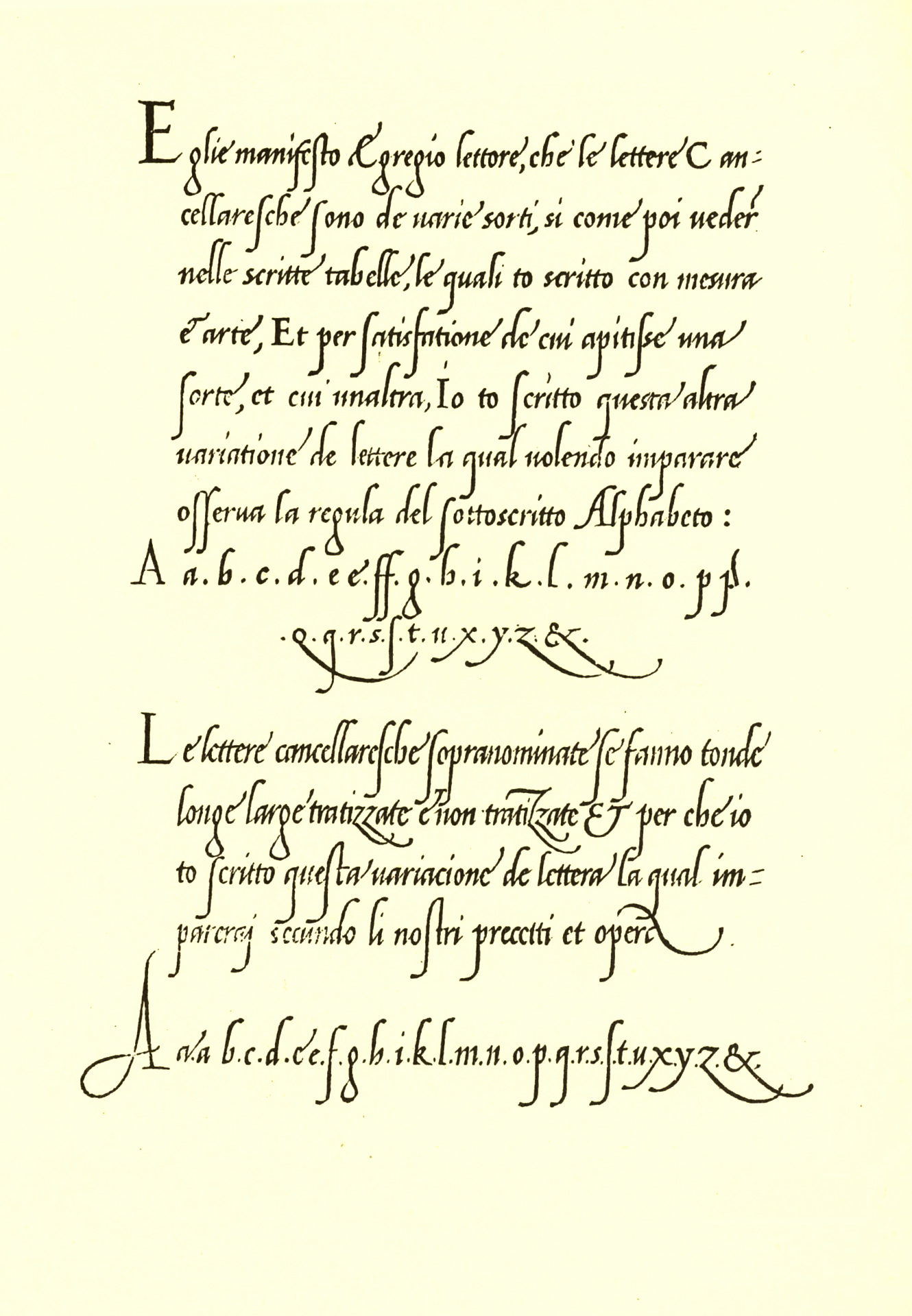
for Venetian printer Aldus Manutius, sometimes generically called the "Aldine roman". Bembo is named for Manutius's first publication with it, a small 1496 book by the poet and cleric Pietro Bembo. The italic is based on work by Giovanni Antonio Tagliente
Giovanni Antonio Tagliente (sometimes written ''Giovannantonio'') (c. 1460s – c. 1528) was a calligrapher, author, printer and publisher based in Venice during the Renaissance period.
Tagliente began his life as a calligrapher and taught aroun ...
, a calligrapher who worked as a printer in the 1520s, after the time of Manutius and Griffo.
Monotype created Bembo during a period of renewed interest in the printing of the Italian Renaissance
The Renaissance ( , ) , from , with the same meanings. is a period in European history
The history of Europe is traditionally divided into four time periods: prehistoric Europe (prior to about 800 BC), classical antiquity (800 BC to AD ...
, under the influence of Monotype executive and printing historian Stanley Morison
Stanley Arthur Morison (6 May 1889 – 11 October 1967) was a British typographer, printing executive and historian of printing. Largely self-educated, he promoted higher standards in printing and an awareness of the best printing and typefaces o ...
. It followed a previous more faithful revival of Manutius's work, Poliphilus, whose reputation it largely eclipsed. Monotype also created a second, much more eccentric italic for it to the design of calligrapher Alfred Fairbank, which also did not receive the same attention as the normal version of Bembo.
Since its creation, Bembo has enjoyed continuing popularity as an attractive, legible book typeface. Prominent users of Bembo have included Penguin Books
Penguin Books is a British publishing house. It was co-founded in 1935 by Allen Lane with his brothers Richard and John, as a line of the publishers The Bodley Head, only becoming a separate company the following year.Everyman's Library
Everyman's Library is a series of reprints of classic literature, primarily from the Western canon. It is currently published in hardback by Random House. It was originally an imprint of J. M. Dent (itself later a division of Weidenfeld & N ...
series, Oxford University Press
Oxford University Press (OUP) is the university press of the University of Oxford. It is the largest university press in the world, and its printing history dates back to the 1480s. Having been officially granted the legal right to print books ...
, Cambridge University Press
Cambridge University Press is the university press of the University of Cambridge. Granted letters patent by King Henry VIII in 1534, it is the oldest university press in the world. It is also the King's Printer.
Cambridge University Pre ...
, the National Gallery
The National Gallery is an art museum in Trafalgar Square in the City of Westminster, in Central London, England. Founded in 1824, it houses a collection of over 2,300 paintings dating from the mid-13th century to 1900. The current Director ...
, Yale University Press
Yale University Press is the university press of Yale University. It was founded in 1908 by George Parmly Day, and became an official department of Yale University in 1961, but it remains financially and operationally autonomous.
, Yale Universi ...
and Edward Tufte
Edward Rolf Tufte (; born March 14, 1942), sometimes known as "ET",. is an American statistician and professor emeritus of political science, statistics, and computer science at Yale University. He is noted for his writings on information design ...
. Bembo has been released in versions for phototypesetting and in several revivals as digital fonts by Monotype and other companies.
History


 The regular (roman) style of Bembo is based on Griffo's typeface for Manutius. Griffo, sometimes called Francesco da Bologna (of
 Bologna
Bologna (, , ; egl, label=Emilian language, Emilian, Bulåggna ; lat, Bononia) is the capital and largest city of the Emilia-Romagna region in Northern Italy. It is the seventh most populous city in Italy with about 400,000 inhabitants and 1 ...
), was an engraver who created designs by cutting punches in steel. These were used as a master to stamp matrices
Matrix most commonly refers to:
* ''The Matrix'' (franchise), an American media franchise
** ''The Matrix'', a 1999 science-fiction action film
** "The Matrix", a fictional setting, a virtual reality environment, within ''The Matrix'' (franchis ...
, the moulds used to cast metal type
In typesetting, a sort or type is a block with a typographic character etched on it, which is lined up with others to print text. In movable-type printing, the sort or type is cast from a matrix mold and assembled by hand with other sorts be ...
.
Manutius at first printed works only in Greek
Greek may refer to:
Greece
Anything of, from, or related to Greece, a country in Southern Europe:
*Greeks, an ethnic group.
*Greek language, a branch of the Indo-European language family.
**Proto-Greek language, the assumed last common ancestor ...
. His first printing in the Latin alphabet
The Latin alphabet or Roman alphabet is the collection of letters originally used by the ancient Romans to write the Latin language. Largely unaltered with the exception of extensions (such as diacritics), it used to write English and th ...
, in February 1496 (1495 by the Venetian calendar), was a book entitled ''Petri Bembi de Aetna Angelum Chabrielem liber''. This book, usually now called ''De Aetna'', was a short 60-page text about a journey to Mount Etna, written by the young Italian humanist poet Pietro Bembo, who would later become a Cardinal, secretary to Pope Leo X
Pope Leo X ( it, Leone X; born Giovanni di Lorenzo de' Medici, 11 December 14751 December 1521) was head of the Catholic Church and ruler of the Papal States from 9 March 1513 to his death in December 1521.
Born into the prominent political an ...
and lover of Lucrezia Borgia.
Griffo was one of the first punchcutters to fully express the character of the humanist hand that contemporaries preferred for manuscripts of classics and literary texts, in distinction to the book hand humanists dismissed as a gothic hand or the everyday chancery hand
The term "chancery hand" can refer to either of two distinct styles of historical handwriting.
A chancery hand was at first a form of handwriting for business transactions that developed in the Lateran chancery (the ) of the 13th century, t ...
. One of the main characteristics that distinguished Griffo's work from most of the earlier "Venetian" tradition of roman type by Nicolas Jenson and others is the now-normal horizontal cross-stroke of the "e", a letterform which Manutius popularised. Modern font designer Robert Slimbach
Robert Joseph Slimbach is Principal Type Designer at Adobe, Inc., where he has worked since 1987. He has won many awards for his digital typeface designs, including the rarely awarded Prix Charles Peignot from the Association Typographique Inter ...
has described Griffo's work as a breakthrough leading to an "ideal balance of beauty and functionality", as earlier has Harry Carter. The type is sometimes known as the "Aldine roman" after Manutius' name.
In France, his work inspired many French printers and punchcutters such as Robert Estienne
The name Robert is an ancient Germanic given name, from Proto-Germanic "fame" and "bright" (''Hrōþiberhtaz''). Compare Old Dutch ''Robrecht'' and Old High German ''Hrodebert'' (a compound of '' Hruod'' ( non, Hróðr) "fame, glory, honou ...
and Claude Garamond
Claude Garamont (–1561), known commonly as Claude Garamond, was a French type designer, publisher and punch-cutter based in Paris. Garamond worked as an engraver of punches, the masters used to stamp matrices, the moulds used to cast metal ty ...
from 1530 onwards, even though the typeface of ''De Aetna'' with its original capitals was apparently used in only about twelve books between 1496 and 1499. Historian Beatrice Warde suggested in the 1920s that its influence may have been due to the high quality of printing shown in the original ''De Aetna'' volume, perhaps created as a small pilot project
A pilot study, pilot project, pilot test, or pilot experiment is a small-scale preliminary study conducted to evaluate feasibility, duration, cost, adverse events, and improve upon the study design prior to performance of a full-scale research p ...
. ''De Aetna'' was printed using a mixture of alternate characters, perhaps as an experiment, which included a lower-case ''p'' in the same style as the capital letter with a flat top. In 1499, Griffo recut the capitals, changing the appearance of the typeface slightly. This version was used to print Manutius' famous illustrated volume ''Hypnerotomachia Poliphili
''Hypnerotomachia Poliphili'' (; ), called in English ''Poliphilo's Strife of Love in a Dream'' or ''The Dream of Poliphilus'', is a book said to be by Francesco Colonna. It is a famous example of an incunable (a work of early printing). The wor ...
''.
Griffo's roman typeface, with several replacements of the capitals, continued to be used by Manutius's company until the 1550s, when a refresh of its equipment brought in French typefaces which had been created by Garamond, Pierre Haultin
Pierre Haultin (c. 1510 – 1587) was a French printer, publisher, punchcutter and typefounder.
He was the nephew of the famous Parisian women printer Charlotte Guillard. As a punchcutter, he may have been trained by Claude Garamont, who w ...
and Robert Granjon
Robert Granjon (1513-November 16, 1589/March 1590) was a French type designer and printer. He worked in Paris, Lyon, Frankfurt, Antwerp, and Rome for various printers. He is best known for having introduced the typeface Civilité and for his ita ...
under its influence. UCLA
The University of California, Los Angeles (UCLA) is a public land-grant research university in Los Angeles, California. UCLA's academic roots were established in 1881 as a teachers college then known as the southern branch of the California ...
curators, who maintain a large collection of Manutius's printing, have described this as a "wholesale change ... the press followed precedent; popular in France, hesetypes rapidly spread over western Europe". Ultimately, old-style fonts like all of these fell out of use with the arrival of the much more geometric Didone types of the eighteenth and nineteenth centuries. They returned to popularity later in the century, with the arrival of the Arts and Crafts movement.
In 1500, Manutius released the first books printed using italic type
In typography, italic type is a cursive font based on a stylised form of calligraphic handwriting. Owing to the influence from calligraphy, italics normally slant slightly to the right. Italics are a way to emphasise key points in a printed ...
, again designed by Griffo. This was originally not intended as a complementary design, as is used today, but rather as an alternative, more informal typeface suitable for small volumes.
Italic
Bembo's italic is not based directly on the work of Griffo, but on the work of calligrapher and handwriting teacherGiovanni Antonio Tagliente
Giovanni Antonio Tagliente (sometimes written ''Giovannantonio'') (c. 1460s – c. 1528) was a calligrapher, author, printer and publisher based in Venice during the Renaissance period.
Tagliente began his life as a calligrapher and taught aroun ...
(sometimes written ''Giovannantonio''). He published a writing manual, ''The True Art of Excellent Writing'', in Venice in 1524, after the time of Manutius and Griffo, with engravings and some text set in an italic typeface presumably based on his calligraphy. (Tagliente did not only publish on handwriting, but also self-help guides on learning to read, arithmetic, embroidery and a book of model love letters.) It too was imitated in France, with imitations appearing from 1528 onwards. Another influential italic type created around this time was that of Ludovico Vicentino degli Arrighi
Ludovico Vicentino degli Arrighi ( Cornedo Vicentino, 1475?–1527?) was a papal scribe and type designer in Renaissance Italy.
Very little is known of the circumstances of his life. He may have started his career as a writing master in Venice, ...
, also a calligrapher who became involved in printing. His almost upright italic design was also imitated in France and would also become influential to twentieth-century font designs.
Monotype history
Monotype Bembo is one of the most famous revivals of the Aldine typeface of 1495. It was created under the influence of Monotype executive and printing historianStanley Morison
Stanley Arthur Morison (6 May 1889 – 11 October 1967) was a British typographer, printing executive and historian of printing. Largely self-educated, he promoted higher standards in printing and an awareness of the best printing and typefaces o ...
by the design team at the Monotype factory in Salfords, Surrey, south of London. While most printers of the Arts and Crafts movement of the previous sixty years had been more interested in the slightly earlier typefaces of Nicolas Jenson, Morison greatly admired Aldus Manutius' typeface above others of the period. The main reasons for his admiration were the balance of the letter construction, such as the evenness of the 'e' with a level cross-stroke and the way the capitals were made slightly lower than the ascenders of the tallest lower-case letters. He described the Aldine roman as "inspired not by writing, but by engraving; not script but sculpture." His friend printer Giovanni Mardersteig similarly suggested the appeal of the Aldine face in his commentary that "Griffo...rid himself of the influence of the characteristic round forms of letters written with a pen; he developed instead a more narrow and it might be said a more modern form, which was better suited to ngraving..whereas Jenson's style made a strong appeal to the sense of beauty prevalent in the period of Art Nouveau, today our taste in architecture and typography inclines towards simpler and more disciplined forms."
Bembo's development took place following a series of breakthroughs in printing technology which had occurred over the last fifty years without breaking from the use of metal type. Pantograph
A pantograph (, from their original use for copying writing) is a mechanical linkage connected in a manner based on parallelograms so that the movement of one pen, in tracing an image, produces identical movements in a second pen. If a line dr ...
engraving had allowed punches to be precisely machined
Machining is a process in which a material (often metal) is cut to a desired final shape and size by a controlled material-removal process. The processes that have this common theme are collectively called subtractive manufacturing, which utilizes ...
from large plan drawings. This gave a cleaner result than historic typefaces whose master punches had been hand-carved out of steel at the exact size of the desired letter. It also allowed rapid development of a large range of sizes. In addition, hand printing had been superseded by the hot metal typesetting systems of the period, of which Monotype's was one of the most popular (in competition with that of Linotype's). Both allowed metal type to be quickly cast under the control of a keyboard, eliminating the need to manually cast metal type and slot it into place into a printing press. With no need to keep type in stock, just the matrices used to cast the type, printers could use a wider range of fonts and there was increasing demand for varied typefaces. Artistically, meanwhile, the preference for using mechanical, geometric Didone and “modernised old style” fonts introduced in the nineteenth century was being displaced by a revival of interest in "true old style" serif fonts developed before this, a change that has proved to be lasting. At the same time, hot metal typesetting had imposed new restrictions: in Monotype's system (while less restrictive than Linotype's), in order to mechanically count the number of characters that could be fitted on a line, letters could only be certain widths, and care was needed to produce letters that looked harmonious in spite of this.
Morison was interested in the history of the 15th century Italian printing, and had discussed the topic with his correspondent, the printer Giovanni Mardersteig, in correspondence with whom he wrote a series of letters discussing Bembo's development. He also discussed the project in his letters with the Poet Laureate Robert Bridges
Robert Seymour Bridges (23 October 1844 – 21 April 1930) was an English poet who was Poet Laureate from 1913 to 1930. A doctor by training, he achieved literary fame only late in life. His poems reflect a deep Christian faith, and he is ...
, who had some interest in printing. For the project Morison bought a copy of ''De Aetna'' which he then sold to Monotype as a model.
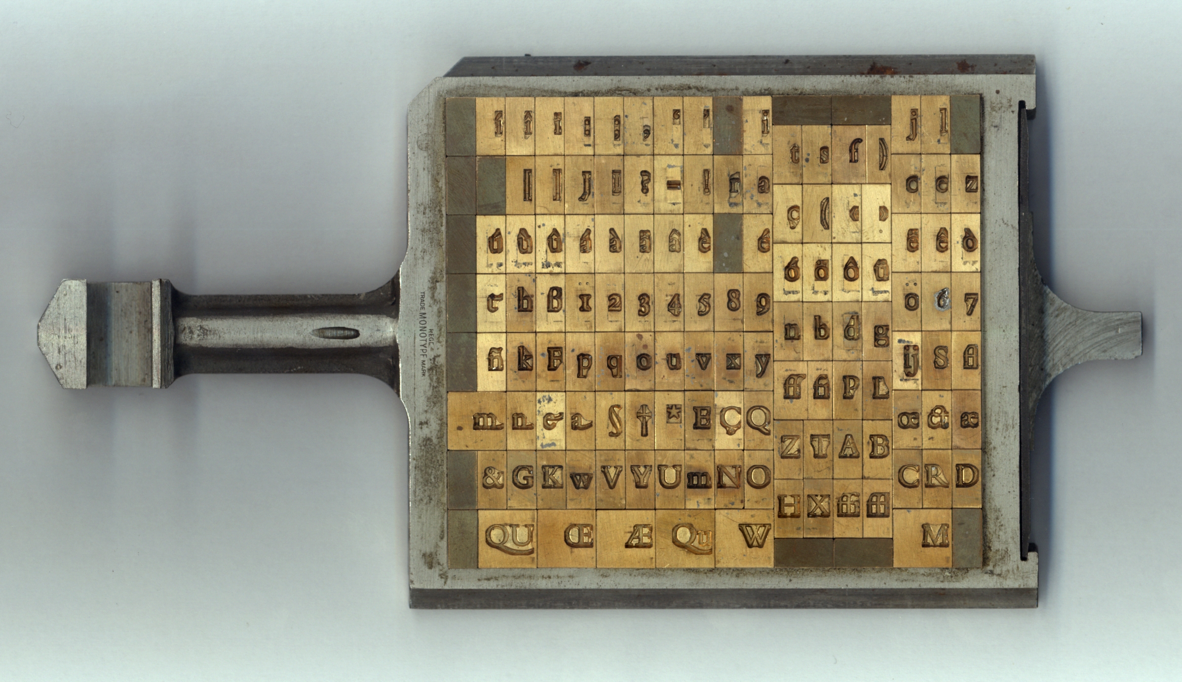
Bembo's technical production followed Monotype's standard method of the period. The characters were drawn on paper in large plan diagrams by the highly experienced drawing office team, led and trained by American engineer Frank Hinman Pierpont
Frank Hinman Pierpont (born 1860, New Haven, Connecticut – died 11 February 1937, England) was an American engineer and typeface designer. He worked primarily in England for the Monotype Corporation of Britain.
After training as a mechani ...
and Fritz Stelzer, both of whom Monotype had recruited from the German printing industry. The drawing staff who executed the design was disproportionately female and in many cases recruited from the local area and the nearby Reigate
Reigate ( ) is a town in Surrey, England, around south of central London. The settlement is recorded in Domesday Book in 1086 as ''Cherchefelle'' and first appears with its modern name in the 1190s. The earliest archaeological evidence for huma ...
art school. From these drawings, Benton-pantographs were used to machine metal punches to stamp matrices. It was Monotype's standard practice at the time to first engrave a limited number of characters and print proofs from them to test overall balance of colour on the page, before completing the remaining characters.
Monotype's publicity team described the final italic as "fine, tranquil" in a 1931 showing, emphasising their desire to avoid a design that seemed too eccentric. It was, however, not the only design considered. Morison initially commissioned from the calligrapher Alfred Fairbank a nearly upright italic design based on the work of Arrighi, and considered using it as Bembo's companion italic before deciding it was too eccentric for this purpose. Monotype ultimately created a more conventional design influenced by Tagliente's typeface and sold Fairbank's design as Bembo Condensed Italic. It was digitised as "Fairbank" in 2003, and sold independently of Monotype's Bembo digitisations. Morison conceded in his memoir that the Fairbank design "looked its best when given sole possession of the page". Fairbank later complained that he had not been told that his italic was intended to be a complementary design, and that he would have designed it differently if he had been.
As was normal in metal type fonts of the period from Monotype and other companies, the font was drawn differently at different sizes by modifying Griffo's original single-size design, a quite large letter at an approximate size of 15 points. The changes made were looser spacing, higher x-height (taller lower-case letters) and a more solid colour
Color (American English) or colour (British English) is the visual perceptual property deriving from the spectrum of light interacting with the photoreceptor cells of the eyes. Color categories and physical specifications of color are assoc ...
of impression at smaller sizes, and a finer, more graceful and tightly spaced design at large sizes.
Characteristics
 Among Bembo's more distinctive characteristics, the capital "Q"s tail starts from the glyph's centre, the uppercase "J" has a slight hook and the sides of the "M" splay outwards slightly. The 'A' has a flat top. Many lowercase letters show subtle, sinuous curves; the termination of the arm of both the r and the e flare slightly upward and outward. The lowercase "c" and "e" push slightly forwards. Characters "h", "m", and "n" are not quite vertical on their right-hand stems, with a subtle curve towards the left going down the stroke. In italic, the ''k'' has an elegantly curved stroke in the lower-right and descenders on the ''p'', ''q'' and ''y'' end with a flat horizontal stroke. In the 1950s, Monotype noted that its features included: "serifs fine slab, fine-bracketed and in l.c. prolonged to right along baseline." This meant that many of the serifs (especially the horizontals, for example on the ''W'') are fine lines of quite uniform width, rather than forming an obvious curve leading into the main form of the letter. The ascenders reach above the cap height.
 In metal type, Bembo includes two capital "R"s, one with a long, extended leg following Griffo's original engraving, and another with a more tucked-in leg for body text if a printer preferred it.
Bembo does not attempt to strictly copy all the features of Renaissance printing, instead blending them with a twentieth-century sensibility and the expectations of contemporary design. An eccentricity of Griffo's first ''De Aetna'' capitals was an asymmetrical ''M'' that does not seem to have a serif at top right. So odd it has been suggested it may have been the result of faulty casting of type, it was nonetheless often copied in French imitations by Garamond and his contemporaries. The final release of Monotype's revival did not follow this, although it was available by special order. Monotype also did not copy the curving capital ''Y'' used by Manutius in the tradition of the Greek letter
 upsilon
Upsilon (, ; uppercase Υ, lowercase υ; el, ''ýpsilon'' ) or ypsilon is the 20th letter of the Greek alphabet. In the system of Greek numerals, grc, Υʹ, label=none has a value of 400. It is derived from the Phoenician waw .
E ...
which had been used in some versions of Poliphilus and Blado, although not in the digitisation of Poliphilus. Nesbitt has described the capitals as "a composite design in the spirit of riffo'stype". Historian James Mosley
James Mosley (born 1935) is a retired librarian and historian whose work has specialised in the history of printing and letter design.
The main part of Mosley's career has been 42 years as Librarian of the St Bride Printing Library in London, whe ...
reports that other changes from the earliest versions were reduction in the weight of the capitals and alteration of the 'G' by adding the conventional right-hand serif, and widening the 'e', and suggests that the numerals of Bembo were based on those Monotype had already developed for the typeface Plantin.
In the italic, the expansive ascenders of Tagliente's type were shortened and the curl to the right replaced with more conventional serifs. Monotype also cut italic capitals sloped to match the lower-case, whereas in the Renaissance italics were used with upright capital letters in the Roman inscriptional tradition. The bold (Monotype's invention, since Griffo and his contemporaries did not use bold type) is extremely solid, providing a very clear contrast to the regular styles, and Monotype also added lining (upper-case height) figures as well as the text figures
Text figures (also known as non-lining, lowercase, old style, ranging, hanging, medieval, billing, or antique figures or numerals) are numerals designed with varying heights in a fashion that resembles a typical line of running text, hence the ...
(at lower-case height) used in the fifteenth and sixteenth centuries.
Book designer Elizabeth Friedländer drew some rarely-seen swash capitals for Bembo for capital introductions to Churchill's history of the second world war.
Related fonts
Poliphilus and Blado

 Monotype had already designed two other types inspired by the same period of Italian printing and calligraphy, the roman Poliphilus and italic Blado (both 1923). Made more eccentric and irregular than the sleek lines of Bembo to evoke the feel of antique printing, these remained in Monotype's catalogue and have been digitised, but are much less known today. Bembo can therefore be seen as an iteration of a preexisting design concept towards mass market appeal, taking the basic idea of the Griffo design and (unlike Poliphilus) updating its appearance to match the more sophisticated printing possible by the 1920s. Bembo's original working name was "Poliphilus Modernised".
Poliphilus is named after the book ''Hypnerotomachia Poliphili'', one of Manutius's most famous books in the Latin alphabet, which was printed with the same roman as ''De Aetna'' but recut capitals; it was made for the Medici Society, who planned to create an English translation. Blado is named after the printer Antonio Blado, a colleague of Arrighi. Morison preferred Bembo's roman and was somewhat dismissive of Poliphilus. Unlike Bembo, both in metal featured a Greek-influenced ''Y'' with a curving head, as in the original.
Centaur
 Monotype licensed and released the font Centaur around the same time as Bembo. It was drawn by the American book designer Bruce Rogers. Its roman is based on a slightly earlier period of Italian renaissance printing than Bembo, the work of Nicolas Jenson in Venice around 1470. Like Bembo, its italic (by Frederic Warde) comes from the 1520s, being again loosely based on the work of Arrighi from around 1520. Compared to Bembo it is somewhat lighter in structure, something particularly true in its digital facsimile. Penguin often used it for headings and titles of 'classic' editions, particularly its capitals and italic; its lower-case does not so effectively harmonise with Bembo due to the different letter shapes such as the tilted 'e'.
Griffo and Dante
Although Bembo went on to dominate British book printing in the twentieth century, in the words ofJohn Dreyfus
John G. Dreyfus (15 April 1918 – 29 December 2002) was a British book designer and historian of printing who worked for Cambridge University Press and the Monotype printing company. He was also president of the ATypI trade association. ''Into P ...
"Morison was not entirely satisfied by the way Griffo's roman had been recut", feeling that "the real charm of the original had not been brought out in the mechanical recutting". His friend printer Giovanni Mardersteig made two attempts at designing an alternative revival for use in his fine printing house, the Officina Bodoni, first in discussion with Morison and cut by hand by punchcutter Charles Malin, who some years later had also cut a version of Perpetua for Morison. This more delicate "Griffo" revival (1929) was used in handprinting and not developed for use outside Mardersteig's company.
In the 1940s, Mardersteig developed plans for a second design, Dante
Dante Alighieri (; – 14 September 1321), probably baptized Durante di Alighiero degli Alighieri and often referred to as Dante (, ), was an Italian people, Italian Italian poetry, poet, writer and philosopher. His ''Divine Comedy'', origin ...
, which was again cut by Malin slowly from 1946 onwards but taken also up by Monotype. Monotype Dante Series 592, Dante Semi Bold Series 682 and Dante Titling Series 612, were only produced in Didot-sizes. It was a more eccentric revival of the Aldine face than Bembo, it did not attract as much popularity.
Titling fonts
 Monotype created several titling designs based on Renaissance printing that could be considered complementary to Bembo: Bembo Titling (based directly on Bembo's capitals, but more delicate to suit a larger text size) and the more geometric Felix Titling in 1934, inspired by humanist capitals drawn by
 Felice Feliciano
Felice Feliciano (Verona 1433 - Rome 1479) was a fifteenth-century calligrapher, composer of alchemical sonnets, collector of drawings and expert on Roman antiquity, especially inscriptions on stone.
Biography
He lived just long enough to see pri ...
in 1463. In the hot metal type era Monotype also issued a titling version of Centaur, which was often used by Penguin; Monotype's digitisations of Centaur do not include it.
Timeline
The Renaissance
* 1496 Griffo's roman * 1501 Griffo's italic; development of italic type follows over the next fifty years. * 1515 Death of Manutius. * 1518 Death of Griffo. * 1520s Tagliente publishes in Venice, Ludovico Vicentino degli Arrighi in Rome (possibly also Venice). Both are former calligraphers who publish writing manuals. * 1522–25 Tagliente publishes a writing manual ''The True Art of Excellent Writing'', as does Arrighi, ''La Operina...'' around the same time. Arrighi's friendGian Giorgio Trissino
Gian Giorgio Trissino (8 July 1478 – 8 December 1550), also called Giovan Giorgio Trissino and self-styled as Giovan Giωrgio Trissino, was a Venetian Renaissance humanist, poet, dramatist, diplomat, grammarian, linguist, and philosopher.
...
writes of Arrighi that "in calligraphy he has surpassed all other men of our age so e now doesin print all that was formerly done with the pen, in his beautiful types he has gone beyond all other printers." His contemporary Antonio Blado publishes in Rome in an italic apparently derived from Arrighi's work.
* 1527 War in central Italy. Arrighi disappears from history; he may have been killed in the Sack of Rome.
* 1528 Tagliente dies in Venice.
* 1535 Blado appointed printer to the papacy and remains in this role until his death in 1567.
* 1530s–1550s France becomes a centre of the typefounding industry under the influence of the work of Manutius and others. French typefaces replace old Italian designs at the Aldine Press in Venice. Tradition that italic capitals should slope like the lower case established.
20th Century
* 1910s The italic calligraphy style of the Italian renaissance is revived by calligraphers includingEdward Johnston
Edward Johnston, CBE (11 February 1872 – 26 November 1944) was a British craftsman who is regarded, with Rudolf Koch, as the father of modern calligraphy, in the particular form of the broad-edged pen as a writing tool.
He is most fa ...
and Alfred Fairbank.
* 1923 Monotype releases Monotype series 119, an italic based on the work of Arrighi and Antonio Blado, and Poliphilus Monotype series 170, a roman based on the work of Griffo.
* 1926 Edward Johnston develops a font based on his italic calligraphy, but it remains obscure.
* 1926 Frederic Warde creates an italic based on the work of Arrighi. Monotype series 252 It is now almost always used as the companion italic of the font Centaur, but initially had an independent existence.
* 1928–29 Monotype develops and releases Bembo, Monotype series 270 based on the work of Griffo but much smoother in texture. After considering releasing an italic by Fairbank-based the work of Arrighi, Monotype abandons the idea, making Bembo's default italic on the Tagliente model. Hot metal matrices for Fairbank's italic or "Bembo Condensed Italic" Monotype series 294 were only made in 4 sizes: 10pt, 12pt, 13pt and 16pt.
* 1929 Monotype releases Centaur and the Warde italic as a matching set.
* 1960s Monotype releases Bembo for phototypesetting. Other companies also release versions.
Reception
 Bembo has been very popular in book publishing, particularly in Britain. It was also recommended by
 HMSO
The Office of Public Sector Information (OPSI) is the body responsible for the operation of His Majesty's Stationery Office (HMSO) and of other public information services of the United Kingdom. The OPSI is part of the National Archives of the U ...
in its style guide for outsourced printing jobs. Cambridge University Press
Cambridge University Press is the university press of the University of Cambridge. Granted letters patent by King Henry VIII in 1534, it is the oldest university press in the world. It is also the King's Printer.
Cambridge University Pre ...
's history describes Bembo as one of its most commonly used typefaces; Morison was closely connected to Cambridge and his personal archive (as well as much of Monotype's) went to the university after his death.
Among reviews of typefaces, writing in the anthology ''Typographic Specimens: The Great Typefaces,'' Jeff Price commented that Bembo became noted for its ability to "provide a text that is extremely consistent in colour", helping it to "remain one of the most popular book types since its release". Roger Black
Roger Anthony Black MBE (born 31 March 1966) is a retired English athlete who competed internationally for Great Britain and England. During his athletics career, he won individual silver medals in the 400 metres sprint at both the Olympic Ga ...
commented in 1983 "For me, Bembo is the all-time classic roman; if I were stuck on a desert island with only one typeface, that would be it." Digital font designer Nick Shinn has also commented, "Bembo has a sleek magnificence, born of high-precision technology at the service of accomplished production skills, which honours the spirit of the original, and an exotic grace of line which humbles most new designs made more ostensibly for the new technology." Oxford University Press
Oxford University Press (OUP) is the university press of the University of Oxford. It is the largest university press in the world, and its printing history dates back to the 1480s. Having been officially granted the legal right to print books ...
editor John Bell also borrowed the name for his set of comic verse lampooning publishing, ''Mutiny on the Bembo''.
Digitisations and derivatives


Monotype digitisations
Monotype has released two separate digitisations named Bembo and more recently Bembo Book, as well as the more slender caps-only display font Bembo Titling and the alternate italic design Fairbank. Bembo Book is considered to be superior by being thicker and more suitable for body text, as well as for offering the alternate shorter ''R'' for better-spaced body text. Monotype's original, early digitisation of Bembo was widely seen as unsuccessful. Two main problems have been cited with it: being digitised from drawings, it was much lighter in type colour than the original metal type which gained weight through ink spread, much reduced on modern printing equipment. In addition, the digital Bembo was based on the 9 pt metal drawings, creating a font with different proportions to the metal type in the point sizes at which Bembo was most often used in books; Sebastian Carter has pointed particularly to the 'M' being drawn too wide. This made the proportions of the digital font appear wrong, failing to match the subtlety of the metal type and phototypesetting release, which was released in three different optical sizes for different print sizes. Future Monotype executive Akira Kobayashi commented that the original digitisation was "a kind of compromise ... the types that were originally designed for hot-metal often looked too light and feeble ... Bembo Book is more or less what I expected." While Bembo Book is considered the superior digitisation, the original continues to offer the advantages of two extra weights (semi- and extra-bold) and infant styles with simplified ''a'' and ''g'' characters resembling handwriting; its lighter appearance may also be of use on printing equipment with greater ink spread. Cross-licensing has meant that it is sold by a range of vendors, often at very low prices. As an example of this, Fontsite obtained the rights to resell a derivative of the original digitisation, using the alternative name Borgia and Bergamo, upgrading it by additionalOpenType
OpenType is a format for scalable computer fonts. It was built on its predecessor TrueType, retaining TrueType's basic structure and adding many intricate data structures for prescribing typographic behavior. OpenType is a registered trademark ...
features such as small capitals and historical alternative characters. Neither version includes digitisations of the larger size versions of Bembo, which had a more delicate and elegant design.
Other Griffo-inspired fonts
A major professional competitor to Bembo is Agmena, created byJovica Veljović
Jovica Veljović (; born 1954) is a Serbian type designer and calligrapher. He is professor for type design at the Hamburg University of Applied Sciences.
In 1985, Veljović was awarded the Prix Charles Peignot, an infrequently awarded prize for t ...
and released by Linotype in 2014. Intended as a unified serif design supporting Roman, Greek and a range of Cyrillic alphabets such as Serbian, it features a more calligraphic italic than Bembo with swash capitals and support for Greek ligatures.
A looser interpretation of the Griffo designs is Iowan Old Style, designed by John Downer
Sir John William Downer, KCMG, KC (6 July 1843 – 2 August 1915) was an Australian politician who served two terms as Premier of South Australia, from 1885 to 1887 and again from 1892 to 1893. He later entered federal politics and served as ...
and also released by Bitstream. With a larger x-height
upright 2.0, alt=A diagram showing the line terms used in typography
In typography, the x-height, or corpus size, is the distance between the baseline and the mean line of lowercase letters in a typeface. Typically, this is the height of the le ...
(taller lower-case letters) than the print-oriented Bembo and influences of signpainting (Downer's former profession), it was intended to be particularly clear for reading at distance, in displays and in signage. It is a default font in the Apple Books
Apple Books (formerly known as iBooks between January 2010 and September 2018) is an e-book reading and store application by Apple Inc. for its iOS and macOS operating systems and devices. It was announced, under the name iBooks, in conjuncti ...
application.
Not explicitly influenced by Bembo but also influenced by Griffo is Minion Places
*Minions, Cornwall, a village in the United Kingdom
People
* Frank Minion (born 1929), American jazz and bop singer
* Fred Minion, English professional footballer
* Joseph Minion (born 1957), American film director and screenwriter
*Marcus ...
by Slimbach. Released by Adobe, a 2008 survey ranked it as one of the most popular typefaces used in modern fine printing.
Besides designs with similar inspiration, a number of unofficial releases and digitisations of Bembo have been made in the phototypesetting and digital periods, reflecting the lack of effective intellectual property protection
Intellectual property (IP) is a category of property that includes intangible creations of the human intellect. There are many types of intellectual property, and some countries recognize more than others. The best-known types are patents, co ...
for typefaces.Copyright, Designs and Patents Act 1988 (c. 48), § 54(England)
(Ireland), §§ 84–85. Accessed January 31, 2013. Several unofficial versions were released during the phototypesetting period under alternate names; for example one unofficial phototypesetting version was named " Biretta" after the hat worn by Roman Catholic clergy, and another by Erhard Kaiser was created for the East German printing concern Typoart, outside the reach of Western intellectual property laws. In the digital period, Rubicon created a version named "Bentley" intended for small sizes and
Bitstream
A bitstream (or bit stream), also known as binary sequence, is a sequence of bits.
A bytestream is a sequence of bytes. Typically, each byte is an 8-bit quantity, and so the term octet stream is sometimes used interchangeably. An octet may ...
made a version under the name of "Aldine 401". Its licensee ParaType later created a set of Cyrillic characters for this in 2008. The name "Bembo" remains a Monotype trademark and may not be used to describe such clones.
Free and open-source fonts
Two open-source designs based on Bembo are Cardo and ET Book. The Cardo fonts, developed by David J. Perry for use in classical scholarship and also including Greek and Hebrew, are freely available under the SIL Open Font License. Unimpressed by the first Bembo digitisation, statistician and designerEdward Tufte
Edward Rolf Tufte (; born March 14, 1942), sometimes known as "ET",. is an American statistician and professor emeritus of political science, statistics, and computer science at Yale University. He is noted for his writings on information design ...
commissioned an alternative digitisation for his books in a limited range of styles and languages, sometimes called 'ET Bembo'. He released it publicly as an open-source font named 'ET Book' in September 2015.
Privately used fonts


Heathrow
Heathrow Airport (), called ''London Airport'' until 1966 and now known as London Heathrow , is a major international airport in London, England. It is the largest of the six international airports in the London airport system (the others bei ...
and other British airports used a highly divergent adaptation of Bembo for many years. Designed by Shelley Winters and named BAA Bembo or BAA Sign, it was very bold with a high x-height.
The National Gallery
The National Gallery is an art museum in Trafalgar Square in the City of Westminster, in Central London, England. Founded in 1824, it houses a collection of over 2,300 paintings dating from the mid-13th century to 1900. The current Director ...
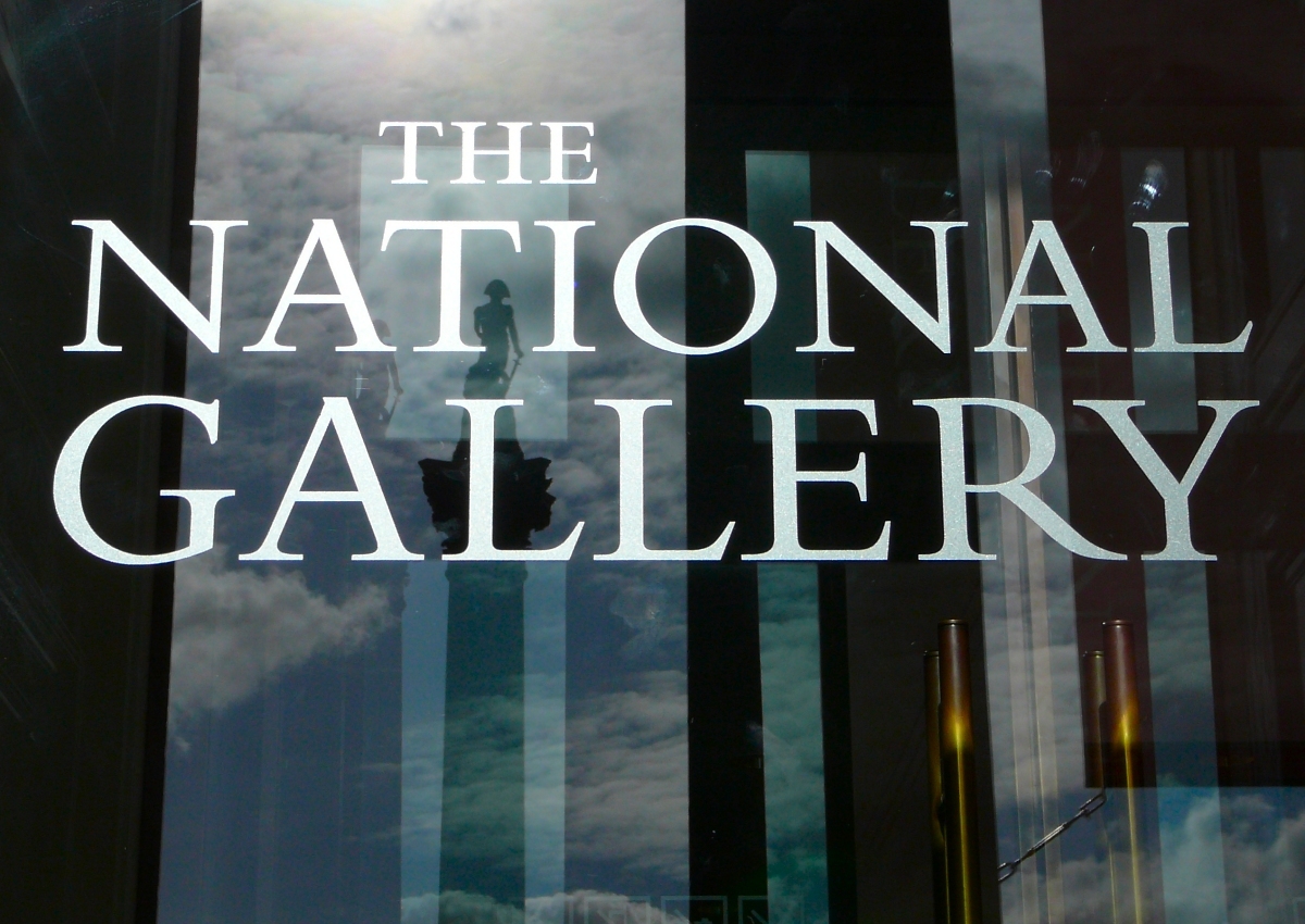
in London used Bembo, then its corporate font, as a plan for the carving of its name into its frontage.
The Yale
Yale University is a private research university in New Haven, Connecticut. Established in 1701 as the Collegiate School, it is the third-oldest institution of higher education in the United States and among the most prestigious in the wor ...
face, developed by Matthew Carter
Matthew Carter (born 1 October 1937) is a British type designer.Christophe_Plantin.html" ;"title="y Christophe Plantin">y Christophe Plantin' in typography's golden age was in perfect condition (some muddle aside) long withPlantin's accoun ...
as a corporate font for Yale University
Yale University is a Private university, private research university in New Haven, Connecticut. Established in 1701 as the Collegiate School, it is the List of Colonial Colleges, third-oldest institution of higher education in the United Sta ...
, is based on Griffo's work; Yale commissioned a custom font from Carter, a member of the university faculty, after being dissatisfied with digital versions of Bembo. Carter commented on the design that "John Gambell, the Yale University printer who initiated and ran the project, also liked the idea of an Aldine face ... Monotype Bembo had been used for University printing at an earlier time, so there was a useful precedent." It is available exclusively to "Yale students, employees, and authorized contractors for use in Yale publications and communications. It may not be used for personal or business purposes, and it may not be distributed to non-Yale personnel."
In the pre-digital period, IBM offered Aldine, a font inspired by Bembo, as a font for the IBM Composer. This was an ultra-premium electric golfball typewriter
A typewriter is a mechanical or electromechanical machine for typing characters. Typically, a typewriter has an array of keys, and each one causes a different single character to be produced on paper by striking an inked ribbon selectivel ...
system, intended for producing copy to be photographically enlarged for small-scale printing projects, or for high-quality office documents. Ultimately the system proved a transitional product, as it was displaced by cheaper phototypesetting, and then in the 1980s by word processors and general-purpose computers.
See also
* Antiqua *History of Western typography
Modern typographers view typography as a craft with a very long history tracing its origins back to the first punches and dies used to make seals and coinage currency in ancient times. The basic elements of typography are at least as old as ...
* Typography
Typography is the art and technique of arranging type to make written language legible, readable and appealing when displayed. The arrangement of type involves selecting typefaces, point sizes, line lengths, line-spacing ( leading), ...
Notes
References
Sources
Cited literature
* * * * * * Meggs, Philip B. and McKelvey, Roy.''Revival of the Fittest: Digital Versions of Classic Typefaces.'' RC Publications: 2000. * Meggs, Philip B. ''History of Graphic Design.'' John Wiley & Sons, Inc.: 1998.External links
Typowiki: Bembo
Monotype digital releases of Griffo-inspired typefaces
Borgia Pro
(3 pages)
Bembo type specimen from 1950
(Danish)
Swamp Press specimen
- with many other Monotype faces and images
Sample of Bembo Titling
Index of Monotype order numbers
Research Report on Bembo
(Vaishnavi Murthy, University of Reading; MA thesis)
Digital scan of ''De Aetna''
(Internet Archive, via
Biblioteca Nazionale Centrale di Firenze
The National Central Library of Florence ( it, Biblioteca Nazionale Centrale di Firenze, BNCF) is a public national library in Florence, the largest in Italy and one of the most important in Europe, one of the two central libraries of Italy, alon ...
)
Five Hundred Years of Bembo
- Kevin Steele bibliography
Who Was Francesco da Bologna?
–
Anthony Panizzi
Sir Antonio Genesio Maria Panizzi (16 September 1797 – 8 April 1879), better known as Anthony Panizzi, was a naturalised British citizen of Italian birth, and an Italian patriot. He was a librarian, becoming the Principal Librarian (i.e. head ...
, 1858. An article on "Francesco da Bologna" from before modern research. Notable as an article on his reputation in the nineteenth century, at a time when old-style serif fonts had apparently been superseded by the Didone types of the eighteenth and nineteenth centuries.
{{Authority control
Old style serif typefaces
Typefaces with text figures
Typefaces with infant variants
Adobe typefaces
1495 introductions
Monotype typefaces
Typefaces and fonts introduced in 1929