|
Ball Terminal
A ball terminal is a design feature of a typeface or glyph where the end of a stroke takes a roughly circular shape, as opposed to a serif In typography, a serif () is a small line or stroke regularly attached to the end of a larger stroke in a letter or symbol within a particular font or family of fonts. A typeface or "font family" making use of serifs is called a serif typeface ... or a square end. External links "Ball terminal" at ParaType {{typography-stub Typography ... [...More Info...] [...Related Items...] OR: [Wikipedia] [Google] [Baidu] |
Typeface
A typeface (or font family) is the design of lettering that can include variations in size, weight (e.g. bold), slope (e.g. italic), width (e.g. condensed), and so on. Each of these variations of the typeface is a font. There are thousands of different typefaces in existence, with new ones being developed constantly. The art and craft of designing typefaces is called '' type design''. Designers of typefaces are called '' type designers'' and are often employed by '' type foundries''. In desktop publishing, type designers are sometimes also called ''font developers'' or ''font designers''. Every typeface is a collection of glyphs, each of which represents an individual letter, number, punctuation mark, or other symbol. The same glyph may be used for characters from different scripts, e.g. Roman uppercase A looks the same as Cyrillic uppercase А and Greek uppercase alpha. There are typefaces tailored for special applications, such as cartography, astrology or mathematics ... [...More Info...] [...Related Items...] OR: [Wikipedia] [Google] [Baidu] |
Glyph
A glyph () is any kind of purposeful mark. In typography, a glyph is "the specific shape, design, or representation of a character". It is a particular graphical representation, in a particular typeface, of an element of written language. A grapheme, or part of a grapheme (such as a diacritic), or sometimes several graphemes in combination (a composed glyph) can be represented by a glyph. Glyphs, graphemes and characters In most languages written in any variety of the Latin alphabet except English, the use of diacritics to signify a sound mutation is common. For example, the grapheme requires two glyphs: the basic and the grave accent . In general, a diacritic is regarded as a glyph, even if it is contiguous with the rest of the character like a cedilla in French, Catalan or Portuguese, the ogonek in several languages, or the stroke on a Polish " Ł". Although these marks originally had no independent meaning, they have since acquired meaning in the field of mathemati ... [...More Info...] [...Related Items...] OR: [Wikipedia] [Google] [Baidu] |
End Of A Stroke
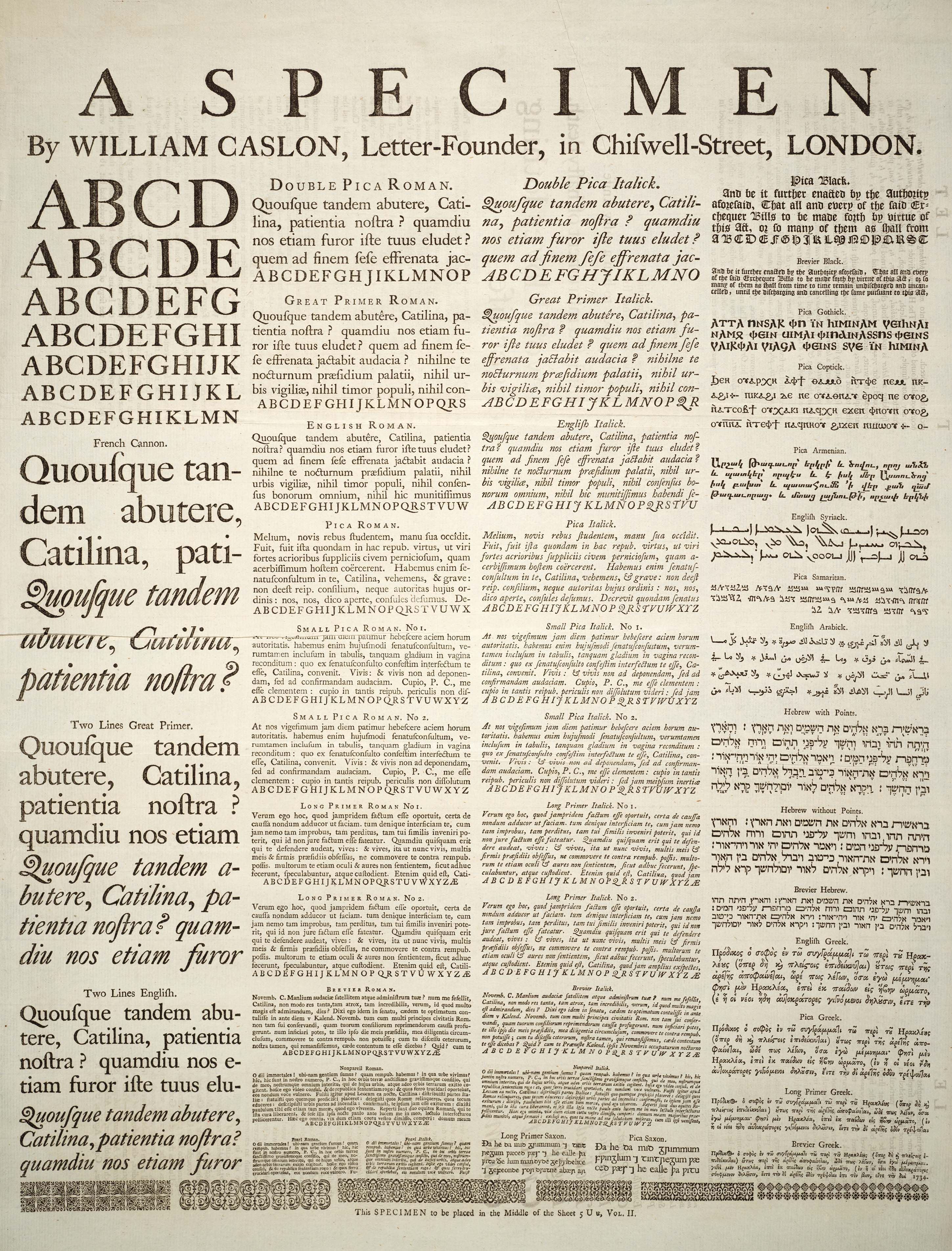
In typography (specifically Typeface anatomy), a stroke can end in a number of ways. Examples include: * The serif, including: ** The regular serif ** The bracketed serif ** The half-serif * The terminal, which is any stroke that does ''not'' end in a serif ** The , a tapered or curved end ** The , an extended or decorative flourish that replaces a serif or terminal on a letter ** The (or teardrop), as found in Caslon, Galliard, and Baskerville ** The , as found in Bodoni and Clarendon ** The , a sharp spur, as found in Perpetua Perpetua and Felicity ( la, Perpetua et Felicitas) were Christian martyrs of the 3rd century. Vibia Perpetua was a recently married, well-educated noblewoman, said to have been 22 years old at the time of her death, and mother of an infant son ..., Pontifex, and Ignatius. Also defined as the triangular ''serifs'' on the straight lines of capitals like E, F and Z. ** Hooked ** Pear-shaped References {{typography-stub Typography ... [...More Info...] [...Related Items...] OR: [Wikipedia] [Google] [Baidu] |
Serif
In typography, a serif () is a small line or stroke regularly attached to the end of a larger stroke in a letter or symbol within a particular font or family of fonts. A typeface or "font family" making use of serifs is called a serif typeface (or serifed typeface), and a typeface that does not include them is sans-serif. Some typography sources refer to sans-serif typefaces as "grotesque" (in German language, German, ) or "Gothic", and serif typefaces as "Roman type, roman". Origins and etymology Serifs originated from the first official Greek writings on stone and in Latin alphabet with Roman square capitals, inscriptional lettering—words carved into stone in Roman Classical antiquity, antiquity. The explanation proposed by Father Edward Catich in his 1968 book ''The Origin of the Serif'' is now broadly but not universally accepted: the Roman letter outlines were first painted onto stone, and the stone carvers followed the brush marks, which flared at stroke ends and corners, ... [...More Info...] [...Related Items...] OR: [Wikipedia] [Google] [Baidu] |

