|
All-caps
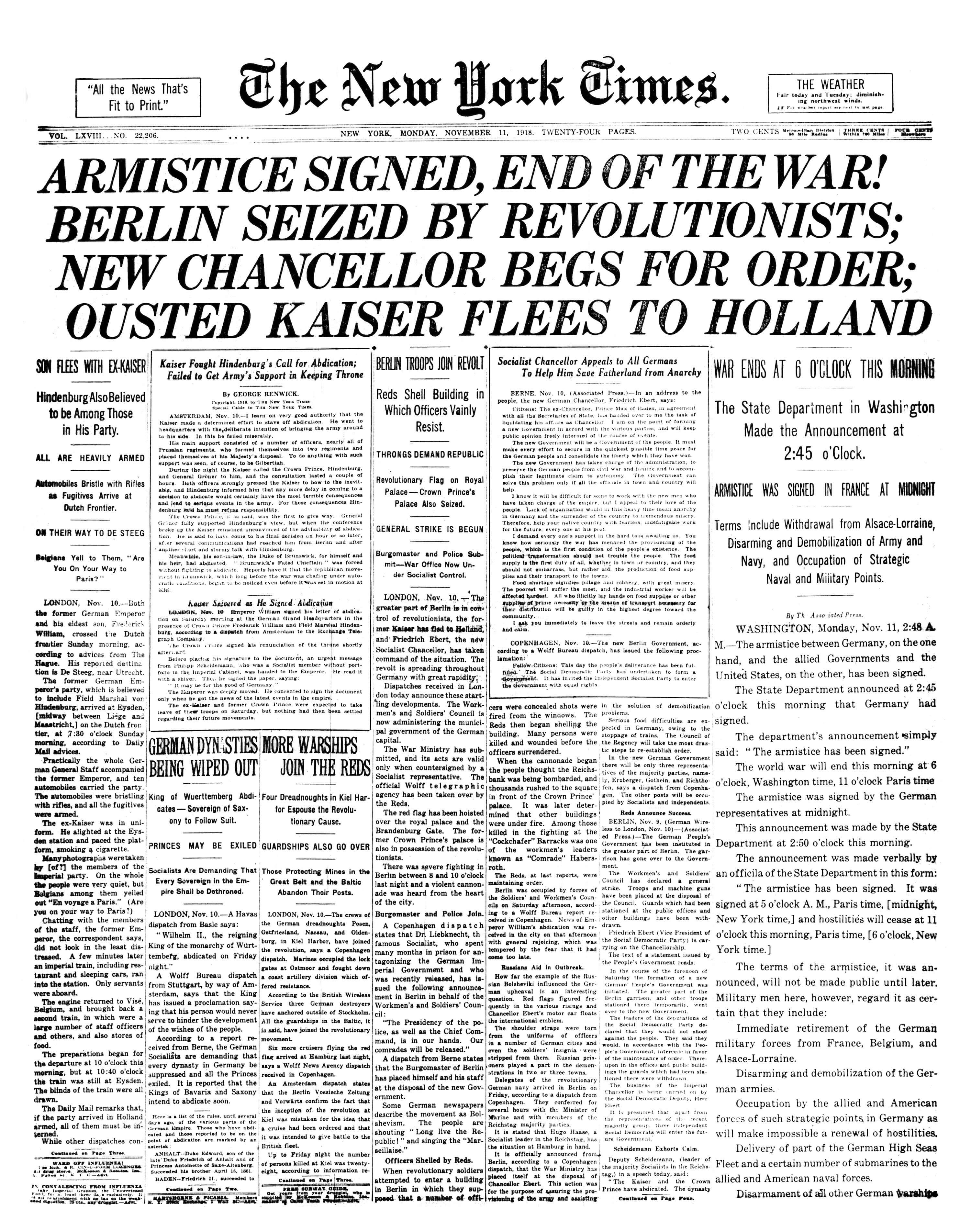
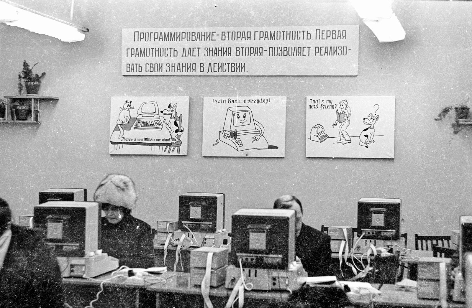
In typography, text or font in all caps (short for "all capitals") contains capital letters without any lowercase letters. For example: All-caps text can be seen in legal documents, advertisements, newspaper headlines, and the titles on book covers. Short strings of words in capital letters appear bolder and "louder" than mixed case, and this is sometimes referred to as "screaming" or "shouting". All caps can also be used to indicate that a given word is an acronym. Studies have been conducted on the readability and legibility of all caps text. Scientific testing from the 20th century onward has generally indicated that all caps text is less legible and readable than lower-case text. In addition, switching to all caps may make text appear hectoring and obnoxious for cultural reasons, since all-capitals is often used in transcribed speech to indicate that the speaker is shouting. All-caps text is common in comic books, as well as on older teleprinter and radio transmission syste ... [...More Info...] [...Related Items...] OR: [Wikipedia] [Google] [Baidu] |
Small Caps
In typography, small caps (short for small capitals) are grapheme, characters typeset with glyphs that resemble uppercase letters but reduced in height and weight close to the surrounding lowercase letters or text figures. Small caps are used in running text as a form of emphasis that is less dominant than all uppercase text, and as a method of emphasis or distinctiveness for text alongside or instead of italics, or when boldface is inappropriate. For example, the text "Text in small caps" appears as in small caps. Small caps can be used to draw attention to the opening phrase or line of a new section of text, or to provide an additional style in a dictionary entry where many parts must be typographically differentiated. Well-designed small capitals are not simply scaled-down versions of normal capitals; they normally retain the same stroke weight as other letters and have a wider Aspect ratio (image), aspect ratio for readability. Typically, the height of a small capital gly ... [...More Info...] [...Related Items...] OR: [Wikipedia] [Google] [Baidu] |
Lower Case
Letter case is the distinction between the letters that are in larger uppercase or capitals (more formally ''majuscule'') and smaller lowercase (more formally '' minuscule'') in the written representation of certain languages. The writing systems that distinguish between the upper- and lowercase have two parallel sets of letters: each in the majuscule set has a counterpart in the minuscule set. Some counterpart letters have the same shape, and differ only in size (e.g. ), but for others the shapes are different (e.g., ). The two case variants are alternative representations of the same letter: they have the same name and pronunciation and are typically treated identically when sorting in alphabetical order. Letter case is generally applied in a mixed-case fashion, with both upper and lowercase letters appearing in a given piece of text for legibility. The choice of case is often denoted by the grammar of a language or by the conventions of a particular discipline. In ortho ... [...More Info...] [...Related Items...] OR: [Wikipedia] [Google] [Baidu] |
Bold Text
In typography, emphasis is the strengthening of words in a text with a font in a different style from the rest of the text, to highlight them. It is the equivalent of prosody stress in speech. Methods and use The most common methods in Western typography fall under the general technique of emphasis through a change or modification of font: ''italics'', boldface and . Other methods include the alteration of LETTER CASE and as well as color and *additional graphic marks*. Font styles and variants The human eye is very receptive to differences in "brightness within a text body." Therefore, one can differentiate between types of emphasis according to whether the emphasis changes the " blackness" of text, sometimes referred to as typographic color. A means of emphasis that does not have much effect on blackness is the use of ''italics'', where the text is written in a script style, or '' oblique'', where the vertical orientation of each letter of the text is slanted to the ... [...More Info...] [...Related Items...] OR: [Wikipedia] [Google] [Baidu] |
Acronym
An acronym is a type of abbreviation consisting of a phrase whose only pronounced elements are the initial letters or initial sounds of words inside that phrase. Acronyms are often spelled with the initial Letter (alphabet), letter of each word in all caps with no punctuation. For some, an initialism or alphabetism connotes this general meaning, and an ''acronym'' is a subset with a narrower definition; an acronym is pronounced as a word rather than as a sequence of letters. In this sense, ''NASA'' () is an acronym, but ''United States, USA'' () is not. The broader sense of ''acronym'', ignoring pronunciation, is its original meaning and in common use. . Dictionary and style-guide editors dispute whether the term ''acronym'' can be legitimately applied to abbreviations which are not pronounced as words, and they do not agree on acronym space (punctuation), spacing, letter case, casing, and punctuation. The phrase that the acronym stands for is called its . The of an acron ... [...More Info...] [...Related Items...] OR: [Wikipedia] [Google] [Baidu] |
Typography
Typography is the art and technique of Typesetting, arranging type to make written language legibility, legible, readability, readable and beauty, appealing when displayed. The arrangement of type involves selecting typefaces, Point (typography), point sizes, line lengths, line spacing, letter spacing, and Kerning, spaces between pairs of letters. The term ''typography'' is also applied to the style, arrangement, and appearance of the letters, numbers, and symbols created by the process. Type design is a closely related craft, sometimes considered part of typography; most typographers do not design typefaces, and some type designers do not consider themselves typographers. Typography also may be used as an ornamental and decorative device, unrelated to the communication of information. Typography is also the work of graphic designers, art directors, manga artists, comic book artists, and, now, anyone who arranges words, letters, numbers, and symbols for publication, display, ... [...More Info...] [...Related Items...] OR: [Wikipedia] [Google] [Baidu] |
Headline
The headline is the text indicating the content or nature of the article below it, typically by providing a form of brief summary of its contents. The large type ''front page headline'' did not come into use until the late 19th century when increased competition between newspapers led to the use of attention-getting headlines. It is sometimes termed a news ''hed'', a deliberate misspelling that dates from production flow during hot type days, to notify the composing room that a written note from an editor concerned a headline and should not be set in type. Headlines in English often use a set of grammatical rules known as '' headlinese'', designed to meet stringent space requirements by, for example, leaving out forms of the verb "to be" and choosing short verbs like "eye" over longer synonyms like "consider". Production A headline's purpose is to quickly and briefly draw attention to the story. It is generally written by a copy editor, but may also be written by the writer, ... [...More Info...] [...Related Items...] OR: [Wikipedia] [Google] [Baidu] |
Italic Type
In typography, italic type is a cursive font based on a stylised form of calligraphic handwriting. Along with blackletter and roman type, it served as one of the major typefaces in the history of Western typography. Owing to the influence from calligraphy, italics normally slant slightly to the right, ''like so''. Different glyph shapes from roman type are usually usedanother influence from calligraphyand upper-case letters may have Swash (typography), swashes, flourishes inspired by ornate calligraphy. Historically, italics were a distinct style of type used entirely separately from roman type, but they have come to be used in conjunction—most fonts now come with a roman type and an oblique type, oblique version (generally called "italic" though often not true italics). In this usage, italics are a way to emphasise key points in a printed text, to identify many types of creative works, to cite foreign words or phrases, or, when quoting a speaker, a way to show which w ... [...More Info...] [...Related Items...] OR: [Wikipedia] [Google] [Baidu] |
Soviet Computers
The history of computing in the Soviet Union began in the late 1940s, when the country began to develop its MESM, Small Electronic Calculating Machine (MESM) at the Kiev Institute of Electrotechnology in Feofaniya. Initial ideological opposition to cybernetics in the Soviet Union was overcome by a Khrushchev era policy that encouraged computer production. By the early 1970s, the uncoordinated work of competing Ministries of the Soviet Union, government ministries had left the Soviet computer industry in disarray. Due to lack of common standards for peripherals and lack of digital storage capacity the Soviet Union's technology significantly lagged behind the West's semiconductor industry. The Soviet government decided to abandon development of original computer designs and encouraged cloning of existing Western systems (e.g. the 1801 series CPU, 1801 CPU series was scrapped in favor of the PDP-11 architecture, PDP-11 ISA by the early 1980s). Soviet industry was unable to mass-pro ... [...More Info...] [...Related Items...] OR: [Wikipedia] [Google] [Baidu] |
ASCII
ASCII ( ), an acronym for American Standard Code for Information Interchange, is a character encoding standard for representing a particular set of 95 (English language focused) printable character, printable and 33 control character, control characters a total of 128 code points. The set of available punctuation had significant impact on the syntax of computer languages and text markup. ASCII hugely influenced the design of character sets used by modern computers; for example, the first 128 code points of Unicode are the same as ASCII. ASCII encodes each code-point as a value from 0 to 127 storable as a seven-bit integer. Ninety-five code-points are printable, including digits ''0'' to ''9'', lowercase letters ''a'' to ''z'', uppercase letters ''A'' to ''Z'', and commonly used punctuation symbols. For example, the letter is represented as 105 (decimal). Also, ASCII specifies 33 non-printing control codes which originated with ; most of which are now obsolete. The control cha ... [...More Info...] [...Related Items...] OR: [Wikipedia] [Google] [Baidu] |


