|
Monotype Typefaces
Monotype fonts were developed by the Monotype company. This name has been used by three firms. Two of them had their roots in "hot metal" or lead type in the printing industry. They did not adapt when the market changed as computer, offset and photographic systems became dominant. These were: * Lanston Monotype Cooperation in Philadelphia, USA * The Monotype Corporation Limited in Salfords, UK A third firm produces fonts for computer use: * Monotype Imaging Inc. The latter firm is in a sense the successor to the English Monotype factory. It has the rights to the original designs, and later obtained rights to many more designs from other sources. The remains of the production archive and what is left of the machines are at the Type Museum in London, England. There the original matrices can still be accessed and parts of the old machines ordered. The collection itself is the property of the British Science Museum. The survival of the Type Museum is threatened since the building ... [...More Info...] [...Related Items...] OR: [Wikipedia] [Google] [Baidu] |
Lanston Monotype Company
Monotype Imaging Holdings Inc., founded as Lanston Monotype Machine Company in 1887 in Philadelphia by Tolbert Lanston, is an American (historically Anglo-American) company that specializes in digital typesetting and typeface design for use with consumer electronics devices. Incorporated in Delaware and headquartered in Woburn, Massachusetts, the company has been responsible for many developments in printing technology—in particular the Monotype machine, which was a fully mechanical hotmetal typesetter, that produced texts automatically, all single type. Monotype was involved in the design and production of many typefaces in the 20th century. Monotype developed many of the most widely used typeface designs, including Times New Roman, Gill Sans, Arial, Bembo and Albertus. Via acquisitions including Linotype GmbH, International Typeface Corporation, Bitstream, FontShop, URW and Hoefler & Co., the company has gained the rights to major font families including Helvetica, ITC F ... [...More Info...] [...Related Items...] OR: [Wikipedia] [Google] [Baidu] |
Pica (typography)
The pica is a typographic unit of measure corresponding to approximately of an inch, or from to of a foot. One pica is further divided into 12 points. In printing, three pica measures are used: * The French pica of 12 Didot points (also called cicero) generally is: 12 × 0.376 = . * The American pica of . It was established by the United States Type Founders' Association in 1886. In TeX one pica is of an inch. * The contemporary computer PostScript pica is exactly of an inch or of a foot, i.e. 4.2 mm or 0.1 in. Publishing applications such as Adobe InDesign and QuarkXPress represent pica measurements with whole-number picas left of a lower-case ''p'', followed by the points number, for example: 5p6 represents 5 picas and 6 points, or 5 picas. Cascading Style Sheets (CSS) defined by the World Wide Web Consortium use pc as the abbreviation for pica ( of an inch), and pt for point ( of an inch). The pica is also used in measuring the font capacity and is applied in the ... [...More Info...] [...Related Items...] OR: [Wikipedia] [Google] [Baidu] |
Arial (typeface)
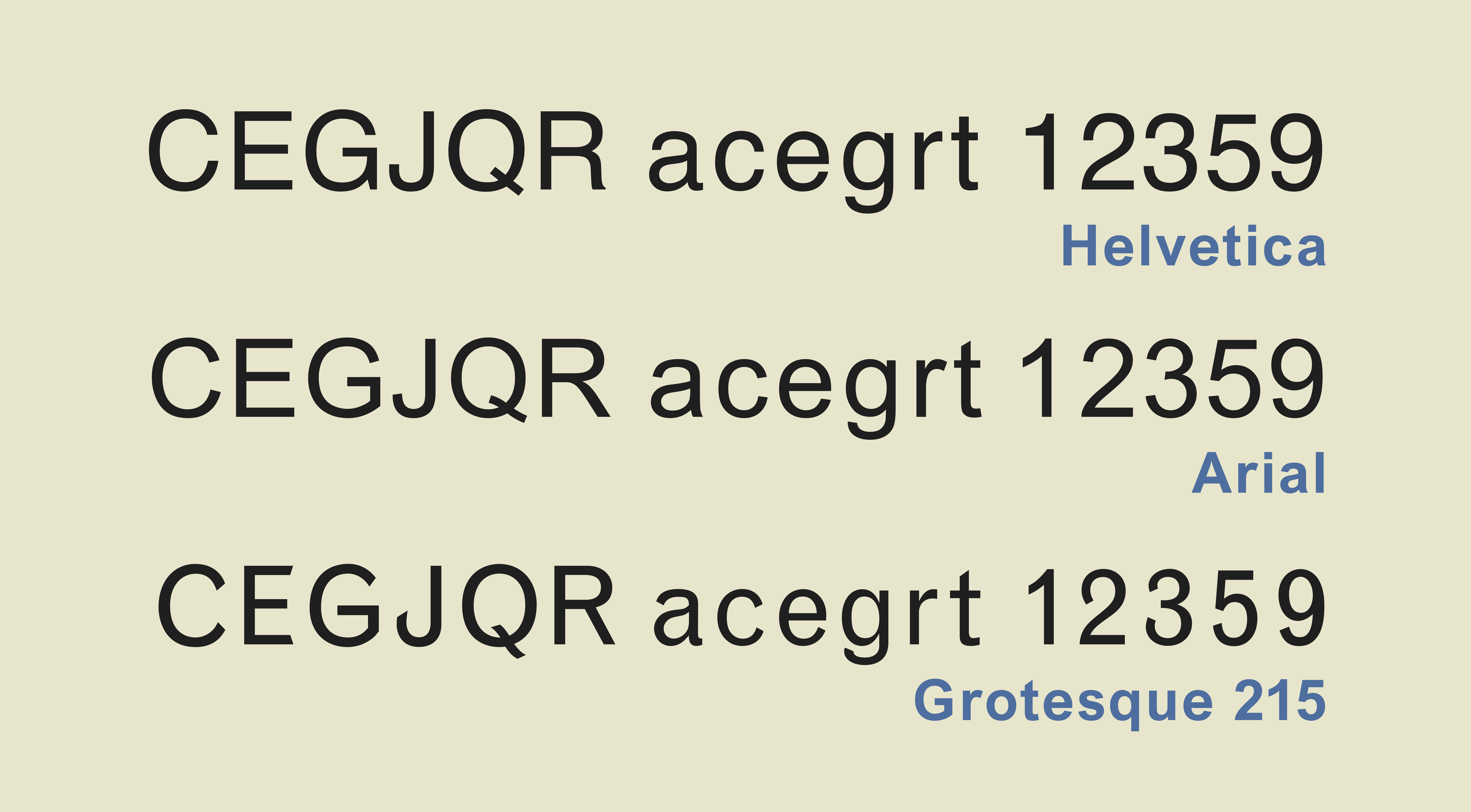
Arial (also called Arial MT) is a sans-serif typeface and set of computer fonts in the neo-grotesque style. Fonts from the Arial family are included with all versions of Microsoft Windows from Windows 3.1 on, some other Microsoft software applications, Apple's macOS and many PostScript 3 computer printers. The typeface was designed in 1982, by Robin Nicholas and Patricia Saunders, for Monotype Typography. Each of its characters has the same width as that character in the popular typeface Helvetica; the purpose of this design is to allow a document designed in Helvetica to be displayed and printed with the intended line-breaks and page-breaks without a Helvetica license. Because of their almost identical appearances, both Arial and Helvetica have commonly been mistaken for each other. The Arial typeface comprises many styles: Regular, Italic, Medium, Medium Italic, Bold, Bold Italic, Black, Black Italic, Extra Bold, Extra Bold Italic, Light, Light Italic, Narrow, Narrow It ... [...More Info...] [...Related Items...] OR: [Wikipedia] [Google] [Baidu] |
Antique Old Style (typeface)
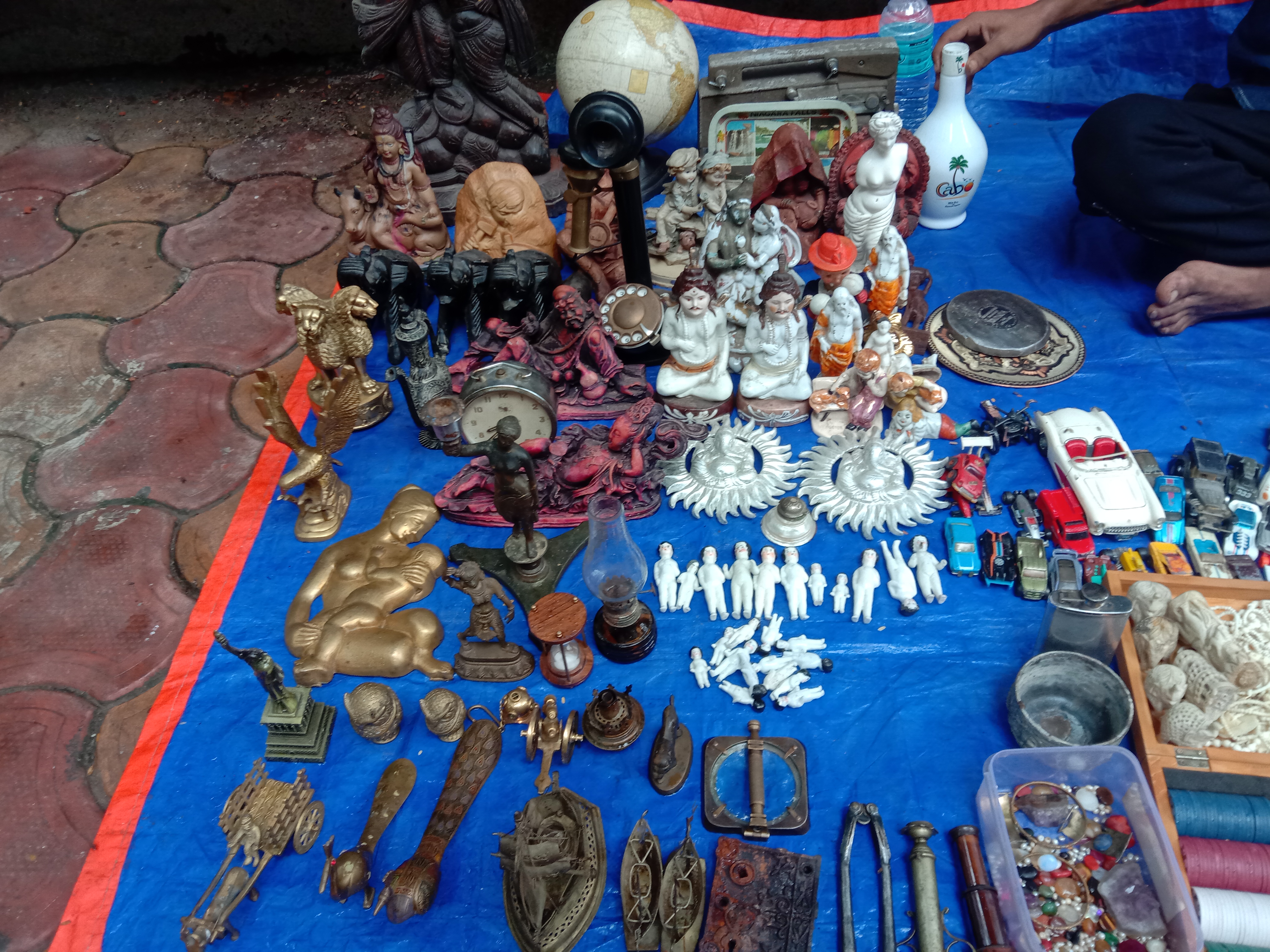
An antique ( la, antiquus; 'old', 'ancient') is an item perceived as having value because of its aesthetic or historical significance, and often defined as at least 100 years old (or some other limit), although the term is often used loosely to describe any object that is old. An antique is usually an item that is collected or desirable because of its age, beauty, rarity, condition, utility, personal emotional connection, and/or other unique features. It is an object that represents a previous era or time period in human history. Vintage and collectible are used to describe items that are old, but do not meet the 100-year criterion. Antiques are usually objects of the decorative arts that show some degree of craftsmanship, collectability, or an attention to design, such as a desk or an early automobile. They are bought at antiques shops, estate sales, auction houses, online auctions, and other venues, or estate inherited. Antiques dealers often belong to national trade assoc ... [...More Info...] [...Related Items...] OR: [Wikipedia] [Google] [Baidu] |
Antique (typeface)
An antique ( la, antiquus; 'old', 'ancient') is an item perceived as having value because of its aesthetic or historical significance, and often defined as at least 100 years old (or some other limit), although the term is often used loosely to describe any object that is old. An antique is usually an item that is collected or desirable because of its age, beauty, rarity, condition, utility, personal emotional connection, and/or other unique features. It is an object that represents a previous era or time period in human history. Vintage and collectible are used to describe items that are old, but do not meet the 100-year criterion. Antiques are usually objects of the decorative arts that show some degree of craftsmanship, collectability, or an attention to design, such as a desk or an early automobile. They are bought at antiques shops, estate sales, auction houses, online auctions, and other venues, or estate inherited. Antiques dealers often belong to national trade assoc ... [...More Info...] [...Related Items...] OR: [Wikipedia] [Google] [Baidu] |
Angulus (typeface)
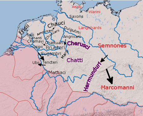
The Angles ( ang, Ængle, ; la, Angli) were one of the main Germanic peoples who settled in Great Britain in the post-Roman period. They founded several kingdoms of the Heptarchy in Anglo-Saxon England. Their name is the root of the name ''England'' ("land of Ængle"). According to Tacitus, writing around 100 AD, a people known as Angles (Anglii) lived east of the Langobards and Semnones, who lived near the Elbe river. Etymology The name of the Angles may have been first recorded in Latinised form, as ''Anglii'', in the '' Germania'' of Tacitus. It is thought to derive from the name of the area they originally inhabited, the Anglia Peninsula (''Angeln'' in modern German, ''Angel'' in Danish). Multiple theories concerning the etymology of the name have been hypothesised: # According to Gesta Danorum Dan and Angul (Angel) were made rulers by the consent of their people because of their bravery. Dan gave name to Danes and Angel gave names to Angles. # It originated f ... [...More Info...] [...Related Items...] OR: [Wikipedia] [Google] [Baidu] |
Andalé Mono
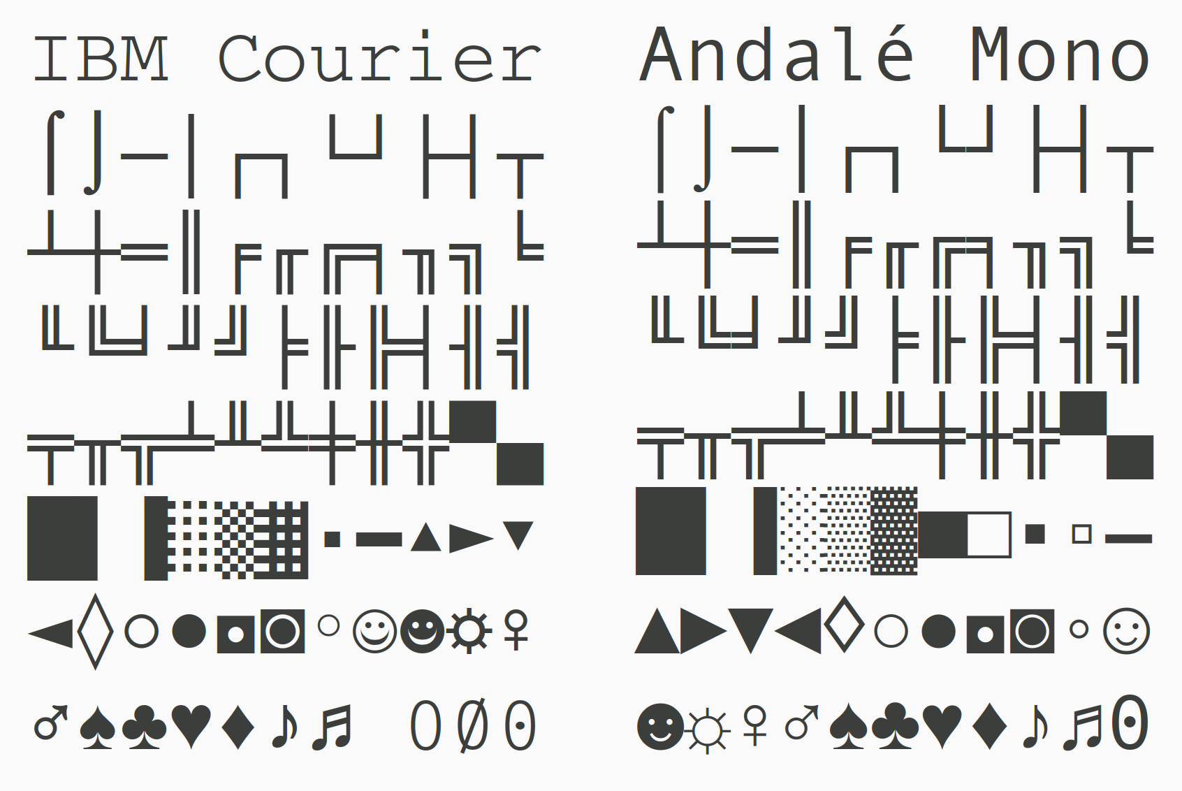
Andalé Mono (for technical reasons also Andale Mono) is a monospaced sans-serif typeface designed by Steve Matteson for terminal emulation and software development environments, originally for the Taligent project by Apple Inc. and IBM. Andalé Mono has a sibling called Andalé Sans. IBM's legacy The character set and design choices of Andalé Mono reveal its origin as a custom font for the Apple and IBM joint project Taligent. The character set includes many IBM specific symbols from IBM Courier, published in 1991. Some characters, like the card symbols, have even identical outlines. Also the dotted zero, which seems to have originated as an option on IBM 3270 displays, is included in both fonts. Distribution Andalé Mono was first distributed as an Internet Explorer 4.0 add-on, originally under the name Monotype.com. Starting with version 1.25 of the font, it was renamed to Andale Mono, and distributed with Internet Explorer 5 and 6. Andalé Mono is no longer distributed ... [...More Info...] [...Related Items...] OR: [Wikipedia] [Google] [Baidu] |
Albion (typeface)
Albion is an alternative name for Great Britain. The oldest attestation of the toponym comes from the Greek language. It is sometimes used poetically and generally to refer to the island, but is less common than 'Britain' today. The name for Scotland in most of the Celtic languages is related to Albion: ''Alba'' in Scottish Gaelic, ''Albain'' (genitive ''Alban'') in Irish, ''Nalbin'' in Manx and ''Alban'' in Welsh and Cornish. These names were later Latinised as ''Albania'' and Anglicised as ''Albany'', which were once alternative names for Scotland. ''New Albion'' and ''Albionoria'' ("Albion of the North") were briefly suggested as names of Canada during the period of the Canadian Confederation. Sir Francis Drake gave the name New Albion to what is now California when he landed there in 1579. Etymology The toponym is thought to derive from the Greek word , Latinised as ( genitive ). It was seen in the Proto-Celtic nasal stem * (oblique *) and survived in Old Irish ... [...More Info...] [...Related Items...] OR: [Wikipedia] [Google] [Baidu] |
Albertus (typeface)
Albertus is a glyphic serif display typeface designed by Berthold Wolpe in the period 1932 to 1940 for the British branch of the printing company Monotype. Wolpe named the font after Albertus Magnus, the thirteenth-century German philosopher and theologian. Wolpe studied as a metal engraver, and Albertus was modelled to resemble letters carved into bronze. The face began as titling capitals. Eventually a lowercase roman was added, and later a strongly cursive, narrow italic. Albertus has slight glyphic serifs. It is available in light and italic varieties. The project began in 1932. Titling caps were released first, and the ''Monotype Recorder'' of summer 1935 presented the capitals as an advance showing. Other characters and a lower case were added by 1940. Albertus has remained popular since its release and since the end of mass use of metal type phototypesetting and digital versions have been released. Characteristics * In the uppercase "M" the middle strokes descend only p ... [...More Info...] [...Related Items...] OR: [Wikipedia] [Google] [Baidu] |
Offset Printing
Offset printing is a common printing technique in which the inked image is transferred (or "offset") from a plate to a rubber blanket and then to the printing surface. When used in combination with the lithographic process, which is based on the repulsion of oil and water, the offset technique employs a flat (planographic) image carrier. Ink rollers transfer ink to the image areas of the image carrier, while a water roller applies a water-based film to the non-image areas. The modern "web" process feeds a large reel of paper through a large press machine in several parts, typically for several meters, which then prints continuously as the paper is fed through. Development of the offset press came in two versions: in 1875 by Robert Barclay of England for printing on tin and in 1904 by Ira Washington Rubel of the United States for printing on paper. History Lithography was initially created to be an inexpensive method of reproducing artwork.Carter, Rob, Ben Day, Philip Megg ... [...More Info...] [...Related Items...] OR: [Wikipedia] [Google] [Baidu] |
Letterpress
Letterpress printing is a technique of relief printing. Using a printing press, the process allows many copies to be produced by repeated direct impression of an inked, raised surface against sheets or a continuous roll of paper. A worker composes and locks movable type into the "bed" or "chase" of a press, inks it, and presses paper against it to transfer the ink from the type, which creates an impression on the paper. In practice, letterpress also includes other forms of relief printing with printing presses, such as wood engravings, photo-etched zinc "cuts" (plates), and linoleum blocks, which can be used alongside metal type, or wood type in a single operation, as well as stereotypes and electrotypes of type and blocks. With certain letterpress units, it is also possible to join movable type with slugs cast using hot metal typesetting. In theory, anything that is "type high" and so forms a layer exactly 0.918 in. thick between the bed and the paper can be printed usin ... [...More Info...] [...Related Items...] OR: [Wikipedia] [Google] [Baidu] |
Times New Roman
Times New Roman is a serif typeface. It was commissioned by the British newspaper ''The Times'' in 1931 and conceived by Stanley Morison, the artistic adviser to the British branch of the printing equipment company Monotype, in collaboration with Victor Lardent, a lettering artist in ''The Times's'' advertising department. It has become one of the most popular typefaces of all time and is installed on most desktop computers. Asked to advise on a redesign, Morison recommended that ''The Times'' change their text typeface from a spindly nineteenth-century face to a more robust, solid design, returning to traditions of printing from the eighteenth century and before. This matched a common trend in printing tastes of the period. Morison proposed an older Monotype typeface named Plantin as a basis for the design, and Times New Roman mostly matches Plantin's dimensions. The main change was that the contrast between strokes was enhanced to give a crisper image. The new design made i ... [...More Info...] [...Related Items...] OR: [Wikipedia] [Google] [Baidu] |



.jpg)

