|
Kerning
In typography, kerning is the process of adjusting the spacing between characters in a proportional font, usually to achieve a visually pleasing result. Kerning adjusts the space between individual letterforms, while tracking (letter-spacing) adjusts spacing uniformly over a range of characters. In a well-kerned font, the two-dimensional blank spaces between each pair of characters all have a visually similar area. The term "keming" is sometimes used informally to refer to poor kerning (the letters r and n placed too close together being easily mistaken for the letter m). The related term ''kern'' denotes a part of a type letter that overhangs the edge of the type block. Metal typesetting The source of the word ''kern'' is from the French word , meaning "projecting angle, quill of a pen". The French term originated from the Latin , , meaning "hinge". In the days when all type was cast metal, the parts of a typecasting sort that needed to overlap adjacent letters simply ... [...More Info...] [...Related Items...] OR: [Wikipedia] [Google] [Baidu] |
Kerning EN
In typography, kerning is the process of adjusting the spacing between characters in a proportional font, usually to achieve a visually pleasing result. Kerning adjusts the space between individual letterforms, while tracking (letter-spacing) adjusts spacing uniformly over a range of characters. In a well-kerned font, the two-dimensional blank spaces between each pair of characters all have a visually similar area. The term "keming" is sometimes used informally to refer to poor kerning (the letters r and n placed too close together being easily mistaken for the letter m). The related term ''kern'' denotes a part of a type letter that overhangs the edge of the type block. Metal typesetting The source of the word ''kern'' is from the French word , meaning "projecting angle, quill of a pen". The French term originated from the Latin , , meaning "hinge". In the days when all type was cast metal, the parts of a typecasting sort that needed to overlap adjacent letters simpl ... [...More Info...] [...Related Items...] OR: [Wikipedia] [Google] [Baidu] |
Letter-spacing
Examples of headline letter spacing In typography, letter spacing, character spacing or tracking is an optically consistent adjustment to the space between letters to change the visual density of a line or block of text. Letter spacing is distinct from kerning, which adjusts the spacing of particular pairs of adjacent characters such as "7." which would appear to be badly spaced if left unadjusted. History Historically, with metal type, a kern meant having a letter stick out beyond the metal slug to which it was attached, or having part of the body of the slug cut off to allow letters to overlap. A kern could therefore only bring letters closer together (negative spacing). Digital kerning could go in either direction. Tracking can similarly go in either direction, but with metal type, one could make groups of letters only farther apart (positive spacing). In the days of hot metal typesetting, ''letter spacing'' required adding horizontal space between letters of words set in ... [...More Info...] [...Related Items...] OR: [Wikipedia] [Google] [Baidu] |
OpenType Math
OpenType is a format for scalable computer fonts. It was built on its predecessor TrueType, retaining TrueType's basic structure and adding many intricate data structures for prescribing typographic behavior. OpenType is a registered trademark of Microsoft Corporation. The specification germinated at Microsoft, with Adobe Systems also contributing by the time of the public announcement in 1996. Because of wide availability and typographic flexibility, including provisions for handling the diverse behaviors of all the world's writing systems, OpenType fonts are used commonly on major computer platforms. History OpenType's origins date to Microsoft's attempt to license Apple's advanced typography technology GX Typography in the early 1990s. Those negotiations failed, motivating Microsoft to forge ahead with its own technology, dubbed "TrueType Open" in 1994. Adobe joined Microsoft in those efforts in 1996, adding support for the glyph outline technology used in its Type 1 fon ... [...More Info...] [...Related Items...] OR: [Wikipedia] [Google] [Baidu] |
OpenType
OpenType is a format for scalable computer fonts. It was built on its predecessor TrueType, retaining TrueType's basic structure and adding many intricate data structures for prescribing typographic behavior. OpenType is a registered trademark of Microsoft Corporation. The specification germinated at Microsoft, with Adobe Systems also contributing by the time of the public announcement in 1996. Because of wide availability and typographic flexibility, including provisions for handling the diverse behaviors of all the world's writing systems, OpenType fonts are used commonly on major computer platforms. History OpenType's origins date to Microsoft's attempt to license Apple's advanced typography technology GX Typography in the early 1990s. Those negotiations failed, motivating Microsoft to forge ahead with its own technology, dubbed "TrueType Open" in 1994. Adobe joined Microsoft in those efforts in 1996, adding support for the glyph outline technology used in its Type 1 fo ... [...More Info...] [...Related Items...] OR: [Wikipedia] [Google] [Baidu] |
Typography
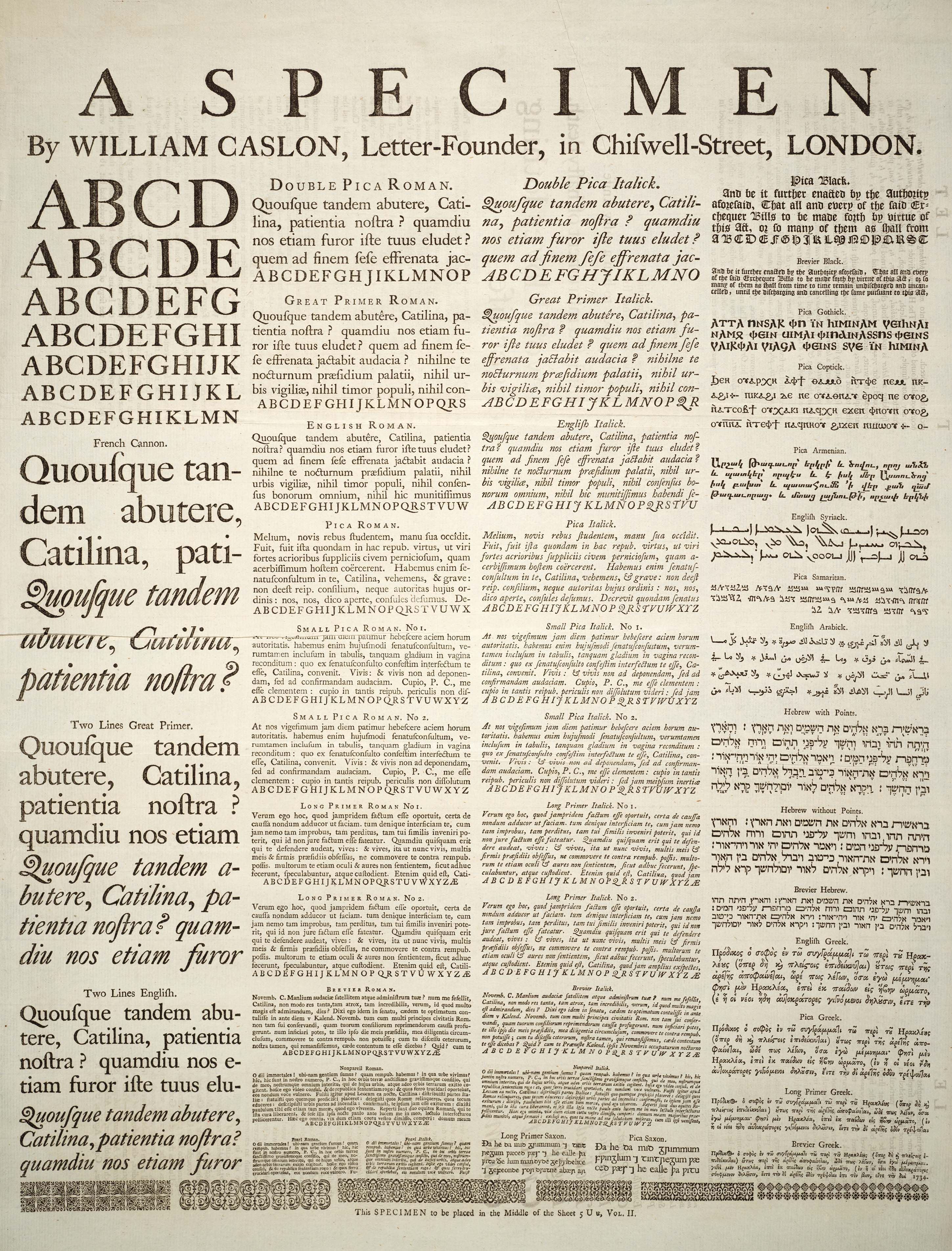
Typography is the art and technique of arranging type to make written language legible, readable and appealing when displayed. The arrangement of type involves selecting typefaces, point sizes, line lengths, line-spacing ( leading), and letter-spacing (tracking), as well as adjusting the space between pairs of letters ( kerning). The term ''typography'' is also applied to the style, arrangement, and appearance of the letters, numbers, and symbols created by the process. Type design is a closely related craft, sometimes considered part of typography; most typographers do not design typefaces, and some type designers do not consider themselves typographers. Typography also may be used as an ornamental and decorative device, unrelated to the communication of information. Typography is the work of typesetters (also known as compositors), typographers, graphic designers, art directors, manga artists, comic book artists, and, now, anyone who arranges words, letters, nu ... [...More Info...] [...Related Items...] OR: [Wikipedia] [Google] [Baidu] |
Typeface
A typeface (or font family) is the design of lettering that can include variations in size, weight (e.g. bold), slope (e.g. italic), width (e.g. condensed), and so on. Each of these variations of the typeface is a font. There are thousands of different typefaces in existence, with new ones being developed constantly. The art and craft of designing typefaces is called '' type design''. Designers of typefaces are called '' type designers'' and are often employed by '' type foundries''. In desktop publishing, type designers are sometimes also called ''font developers'' or ''font designers''. Every typeface is a collection of glyphs, each of which represents an individual letter, number, punctuation mark, or other symbol. The same glyph may be used for characters from different scripts, e.g. Roman uppercase A looks the same as Cyrillic uppercase А and Greek uppercase alpha. There are typefaces tailored for special applications, such as cartography, astrology or mathematics ... [...More Info...] [...Related Items...] OR: [Wikipedia] [Google] [Baidu] |
Ligature (typography)
In writing and typography, a ligature occurs where two or more graphemes or letters are joined to form a single glyph. Examples are the characters æ and œ used in English and French, in which the letters 'a' and 'e' are joined for the first ligature and the letters 'o' and 'e' are joined for the second ligature. For stylistic and legibility reasons, 'f' and 'i' are often merged to create 'fi' (where the tittle on the 'i' merges with the hood of the 'f'); the same is true of 's' and 't' to create 'st'. The common ampersand (&) developed from a ligature in which the handwritten Latin letters 'E' and 't' (spelling , Latin for 'and') were combined. History The earliest known script Sumerian cuneiform and Egyptian hieratic both include many cases of character combinations that gradually evolve from ligatures into separately recognizable characters. Other notable ligatures, such as the Brahmic abugidas and the Germanic bind rune, figure prominently throughout ancient man ... [...More Info...] [...Related Items...] OR: [Wikipedia] [Google] [Baidu] |
Compact Font Format
PostScript fonts are font files encoded in outline font specifications developed by Adobe Systems for professional desktop publishing, digital typesetting. This system uses PostScript file format to encode font information. "PostScript fonts" may also separately be used to refer to a basic set of fonts included as standards in the PostScript system, such as Times New Roman, Helvetica, and ITC Avant Garde, Avant Garde. History #Type 1, Type 1 and #Type 3, Type 3 fonts, though introduced by Adobe in 1984 as part of the PostScript page description language, did not see widespread use until March 1985 when the first laser printer to use the PostScript language, the LaserWriter, Apple LaserWriter, was introduced. Even then, in 1985, the outline fonts were resident only in the printer, and the screen used bitmap fonts as substitutes for outline fonts. Although originally part of PostScript, Type 1 fonts used a simplified set of drawing operations compared to ordinary PostScript (prog ... [...More Info...] [...Related Items...] OR: [Wikipedia] [Google] [Baidu] |
Desktop Publishing
Desktop publishing (DTP) is the creation of documents using page layout software on a personal ("desktop") computer. It was first used almost exclusively for print publications, but now it also assists in the creation of various forms of online content. Desktop publishing software can generate layouts and produce typographic-quality text and images comparable to traditional typography and printing. Desktop publishing is also the main reference for digital typography. This technology allows individuals, businesses, and other organizations to self-publish a wide variety of content, from menus to magazines to books, without the expense of commercial printing. Desktop publishing often requires the use of a personal computer and WYSIWYG page layout software to create documents for either large-scale publishing or small-scale local multifunction peripheral output and distribution – although a non-WYSIWYG system such as LaTeX could also be used for the creation of highly structur ... [...More Info...] [...Related Items...] OR: [Wikipedia] [Google] [Baidu] |
WAR Kerning
War is an intense armed conflict between states, governments, societies, or paramilitary groups such as mercenaries, insurgents, and militias. It is generally characterized by extreme violence, destruction, and mortality, using regular or irregular military forces. Warfare refers to the common activities and characteristics of types of war, or of wars in general. Total war is warfare that is not restricted to purely legitimate military targets, and can result in massive civilian or other non-combatant suffering and casualties. While some war studies scholars consider war a universal and ancestral aspect of human nature, others argue it is a result of specific socio-cultural, economic or ecological circumstances. Etymology The English word ''war'' derives from the 11th-century Old English words ''wyrre'' and ''werre'', from Old French ''werre'' (also ''guerre'' as in modern French), in turn from the Frankish *''werra'', ultimately deriving from the Proto-Germanic * ... [...More Info...] [...Related Items...] OR: [Wikipedia] [Google] [Baidu] |
Glyph Positioning Table
A glyph () is any kind of purposeful mark. In typography, a glyph is "the specific shape, design, or representation of a character". It is a particular graphical representation, in a particular typeface, of an element of written language. A grapheme, or part of a grapheme (such as a diacritic), or sometimes several graphemes in combination (a composed glyph) can be represented by a glyph. Glyphs, graphemes and characters In most languages written in any variety of the Latin alphabet except English, the use of diacritics to signify a sound mutation is common. For example, the grapheme requires two glyphs: the basic and the grave accent . In general, a diacritic is regarded as a glyph, even if it is contiguous with the rest of the character like a cedilla in French, Catalan or Portuguese, the ogonek in several languages, or the stroke on a Polish " Ł". Although these marks originally had no independent meaning, they have since acquired meaning in the field of mathematics ... [...More Info...] [...Related Items...] OR: [Wikipedia] [Google] [Baidu] |
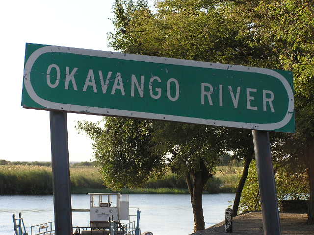
Okavango River Sign
{{geodis ...
Okavango may refer to: Geographical features * Okavango River, a river in southwest Africa, which drains into the Okavango Delta * Okavango Delta, a delta in Botswana * Okavango Basin, an endorheic basin that includes the Okavango River and Okavango Delta. Administrative units * Kavango Region, a region of Namibia, named ''Okavango'' until 1998 Others * Geely Okavango, a sport utility vehicle model See also *Kavango (other) Kavango may refer to: ;Geographical features: * Okavango River, a river in southwest Africa, which drains into the Okavango Delta * Okavango Delta, a delta in Botswana * Okavango Basin, an endorheic basin that includes the Okavango River and Okavan ... [...More Info...] [...Related Items...] OR: [Wikipedia] [Google] [Baidu] |


