|
Egyptienne (typeface)
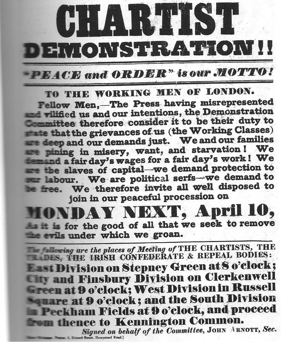
Égyptienne is a Swiss serif typeface belonging to the classification slab serif, or ''Egyptian,'' where the serifs are unbracketed and similar in weight to the horizontal strokes of the letters. Egyptienne was designed in 1956 by Adrian Frutiger for the Fonderie Deberny et Peignot and was the first new text face created for the process of phototypesetting. The x-height is high, and some lowercase characters, especially a and e bear comparison with other Frutiger typefaces, especially Meridien and Serifa. Egyptienne shows historical influence of the Clarendon faces. Égyptienne commonly appears on Chocolate letter Chocolate letters are a form of candy associated with the Dutch holiday of Sinterklaas (Saint Nicholas). Celebrants of the Sinterklaas celebration are traditionally given their initials made out of chocolate, either on Sinterklaas Eve, which is ...s. References * Friedl, Frederich, Nicholas Ott and Bernard Stein. ''Typography: An Encyclopedic Survey of Typ ... [...More Info...] [...Related Items...] OR: [Wikipedia] [Google] [Baidu] |
Serif
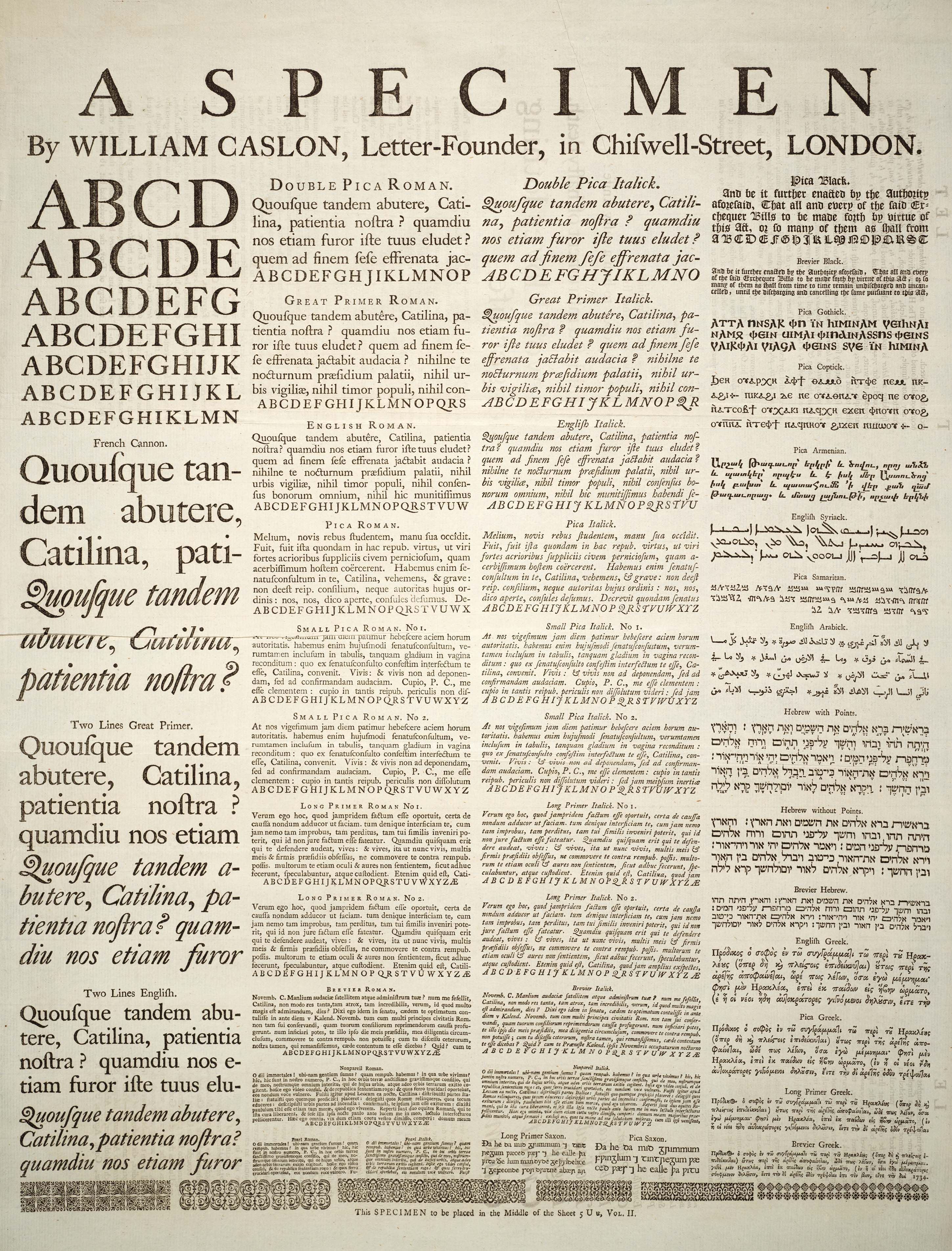
In typography, a serif () is a small line or stroke regularly attached to the end of a larger stroke in a letter or symbol within a particular font or family of fonts. A typeface or "font family" making use of serifs is called a serif typeface (or serifed typeface), and a typeface that does not include them is sans-serif. Some typography sources refer to sans-serif typefaces as "grotesque" (in German, ) or "Gothic", and serif typefaces as "roman". Origins and etymology Serifs originated from the first official Greek writings on stone and in Latin alphabet with inscriptional lettering—words carved into stone in Roman antiquity. The explanation proposed by Father Edward Catich in his 1968 book ''The Origin of the Serif'' is now broadly but not universally accepted: the Roman letter outlines were first painted onto stone, and the stone carvers followed the brush marks, which flared at stroke ends and corners, creating serifs. Another theory is that serifs were devised to neate ... [...More Info...] [...Related Items...] OR: [Wikipedia] [Google] [Baidu] |
Serifa
Serifa is a slab serif typeface family created by Adrian Frutiger in 1967. The typeface is based on the Univers family. Usage It was most prominently featured in the logo of Montgomery Ward from 1982 to 1992 and again in the revived online store. It was also used in the campaign ads for Ross Perot's 1992 Presidential campaign and from 1982 to late 1987 on the graphics of various CBS News CBS News is the news division of the American television and radio service CBS. CBS News television programs include the ''CBS Evening News'', ''CBS Mornings'', news magazine programs '' CBS News Sunday Morning'', '' 60 Minutes'', and '' 48 H ... programming, and for the local news programs at the CBS owned-and-operated television stations (as well as several affiliates). In 2014 Jake Tilson used it in the NT signage to complement the NT logo.{{cite web , url=http://www.jaketilson.com/design/national/index.html , title=Jake Tilson / Design Serifa is also used in nearly all of the Colle ... [...More Info...] [...Related Items...] OR: [Wikipedia] [Google] [Baidu] |
Letterpress Typefaces
Letterpress printing is a technique of relief printing. Using a printing press, the process allows many copies to be produced by repeated direct impression of an inked, raised surface against sheets or a continuous roll of paper. A worker composes and locks movable type into the "bed" or "chase" of a press, inks it, and presses paper against it to transfer the ink from the type, which creates an impression on the paper. In practice, letterpress also includes other forms of relief printing with printing presses, such as wood engravings, photo-etched zinc "cuts" (plates), and linoleum blocks, which can be used alongside metal type, or wood type in a single operation, as well as stereotypes and electrotypes of type and blocks. With certain letterpress units, it is also possible to join movable type with slugs cast using hot metal typesetting. In theory, anything that is "type high" and so forms a layer exactly 0.918 in. thick between the bed and the paper can be printed using l ... [...More Info...] [...Related Items...] OR: [Wikipedia] [Google] [Baidu] |
Typefaces And Fonts Introduced In 1956
A typeface (or font family) is the design of lettering that can include variations in size, weight (e.g. bold), slope (e.g. italic), width (e.g. condensed), and so on. Each of these variations of the typeface is a font. There are thousands of different typefaces in existence, with new ones being developed constantly. The art and craft of designing typefaces is called ''type design''. Designers of typefaces are called ''type designers'' and are often employed by ''type foundries''. In desktop publishing, type designers are sometimes also called ''font developers'' or ''font designers''. Every typeface is a collection of glyphs, each of which represents an individual letter, number, punctuation mark, or other symbol. The same glyph may be used for characters from different scripts, e.g. Roman uppercase A looks the same as Cyrillic uppercase А and Greek uppercase alpha. There are typefaces tailored for special applications, such as cartography, astrology or mathematics. ... [...More Info...] [...Related Items...] OR: [Wikipedia] [Google] [Baidu] |
Slab Serif Typefaces
Slab or SLAB may refer to: Physical materials * Concrete slab, a flat concrete plate used in construction * Stone slab, a flat stone used in construction * Slab (casting), a length of metal * Slab (geology), that portion of a tectonic plate that is subducting ** Slab pull force, the tectonic plate force due to subduction ** Slab suction, one of the major plate tectonic driving forces ** Slab window, a gap that forms in a subducted oceanic plate ** Slab (fossil) and counter slab, the two counterparts of a fossil impression * Slab hut, a kind of dwelling made from slabs of split or sawn timber * Slab of beer, a flat package containing a large number of cans of beer Places * Slab Point, a rocky point in the South Shetland Islands, Antarctica United States * Slab, West Virginia, an unincorporated community in Ritchie County, West Virginia * Slab City, California, a locality in the Colorado Desert * Slab City, Wisconsin, an unincorporated community in Shawano County, Wisconsin ... [...More Info...] [...Related Items...] OR: [Wikipedia] [Google] [Baidu] |
Linotype Typefaces
Linotype may refer to: * Linotype machine, a typesetting machine, once commonly used for newspapers * Mergenthaler Linotype Company The Mergenthaler Linotype Company is a corporation founded in the United States in 1886 to market the Linotype machine (), a system to cast metal type in lines (linecaster) invented by Ottmar Mergenthaler. It became the world's leading manufacture ... (later, Linotype GmbH), a type foundry that produced the first linotype machines * Linotype (alloy), a group of lead alloys, used in linotype machines {{disambig ... [...More Info...] [...Related Items...] OR: [Wikipedia] [Google] [Baidu] |
Chocolate Letter
Chocolate letters are a form of candy associated with the Dutch holiday of Sinterklaas (Saint Nicholas). Celebrants of the Sinterklaas celebration are traditionally given their initials made out of chocolate, either on Sinterklaas Eve, which is the fifth of December each year, or during the morning on Sinterklaas Day, which is the sixth day of December. Various sizes, types and flavours are available. In order to use the same amount of chocolate for each letter the manufacturer varies the thickness of the letter. This way one letter is not favoured over another, for example, with wide letters such as the W or the M getting more chocolate than narrow letters such as I or the J. Instead, the wide letters are made with a thinner layer of chocolate, and the narrow letters get a thicker layer of chocolate. An often used typeface A typeface (or font family) is the design of lettering that can include variations in size, weight (e.g. bold), slope (e.g. italic), width (e.g. conde ... [...More Info...] [...Related Items...] OR: [Wikipedia] [Google] [Baidu] |
Phototypesetting
Phototypesetting is a method of setting type. It uses photography to make columns of type on a scroll of photographic paper. It has been made obsolete by the popularity of the personal computer and desktop publishing (digital typesetting). The first phototypesetters quickly project light through a film negative of an individual character in a font, then through a lens that magnifies or reduces the size of the character onto photographic paper or film, which is collected on a spool in a light-proof canister. The paper or film is then fed into a processor, a machine that pulls the paper or film strip through two or three baths of chemicals, from which it emerges ready for paste-up or film make-up. Later phototypesetting machines used other methods, such as displaying a digitised character on a CRT screen. Phototypesetting offered numerous advantages over metal type, including the lack of need to keep heavy metal type and matrices in stock, the ability to use a much wider rang ... [...More Info...] [...Related Items...] OR: [Wikipedia] [Google] [Baidu] |
Slab Serif
In typography, a slab serif (also called ''mechanistic'', ''square serif'', ''antique'' or ''Egyptian'') typeface is a type of serif typeface characterized by thick, block-like serifs. Serif terminals may be either blunt and angular ( Rockwell), or rounded (Courier). Slab serifs were introduced in the early nineteenth century. Slab serifs form a large and varied genre. Some such as Memphis and Rockwell have a geometric design with minimal variation in stroke width: they are sometimes described as sans-serif fonts with added serifs. Others such as those of the Clarendon genre have a structure more like most other serif fonts, though with larger and more obvious serifs. These designs may have bracketed serifs which increase width along their length before merging with the main strokes of the letters, while on geometrics the serifs have a constant width. Display-oriented slab serifs are often extremely bold, intended to grab the reader's attention on a poster, while slab serifs or ... [...More Info...] [...Related Items...] OR: [Wikipedia] [Google] [Baidu] |
Deberny & Peignot
Deberny & Peignot (Fonderie Deberny et Peignot) was a French type foundry, created by the 1923 merger of G. Peignot & Fils and Deberny & Cie. It was bought by the Haas Type Foundry (Switzerland) in 1972, which in turn was merged into D. Stempel AG in 1985, then into Linotype GmbH in 1989, and is now part of Monotype Corporation. Starting in 1925, Deberny & Peignot type was distributed in the United States by Continental Type Founders Association. Typefaces These typefaces were produced by Deberny & Peignot:Jaspert, W. Pincus, W. Turner Berry and A.F. Johnson. ''The Encyclopedia of Type Faces.'' Blandford Press Lts.: 1953, 1983, , p. 2408-249 * Acier Noir (1936, A.M. Cassandre) * Ancien * Astrée (1921, Robert Girard), the Stephenson Blake version is known as ''Mazarin'' * Auriol, (1901–04, George Auriol) * Auriol-Labeur (George Auriol) * Auriol-Champlevé (George Auriol) * Banjo (1930) * Baskerville (1916), reengraved from the original punches. * Bellery-Desfontaine ... [...More Info...] [...Related Items...] OR: [Wikipedia] [Google] [Baidu] |
Grapheme
In linguistics, a grapheme is the smallest functional unit of a writing system. The word ''grapheme'' is derived and the suffix ''-eme'' by analogy with ''phoneme'' and other names of emic units. The study of graphemes is called ''graphemics''. The concept of graphemes is abstract and similar to the notion in computing of a Character (computing), character. By comparison, a specific shape that represents any particular grapheme in a given typeface is called a glyph. Conceptualization There are two main opposing grapheme concepts. In the so-called ''referential conception'', graphemes are interpreted as the smallest units of writing that correspond with sounds (more accurately phonemes). In this concept, the ''sh'' in the written English word ''shake'' would be a grapheme because it represents the phoneme Voiceless postalveolar fricative, /ʃ/. This referential concept is linked to the ''dependency hypothesis'' that claims that writing merely depicts speech. By contrast, t ... [...More Info...] [...Related Items...] OR: [Wikipedia] [Google] [Baidu] |

.jpg)
