|
Bookman Old Style
Bookman or Bookman Old Style, is a serif typeface. A wide, legible design that is slightly bolder than most body text faces, Bookman has been used for both display typography, for trade printing such as advertising, and less commonly for body text. In advertising use it is particularly associated with the graphic design of the 1960s and 1970s, when revivals of it were very popular. It is also used as the official font of Indonesian laws since 2011. Bookman evolved from fonts known as Old Style Antique, released around 1869. These were created as a bold version of the "Old Style" typeface, which had been cut by Alexander Phemister around the 1850s for the Miller & Richard foundry and become a standard, popular book typeface. Old Style Antique has letterforms similar to those of the eighteenth-century typeface Caslon, with a more even and regular structure, a wide and tall lower-case, and little contrast in line width. Bookman is much bolder than the original Old Style, to whi ... [...More Info...] [...Related Items...] OR: [Wikipedia] [Google] [Baidu] |
Serif
In typography, a serif () is a small line or stroke regularly attached to the end of a larger stroke in a letter or symbol within a particular font or family of fonts. A typeface or "font family" making use of serifs is called a serif typeface (or serifed typeface), and a typeface that does not include them is sans-serif. Some typography sources refer to sans-serif typefaces as "grotesque" (in German, ) or "Gothic", and serif typefaces as "roman". Origins and etymology Serifs originated from the first official Greek writings on stone and in Latin alphabet with inscriptional lettering—words carved into stone in Roman antiquity. The explanation proposed by Father Edward Catich in his 1968 book ''The Origin of the Serif'' is now broadly but not universally accepted: the Roman letter outlines were first painted onto stone, and the stone carvers followed the brush marks, which flared at stroke ends and corners, creating serifs. Another theory is that serifs were devised to neate ... [...More Info...] [...Related Items...] OR: [Wikipedia] [Google] [Baidu] |
Caslon
Caslon is the name given to serif typefaces designed by William Caslon I (c. 1692–1766) in London, or inspired by his work. Caslon worked as an engraver of punches, the masters used to stamp the moulds or matrices used to cast metal type. He worked in the tradition of what is now called old-style serif letter design, that produced letters with a relatively organic structure resembling handwriting with a pen. Caslon established a tradition of engraving type in London, which previously had not been common, and was influenced by the imported Dutch Baroque typefaces that were popular in England at the time. His typefaces established a strong reputation for their quality and their attractive appearance, suitable for extended passages of text. The letterforms of Caslon's roman, or upright type include an "A" with a concave hollow at top left and a "G" without a downwards-pointing spur at bottom right. The sides of the "M" are straight. The "W" has three terminals at the top ... [...More Info...] [...Related Items...] OR: [Wikipedia] [Google] [Baidu] |
Golden Type
The Golden Type is a serif font designed by artist William Morris for his fine book printing project, the Kelmscott Press, in 1890. It is an "old-style" serif font, based on type designed by engraver and printer Nicolas Jenson in Venice around 1470. It is named for the ''Golden Legend'', which was intended to be the first book printed using it. The original design has neither an italic nor a bold weight, as neither of these existed in Jenson's time. Morris's aim in the Kelmscott Press was to revive the style of early printing and medieval manuscripts, and the design accordingly is a profound rejection of the harsh, industrial aesthetic of the contemporary Didone typefaces used at the time in general-purpose printing, and also of the relatively pallid "modernised old style" designs popular in books. Instead, the design has a relatively heavy "colour" on the page. The design is a loose revival, somewhat bolder than Jenson's original engraving, giving it something of the appearanc ... [...More Info...] [...Related Items...] OR: [Wikipedia] [Google] [Baidu] |
Theodore De Vinne
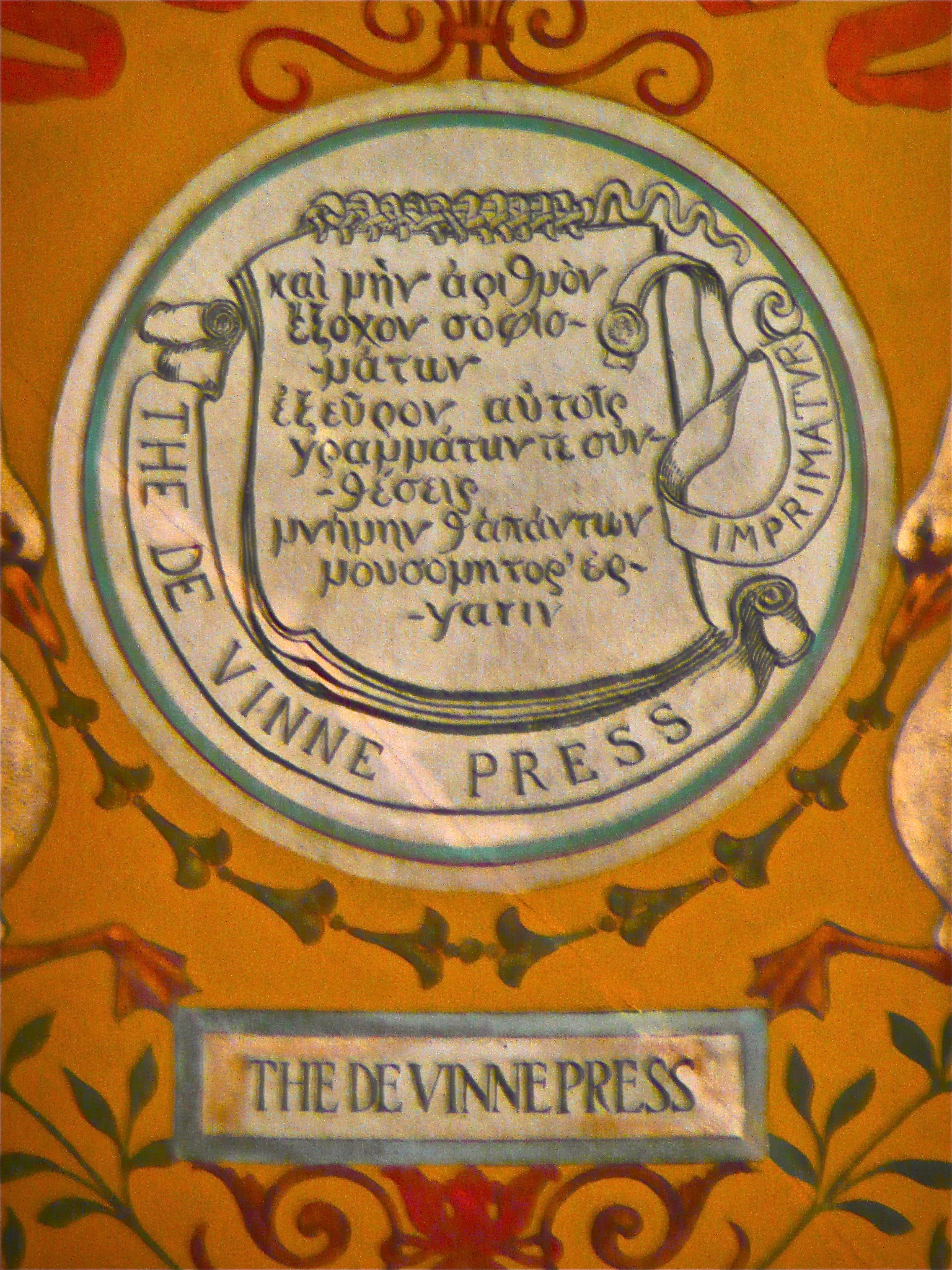
Theodore Low De Vinne (December 25, 1828 – February 16, 1914) was an American printer and scholarly author on typography. Considered "the leading commercial printer of his day," De Vinne did much for the improvement of American printing and typography. Life and career De Vinne was born at Stamford, Connecticut, and educated in the common schools of the various towns where his father, an itinerant Methodist minister, had pastorates. He learned the rudiments of printing while employed in a shop at Fishkill, New York. He worked at the Newburgh, New York ''Gazette'', then moved to New York City. In 1850 he was hired as a compositor by the printing shop of Francis Hart in New York, where he rose to the position of foreman within a year, which included duties as shop manager. He became a partner in Hart's business in 1858 and assumed sole proprietorship of the firm upon Hart's death in 1877, eventually renaming it to Theodore L. De Vinne & Co. in 1883. While still a partner ... [...More Info...] [...Related Items...] OR: [Wikipedia] [Google] [Baidu] |
Nicolas Jenson
Nicholas Jenson (c. 1420 – 1480) was a French engraver, pioneer, printer and type designer who carried out most of his work in Venice, Italy. Jenson acted as Master of the French Royal Mint at Tours and is credited with being the creator of one of the finest early Roman typefaces. Nicholas Jenson has been something of an iconic figure among students of early printing since the nineteenth century when the artist William Morris praised the beauty and perfection of his roman font. Jenson is an important figure in the early history of printing and a pivotal force in the emergence of Venice as one of the first great centers of the printing press. History In October 1458, while acting as Master of the French Royal Mint, Jenson was sent to Mainz, by King Charles VII, to study the art of metal movable type. By the time Jenson arrived in Mainz, there were a number of established printers under which he could have been apprenticed. Jenson left Mainz in 1461. Some hypothesize that Jens ... [...More Info...] [...Related Items...] OR: [Wikipedia] [Google] [Baidu] |
Monotype Imaging
Monotype Imaging Holdings Inc., founded as Lanston Monotype Machine Company in 1887 in Philadelphia by Tolbert Lanston, is an American (historically Anglo-American) company that specializes in digital typesetting and typeface design for use with consumer electronics devices. Incorporated in Delaware and headquartered in Woburn, Massachusetts, the company has been responsible for many developments in printing technology—in particular the Monotype machine, which was a fully mechanical hotmetal typesetter, that produced texts automatically, all single type. Monotype was involved in the design and production of many typefaces in the 20th century. Monotype developed many of the most widely used typeface designs, including Times New Roman, Gill Sans, Arial, Bembo and Albertus. Via acquisitions including Linotype GmbH, International Typeface Corporation, Bitstream, FontShop, URW and Hoefler & Co., the company has gained the rights to major font families including Helvetica, ITC Fra ... [...More Info...] [...Related Items...] OR: [Wikipedia] [Google] [Baidu] |
Walter Tracy
Walter Valentine Tracy RDI (14 February 1914 – 28 April 1995) was an English type designer, typographer and writer. Biography Walter Tracy was born in Islington, London and attended Shoreditch Secondary school. At the age of fourteen he was apprenticed to the large printing firm William Clowes as a compositor. When he had completed his apprenticeship, Tracy went to work in the typographic studio of The Baynard Press, a printing house. From 1938 to 1946, Tracy had been rejected by the army's medical examination, he worked in an advertising agency as a print buyer. From 1947 Tracy began to work part-time for the British Linotype & Machinery Ltd. (L&M) company, a subsidiary of Mergenthaler Linotype. The following year he was hired as a full-time employee by L&M, where he was going to spend the following 30 years. There he became involved with designing typefaces for newspapers, and classified advertising. His typeface Jubilee, designed to be more robust than Stanley Moris ... [...More Info...] [...Related Items...] OR: [Wikipedia] [Google] [Baidu] |
X-height
upright 2.0, alt=A diagram showing the line terms used in typography In typography, the x-height, or corpus size, is the distance between the baseline and the mean line of lowercase letters in a typeface. Typically, this is the height of the letter ''x'' in the font (the source of the term), as well as the letters ''v'', ''w'', and ''z''. (Curved letters such as ''a'', ''c'', ''e'', ''m'', ''n'', ''o'', ''r'', ''s'', and ''u'' tend to exceed the x-height slightly, due to overshoot; ''i'' has a dot that tends to go above x-height.) One of the most important dimensions of a font, x-height defines how high lowercase letters without ascenders are compared to the cap height of uppercase letters. Display typefaces intended to be used at large sizes, such as on signs and posters, vary in x-height. Many have high x-heights to be read clearly from a distance. This, though, is not universal: some display typefaces such as Cochin and Koch-Antiqua intended for publicity uses have low x- ... [...More Info...] [...Related Items...] OR: [Wikipedia] [Google] [Baidu] |
Miller And Richard Oldstyle Antique Type Specimen (16146280364)
A miller is a person who operates a mill, a machine to grind a grain (for example corn or wheat) to make flour. Milling is among the oldest of human occupations. "Miller", "Milne" and other variants are common surnames, as are their equivalents in other languages around the world (" Melnyk" in Russian, Belorussian & Ukrainian, "Meunier" in French, " Müller" or "Mueller" in German, "Mulder" and "Molenaar" in Dutch, "Molnár" in Hungarian, "Molinero" in Spanish, "Molinaro" or "Molinari" in Italian etc.). Milling existed in hunter-gatherer communities, and later millers were important to the development of agriculture. The materials ground by millers are often foodstuffs and particularly grain. The physical grinding of the food allows for the easier digestion of its nutrients and saves wear on the teeth. Non-food substances needed in a fine, powdered form, such as building materials, may be processed by a miller. Quern-stone The most basic tool for a miller was the quern-s ... [...More Info...] [...Related Items...] OR: [Wikipedia] [Google] [Baidu] |
Old Style
Old Style (O.S.) and New Style (N.S.) indicate dating systems before and after a calendar change, respectively. Usually, this is the change from the Julian calendar to the Gregorian calendar as enacted in various European countries between 1582 and 1923. In England, Wales, Ireland and Britain's American colonies, there were two calendar changes, both in 1752. The first adjusted the start of a new year from Lady Day (25 March) to 1 January (which Scotland had done from 1600), while the second discarded the Julian calendar in favour of the Gregorian calendar, removing 11 days from the September 1752 calendar to do so.Spathaky, MikOld Style and New Style Dates and the change to the Gregorian Calendar "Before 1752, parish registers, in addition to a new year heading after 24th March showing, for example '1733', had another heading at the end of the following December indicating '1733/4'. This showed where the Historical Year 1734 started even though the Civil Year 1733 continued u ... [...More Info...] [...Related Items...] OR: [Wikipedia] [Google] [Baidu] |


.jpg)


