|
Baskerville (font)
Baskerville is a serif typeface designed in the 1750s by John Baskerville (1706–1775) in Birmingham, England, and cut into metal by punchcutter John Handy. Baskerville is classified as a transitional typeface, intended as a refinement of what are now called old-style typefaces of the period, especially those of his most eminent contemporary, William Caslon. Compared to earlier designs popular in Britain, Baskerville increased the contrast between thick and thin strokes, making the serifs sharper and more tapered, and shifted the axis of rounded letters to a more vertical position. The curved strokes are more circular in shape, and the characters became more regular. These changes created a greater consistency in size and form, influenced by the calligraphy Baskerville had learned and taught as a young man. Baskerville's typefaces remain very popular in book design and there are many modern revivals, which often add features such as bold type which did not exist in Basker ... [...More Info...] [...Related Items...] OR: [Wikipedia] [Google] [Baidu] |
Serif
In typography, a serif () is a small line or stroke regularly attached to the end of a larger stroke in a letter or symbol within a particular font or family of fonts. A typeface or "font family" making use of serifs is called a serif typeface (or serifed typeface), and a typeface that does not include them is sans-serif. Some typography sources refer to sans-serif typefaces as "grotesque" (in German, ) or "Gothic", and serif typefaces as "roman". Origins and etymology Serifs originated from the first official Greek writings on stone and in Latin alphabet with inscriptional lettering—words carved into stone in Roman antiquity. The explanation proposed by Father Edward Catich in his 1968 book ''The Origin of the Serif'' is now broadly but not universally accepted: the Roman letter outlines were first painted onto stone, and the stone carvers followed the brush marks, which flared at stroke ends and corners, creating serifs. Another theory is that serifs were devised to neate ... [...More Info...] [...Related Items...] OR: [Wikipedia] [Google] [Baidu] |
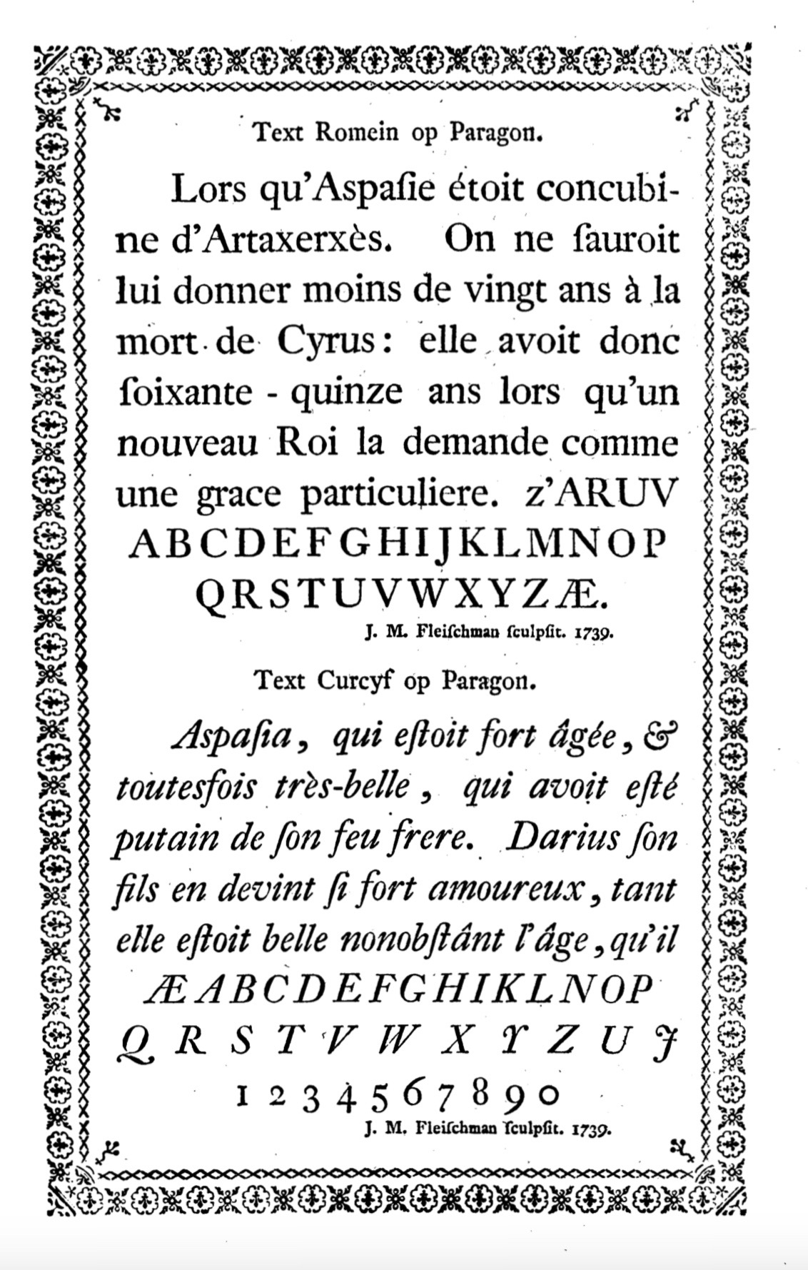
Joan Michaël Fleischman
Joan Michaël Fleischman (1707–27 May 1768, german: Johann Michael Fleischmann), was an 18th-century German-Dutch typographer and punchcutter. Fleischman worked in the Baroque period of design and his roman typefaces have been described as "transitional" in style, more stylised and sharply cut than was common before. Perhaps his most notable design was his complex music font, that was later used to decorate the edges of documents, including the first bank note of the Netherlands called the "roodborstje" or robin. Biography He was born in Wöhrd, Nuremberg, but moved to Amsterdam, where he worked for Izaak van der Putte and Hermanus Uytwerff before opening his own type foundry in 1735. Fleischman was unable to continue the type foundry on his own, and Rudolf Wetstein ran the business for him, while he continued to work for him as a punchcutter. After Rudolf died in 1742, his son Hendrik Joris Wetstein sold the company in 1743 to Izaak Enschedé of Haarlem, forming the nu ... [...More Info...] [...Related Items...] OR: [Wikipedia] [Google] [Baidu] |
Thomas Frognall Dibdin
Thomas Frognall Dibdin (177618 November 1847) was an English bibliographer, born in Calcutta to Thomas Dibdin, the sailor brother of the composer Charles Dibdin. Dibdin was orphaned at a young age. His father died in 1778 while returning to England, and his mother died one of the following two years, and an elderly maternal aunt eventually assumed responsibility for Dibdin.David A. Stoker, "Thomas Frognall Dibdin", ''Dictionary of Literary Biography, Volume 184: Nineteenth-Century British Book-Collectors and Bibliographers''. The Gale Group, 1997. He was educated at St John's College, Oxford, and studied for a time at Lincoln's Inn. After an unsuccessful attempt to obtain practice as a provincial counsel at Worcester, he was ordained a clergyman at the close of 1804, being appointed to a curacy at Kensington. It was not until 1823 that he received the living of Exning in Sussex. Soon afterwards he was appointed by Lord Liverpool to the rectory of St Mary's, Bryanston Square, ... [...More Info...] [...Related Items...] OR: [Wikipedia] [Google] [Baidu] |
Benjamin Franklin
Benjamin Franklin ( April 17, 1790) was an American polymath who was active as a writer, scientist, inventor, statesman, diplomat, printer, publisher, and political philosopher. Encyclopædia Britannica, Wood, 2021 Among the leading intellectuals of his time, Franklin was one of the Founding Fathers of the United States, a drafter and signer of the United States Declaration of Independence, and the first United States Postmaster General. As a scientist, he was a major figure in the American Enlightenment and the history of physics for his studies of electricity, and for charting and naming the current still known as the Gulf Stream. As an inventor, he is known for the lightning rod, bifocals, and the Franklin stove, among others. He founded many civic organizations, including the Library Company, Philadelphia's first fire department, and the University of Pennsylvania. Isaacson, 2004, p. Franklin earned the title of "The First American" for his early and indefa ... [...More Info...] [...Related Items...] OR: [Wikipedia] [Google] [Baidu] |
Giambattista Bodoni
Giambattista Bodoni (, ; 16 February 1740 – 30 November 1813) was an Italian typographer, type-designer, compositor, printer, and publisher in Parma. He first took the type-designs of Pierre Simon Fournier as his exemplars, but afterwards became an admirer of the more modelled types of John Baskerville; and he and Firmin Didot evolved a style of type called "Modern", in which the letters are cut in such a way as to produce a strong contrast between the thick and thin parts of their body. Bodoni designed many typefaces, each one in a large range of type sizes. He is even more admired as a compositor than as a type designer, as the large range of sizes which he cut enabled him to compose his pages with the greatest possible subtlety of spacing. Like Baskerville, he sets off his texts with wide margins and uses little or no illustrations or decorations. Bodoni achieved an unprecedented level of technical refinement, allowing him to faithfully reproduce letterforms with very thin ... [...More Info...] [...Related Items...] OR: [Wikipedia] [Google] [Baidu] |
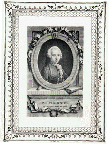
Pierre Simon Fournier
Pierre-Simon Fournier (15 September 1712 – 8 October 1768) was a French mid-18th century punch-cutter, typefounder and typographic theoretician. He was both a collector and originator of types. Fournier's contributions to printing were his creation of initials and ornaments, his design of letters, and his standardization of type sizes. He worked in the rococo form, and designed typefaces including Fournier and Narcissus. He was known for incorporating ‘decorative typographic ornaments’ into his typefaces. Fournier's main accomplishment is that he ‘created a standardized measuring system that would revolutionize the typography industry forever’. He was also known as Fournier le Jeune ("the younger") to distinguish him from his father Jean Claude, who was also in the typesetting industry. In his early life, Fournier studied watercolour with J. B. G. Colson, and later wood engraving. In 1737, Fournier published his first theoretical work, on the minimum spacing between le ... [...More Info...] [...Related Items...] OR: [Wikipedia] [Google] [Baidu] |


